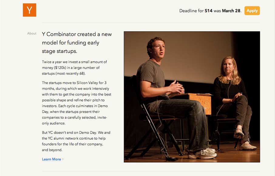
New design for the Y Combinator site. It’s a nice clean design that’s slightly asymmetrical which I like. I also like how the navigation is played down on the site, it’s at the bottom. The focus is more on the first level content like the startup programs and the news elements.
Glassmorphism: The Transparent Design Trend That Refuses to Fade
Glassmorphism brings transparency, depth, and light back into modern UI. Learn how this “frosted glass” design trend enhances hierarchy, focus, and atmosphere, plus how to implement it in CSS responsibly.


0 Comments