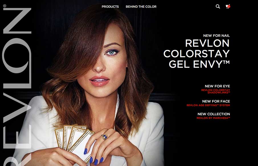
So – how do you get your website to mirror your long established, beautify and elegant print campaigns – ask Revlon. The home page of the site looks like a magazine cover, something to draw you in with a big picture, but let’s you know that there is more inside. The product detail pages (exp: http://www.revlon.com/products/eyes/mascara/Revlon-Lash-Potion-Volume-Length-Mascara.aspx#309970455026||0 ) have the same feel, with the HD images blending perfectly into glossy black background – it doesn’t feel like it’s an e-commerce site.
Glassmorphism: The Transparent Design Trend That Refuses to Fade
Glassmorphism brings transparency, depth, and light back into modern UI. Learn how this “frosted glass” design trend enhances hierarchy, focus, and atmosphere, plus how to implement it in CSS responsibly.


0 Comments