Bold colors and simple copy help sell this company even if I can't speak the language. It's a nice simple yet bold interaction design that has a nice feel to it. I like the little contact envelope that rolls out to be more info in the bottom right the most.
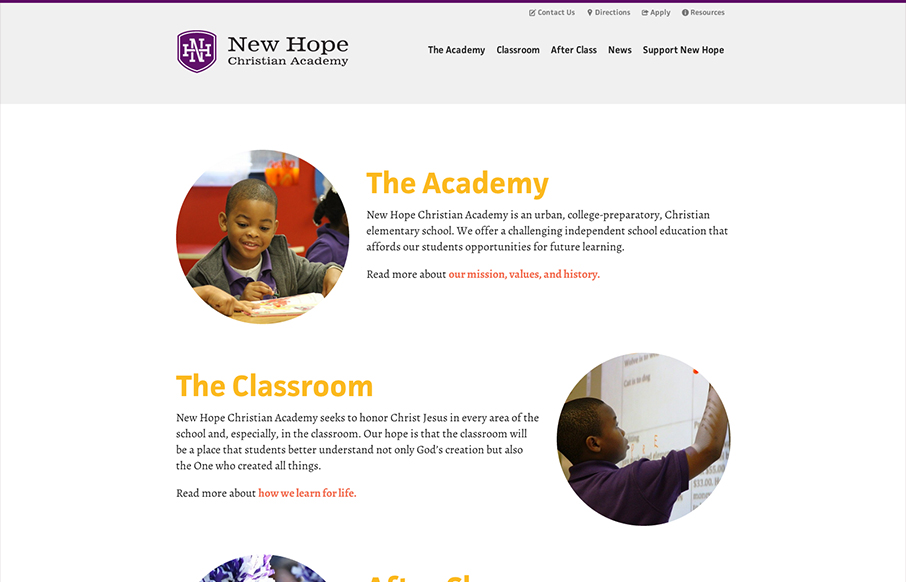
New Hope
This new site launch by SimpleFocus is very intriguing to me. It has a nice simplified feeling to the layout visually but there's still just about as much "stuff" on the page as any typical site I've seen. I can't help but think this is largely derived from the...
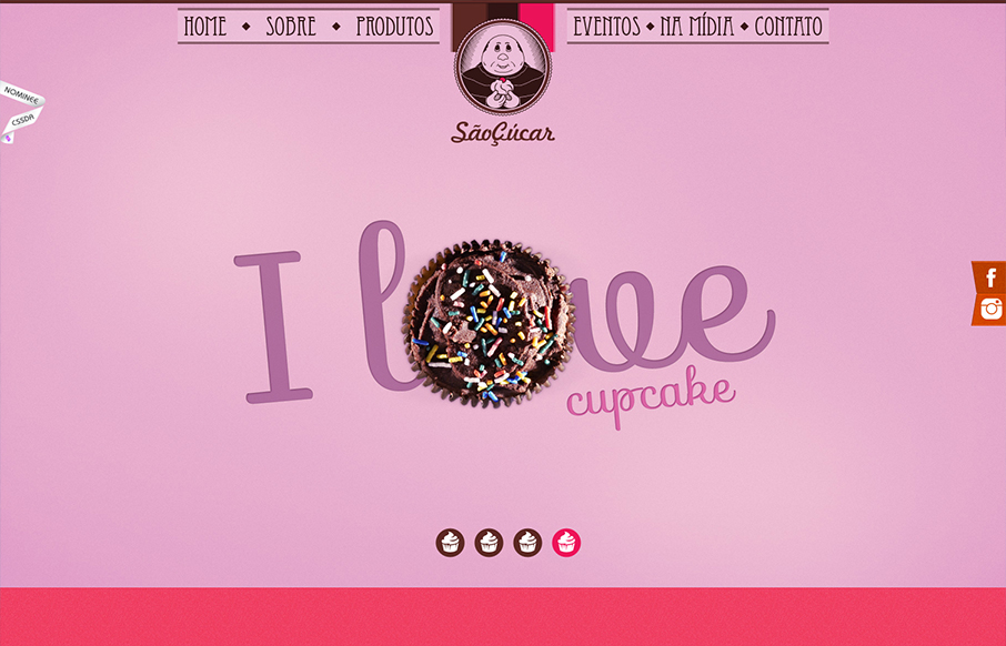
Saocucar
Bold colors and interactions make up this great website for Saocucar. Nice fixed header/nav and bold colors for each section are matched with strong typography to make for a compelling visual treat as you make your way to the bottom of the page.
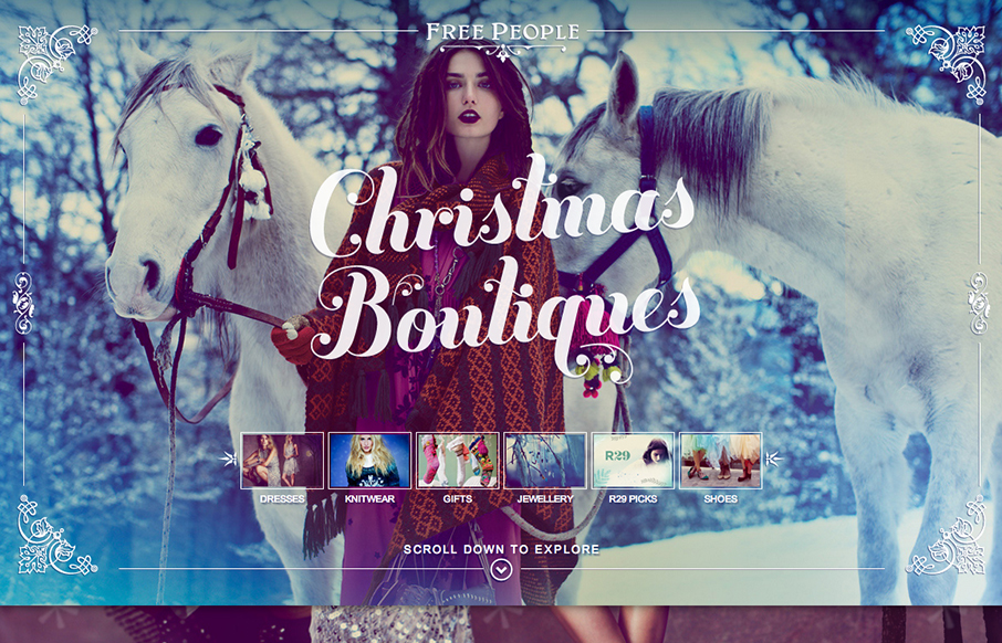
Free People Christmas Boutiques
Using a scrolling page with a parallax design isn't new but I really love how this page is using those same tools. The little screen shots front and center really help to drive you to a section of the page, you just can't help but click on them. Then the visuals as...
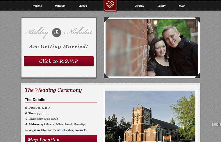
Burke Miller Wedding
I like the big bold blocky layout. It reminds me of a wedding photo album but doesn't go too far over the top with the visual metaphor. I like that a great deal. Nice responsive solution here too.
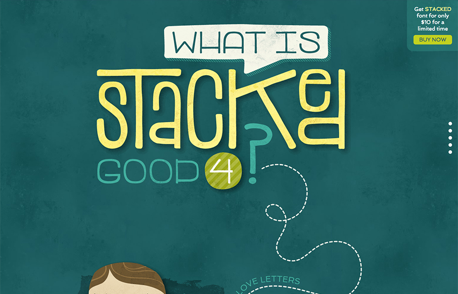
Stacked Font
Great site showing off the font in question. Stacked Font, it's fun and super easy to take in. I like the long scrolling page format that let's you explore as you make your way down. Fun!
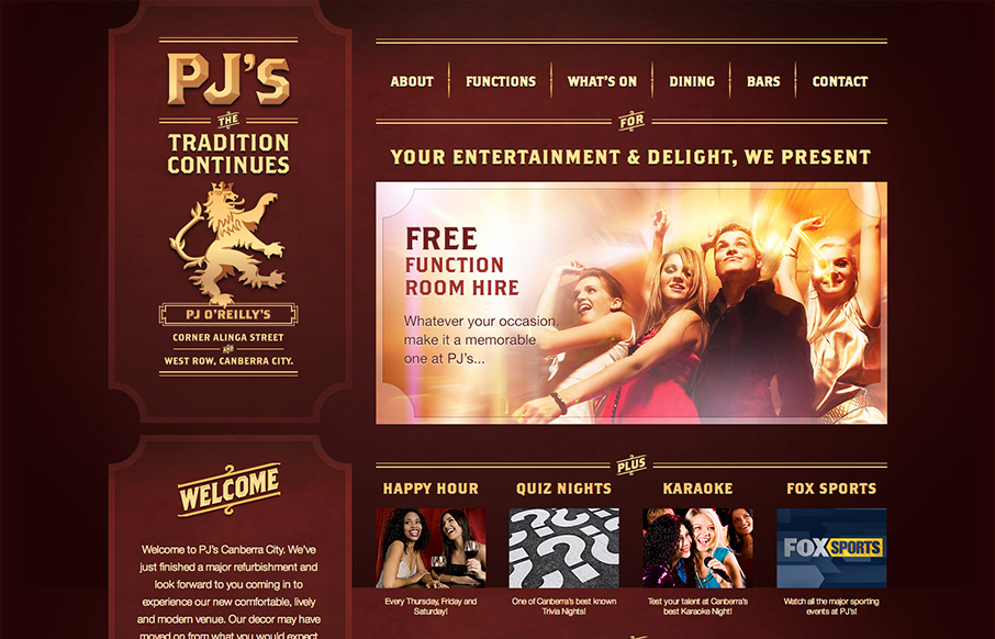
PJ O’Reilly’s
Pretty cool looking design for a restaurant/bar here. It's responsive which I just super love to see in sites designed for restaurants and bars like this. I dig the dark color palette and blocky type as well, it kinda fits my mental model of what an irish pub would be...
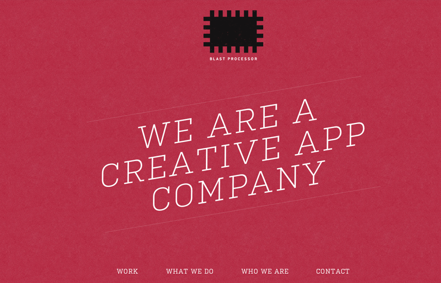
Blast Processor
I love the red color and texture used for the main intro section and header for the Blast Processor site. I also like how the header slides into a fixed position and at the same time the main nav slides to the right. Overall a nice clean layout that works well in most...
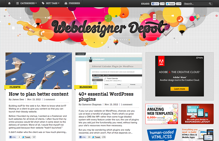
Webdesigner Depot
The latest redesign of Webdesigner Depot is pretty epic. Parallax based art in the header, a stark change in layout and it's responsive. The site is very much worthy of some in-depth study for sure. My favorite part of this design is the large buttons near the footer...
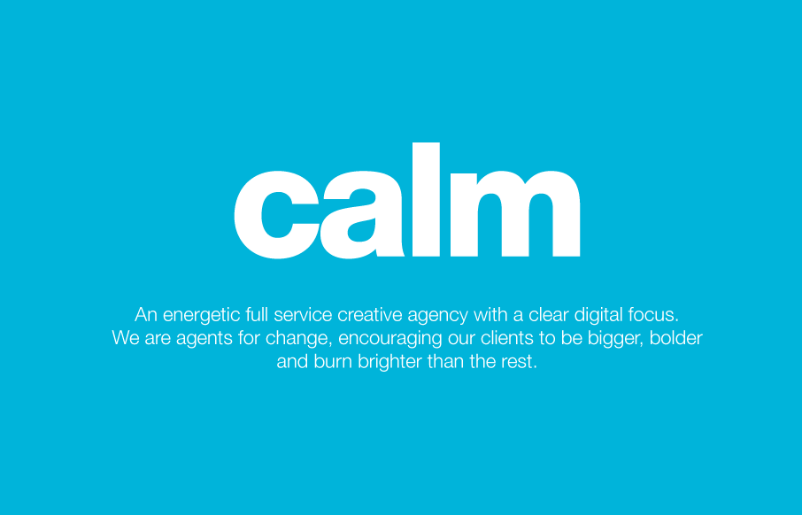
Calm Digital
Some pretty good interactions built into this design. The main screen looks like a splash page but then you can scroll it and the navigation loads from the top-down and stays fixed over a long scrolling page. It then has a nice infographic type section and portfolio...
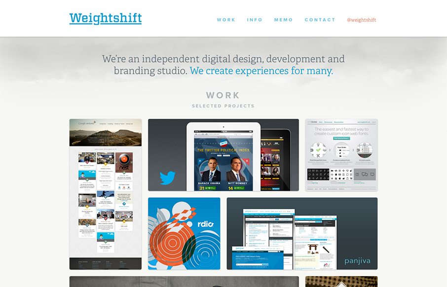
Weightshift
Superb responsive design decisions made on this newest version of Weightshift's site. Making the portfolio images get smaller and more button like for the iPad and iPhone screen widths is brilliant. I also think the focus on the selective nav elements as you get...
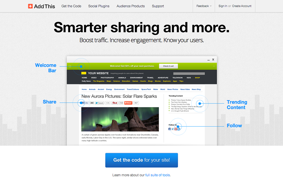
AddThis
Really beautiful product website here for AddThis. I've always liked their design and this one with the push for simplicity is the best to date. The animated background works really to give it some visual interest while not creating too much noise.
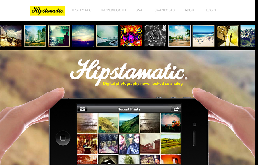
Hipstamatic
Great quick storytelling is at the heart of this website. You see the hands slide on screen to show how to hold the camera and use the app quickly and succinctly. Brilliant even. You then get a similare treatment on all the other apps that they make, visuals helping...
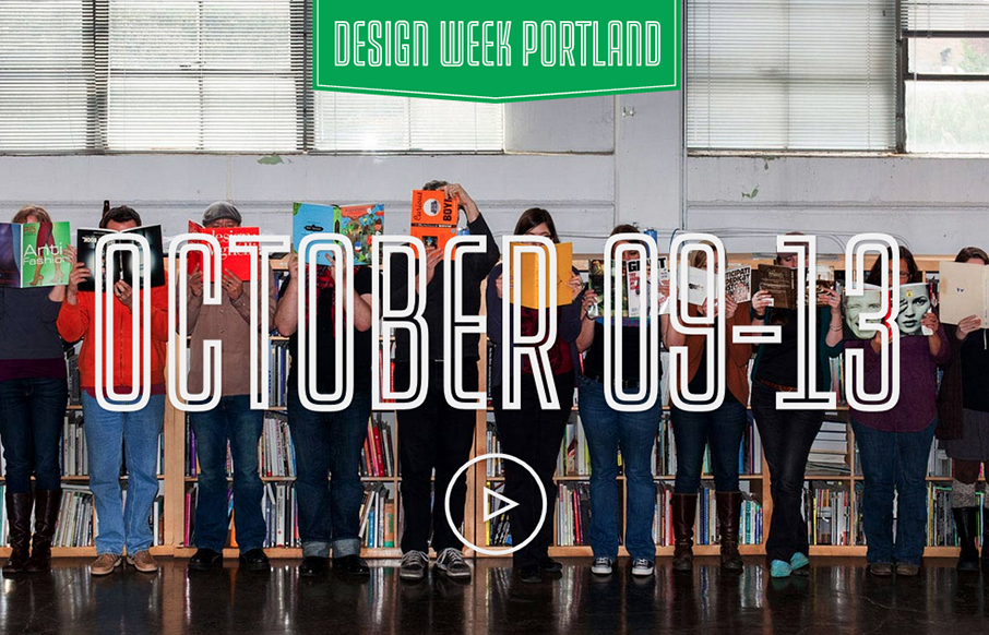
Design Week Portland
Strong graphic vibe to this website. It's surprisingly simple but doesn't compromise on coolness, which is how it should be I think for a site like this... Badass little short video too.
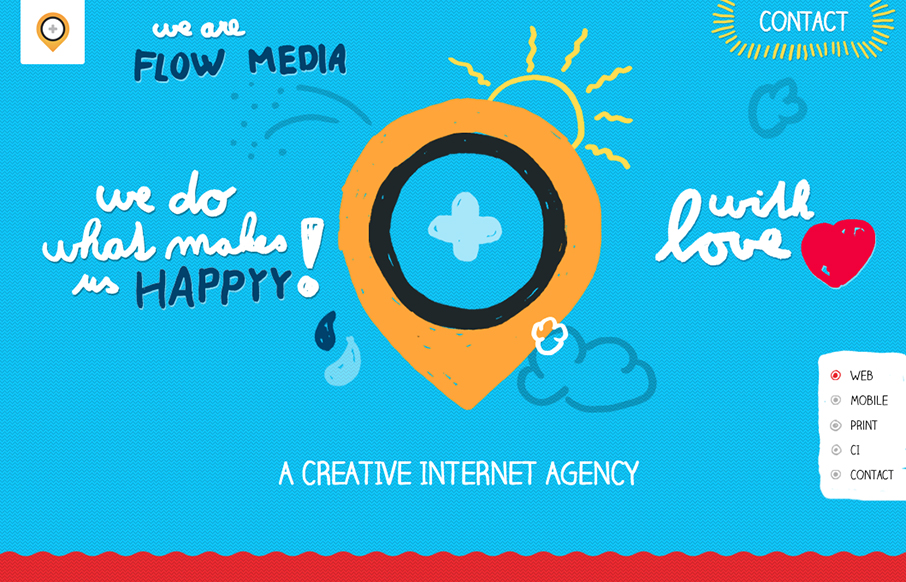
Flow Media
The mixture of the long scrolling page and the screen clearing visual effect when you click on the nav item gives the site the feel that it's not just a long form scroller. I'm not 100% sure if that's good or bad. Nice responsive solution too.
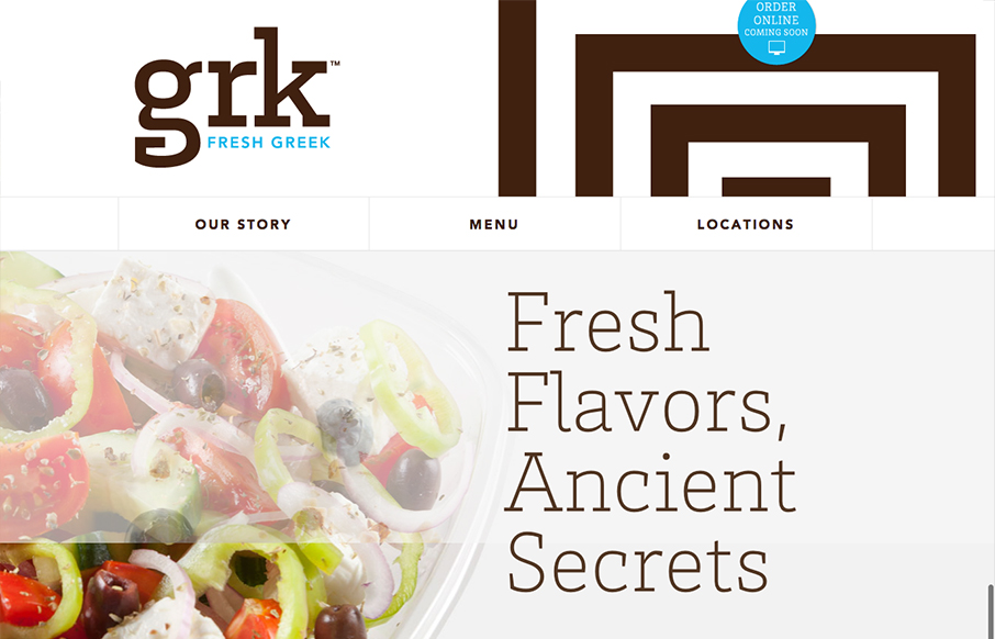
grk
Nice clean and responsive restaurant website. I love this trend of making restaurant websites responsive, give me more please! Overall nice presentation of the food and menu make this website attractive and highly usable. Bravo.
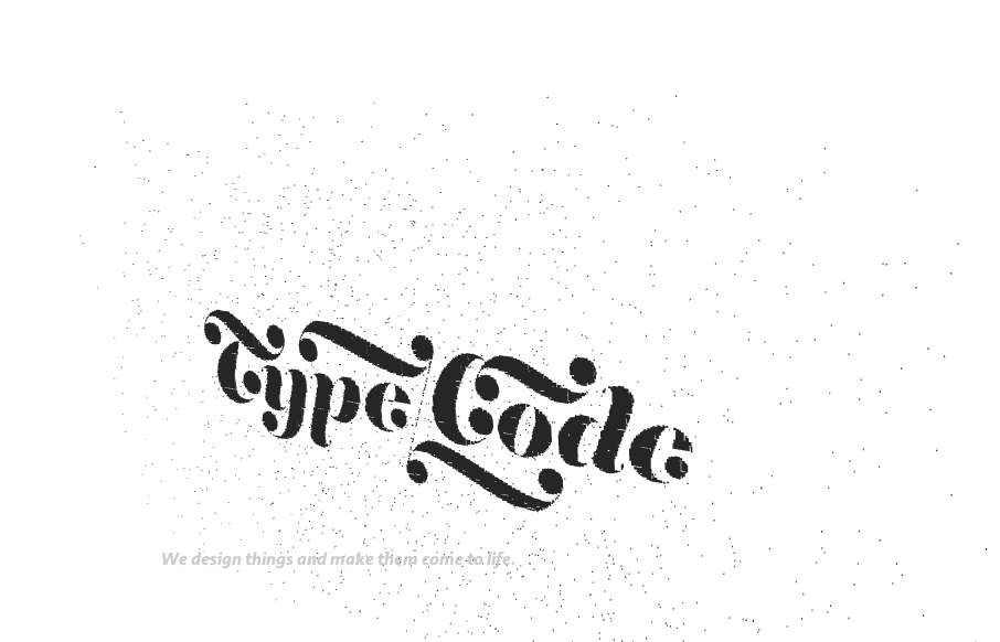
Typecode
Great interactions mark this website for me. I like the playfulness of the Typecode logo on the initial load/home page. Then the fixe nav and side scrolling load make the site feel very exotic. Clean and almost stark with the black and white make the work stand out...
BriAbby
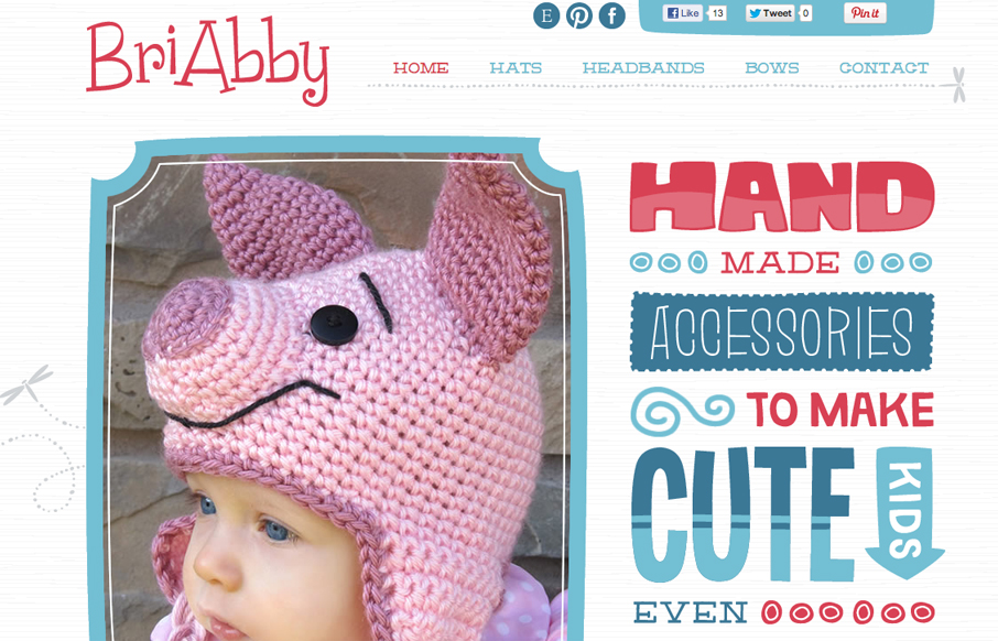
Some really fun typography on this website. I like the large photo positioned next to the large type. But the thing that makes it is what the type says. The copy is clear and concise and presented in a fun way. Win all the way.
Saving Orphans Worldwide
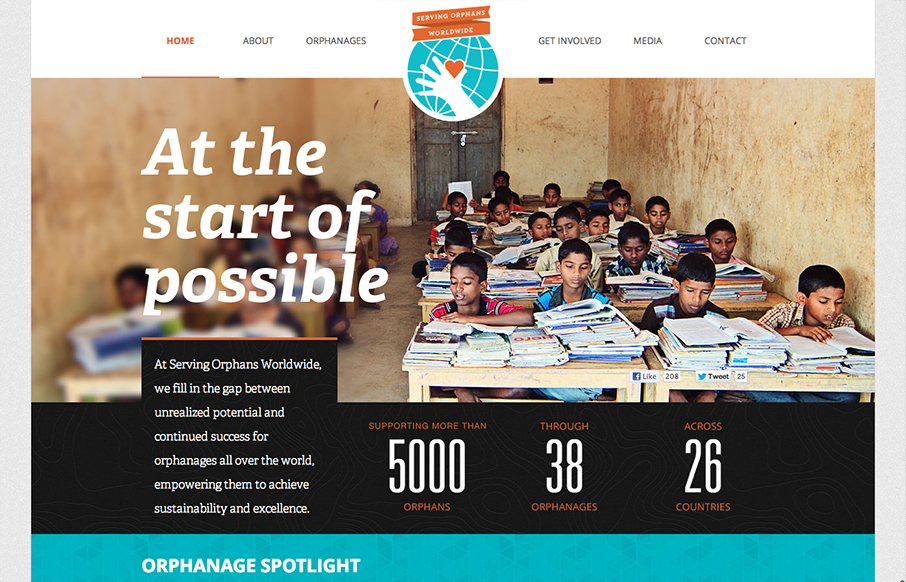
What a great layout. The way they've used the fixed big hero image to say in place as you scroll down is brilliant, as it keeps you pretty well focused on the people they've used in those same photos. Then the overall design just breaks down into such great chunks and...
Wee Society
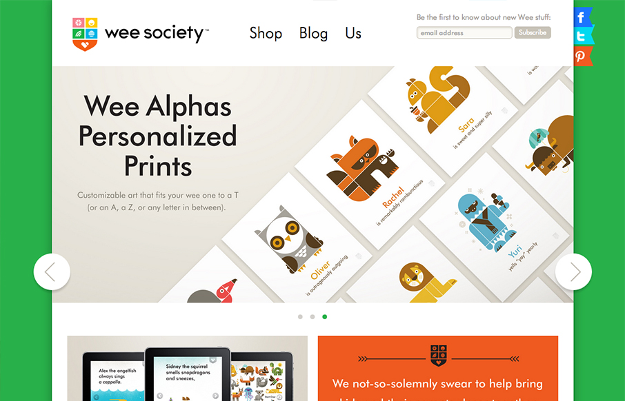
Super fun looking design/illustration work here. Every now and then there's just a fun website and this is one of those. Love the animal cartoon work and the website is just about perfect as far as matching the vibe. Love it!
KIKK Festival
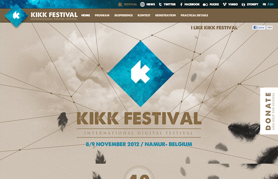
Lots of cool little interactions to keep it interesting. I like the feathers animated to fall down the page, even though I don't fully get it. I also like the circles that the speaker portraits are set in.
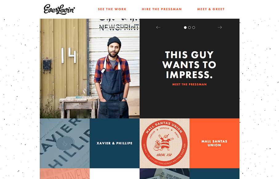
Everlovin’ Press
Great layout and photography really helps tell the story of this letterpress shop/guy. A lot of character comes out when you get something printed by hand like this shop does so the website naturally has to carry that same level of care and love right? I'm pleasantly...
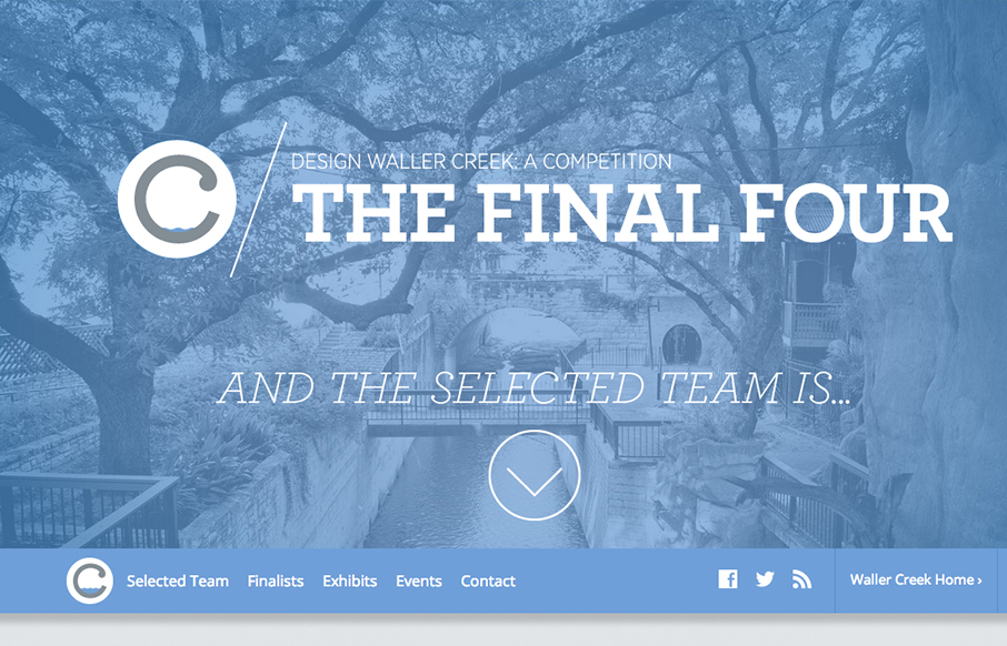
Waller Creek Final Four
There is so much richly constructed simple interaction here to check out. I love it. I like the simple organization and feel of the site but with nice little animations and extras on the details.
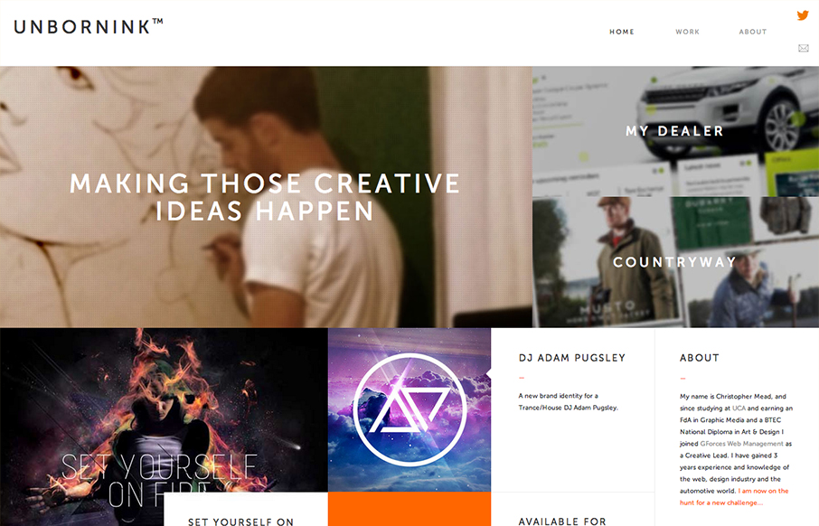
Unbornink
Man, at first glance I totally thought this was as website for a high end design agency only to discover it's basically just a portfolio for one person. That's impressive to me because it's not just the look that pulled me in, the the presentation of the work and...
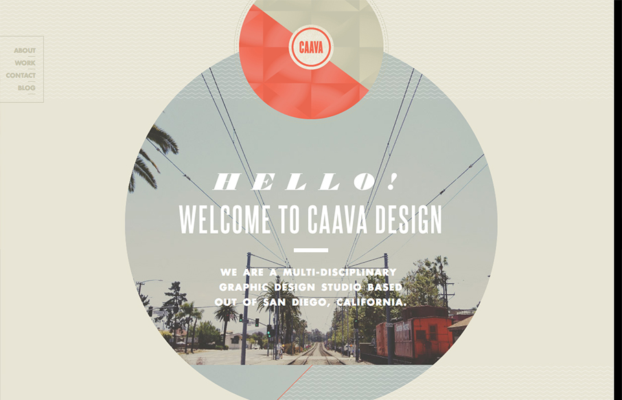
Caava
Nice touches here and there make this a really interesting site design. I really dig the big circle with the image in it and how it stays put as you scroll. I've seen that before but it feels fresh here.
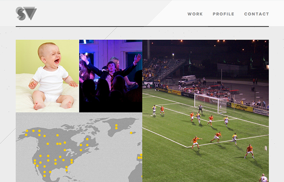
Stevevorass
Great simple but bold graphic website. I dig the grid and the way the responsive system works for this site. The portfolio section is great too with the way they demo the designs.
FieldTrip
Lovely home page design. With the split/slide in animation of the creative tools as you slide down the page the site immediately feels activated. I think that's the point given the subject matter and way the FieldTrip conference is supposed to play out. Just read the...
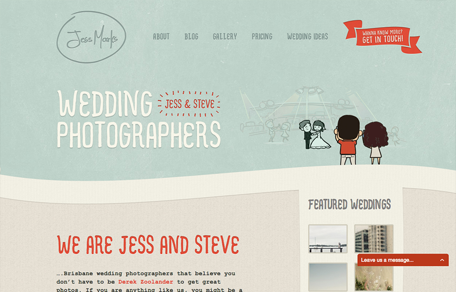
Jess Marks
I love these colors, they feel so soft and welcoming and perfect for the subject matter. The little slideshow/animation of the scenes helps you understand really quickly what the site is all about if you don't notice the large type "wedding photographers" - I mention...
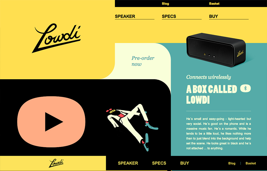
Lowdi
The design is a nice example of an asymmetrical design that leads to a symmetrical as you scroll down. I like that balance. Nice colors and interactions make this a well rounded design that's going to be memorable.
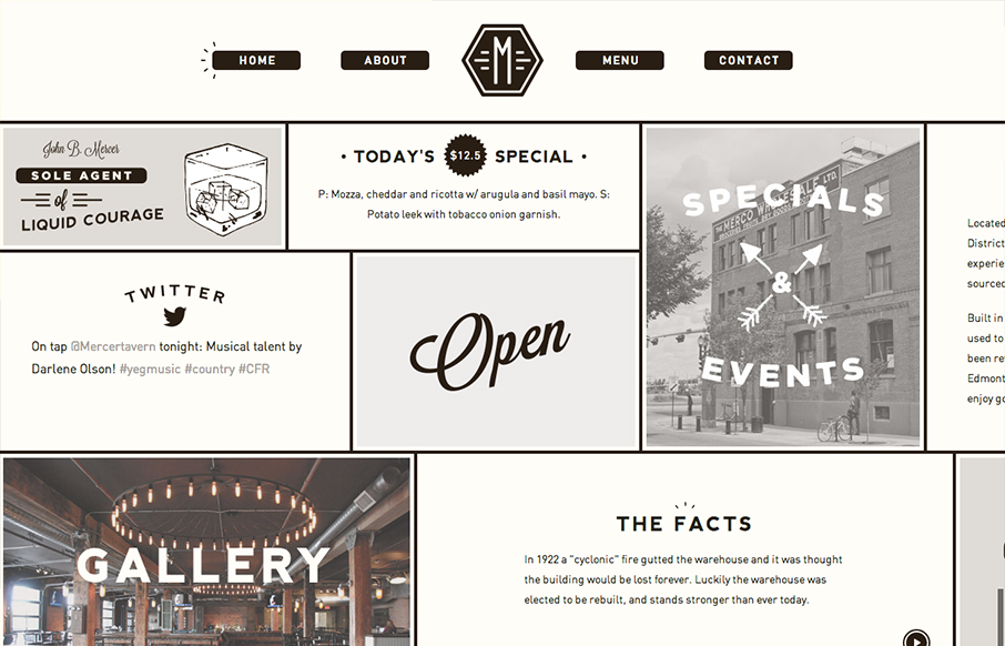
Mercer Tavern
Interesting single page design. It scroll sideways which gives it an extra push of into making if "feel" really graphic. Not sure that makes sense, but it did in my head. I'm not normally a fan of tricks like this side scroll design here. But for some reason it just...

