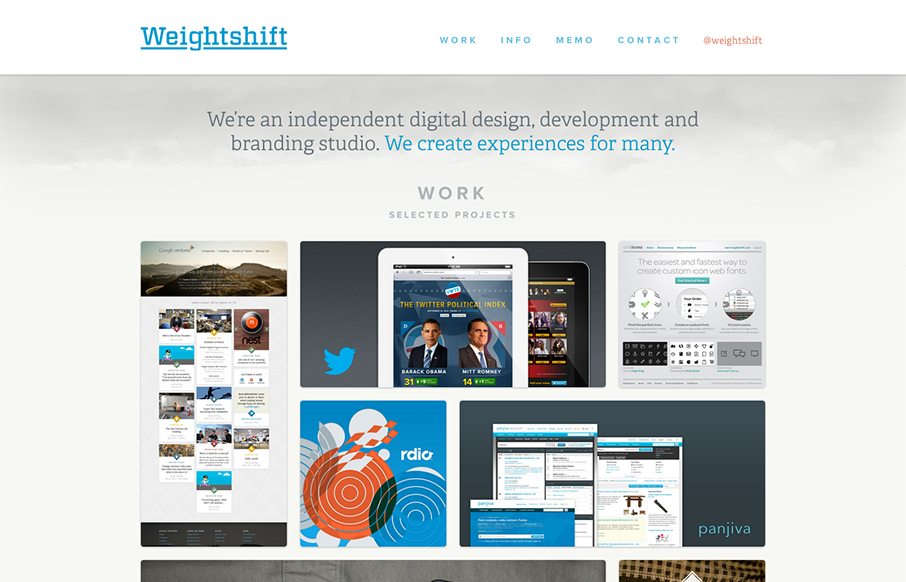
Superb responsive design decisions made on this newest version of Weightshift’s site. Making the portfolio images get smaller and more button like for the iPad and iPhone screen widths is brilliant. I also think the focus on the selective nav elements as you get smaller in screen width works great too. Going down to “work, info & memo” makes it so well focused and clear. Love this website!
Glassmorphism: The Transparent Design Trend That Refuses to Fade
Glassmorphism brings transparency, depth, and light back into modern UI. Learn how this “frosted glass” design trend enhances hierarchy, focus, and atmosphere, plus how to implement it in CSS responsibly.


Nice effect and work.
Thumb up!!!