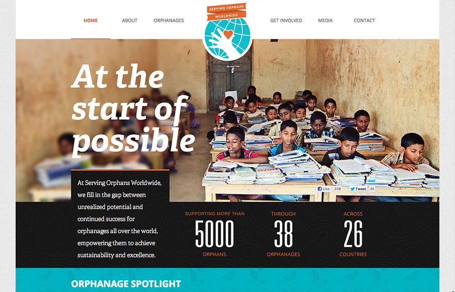
What a great layout. The way they’ve used the fixed big hero image to say in place as you scroll down is brilliant, as it keeps you pretty well focused on the people they’ve used in those same photos. Then the overall design just breaks down into such great chunks and density content wise as you make your way to the footer and there’s just enough interaction and deviation in the detail work to keep you really riveted.


The Call to Action, Revisited
The Call to Action hasn’t changed in a decade, but the bar has. A fresh look at prominence, copy, mobile tap targets, and accessibility, with lessons from three major design systems.


0 Comments