
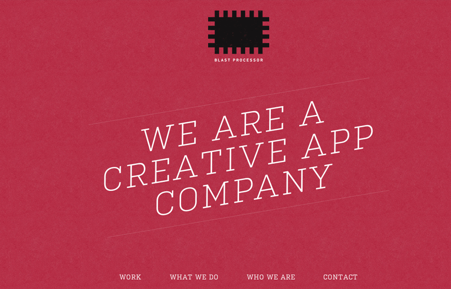
I love the red color and texture used for the main intro section and header for the Blast Processor site. I also like how the header slides into a fixed position and at the same time the main nav slides to the right. Overall a nice clean layout that works well in most of it’s responsive screen width targets.


Fitts’s Law: Why the Easy Button Wins
Large, close targets are faster to hit than small, distant ones, that’s Fitts’s Law. A look at the 1954 rule behind buttons, prime and magic pixels, thumb zones, and dark patterns.


0 Comments