The new Uber site design is slick and upscale. Nice use of the slideshow IMHO, the images are something out of vogue and adds to the visual branding that they're rolling with. The site is a stark black and white design with a hint of of the blue/green color used for...
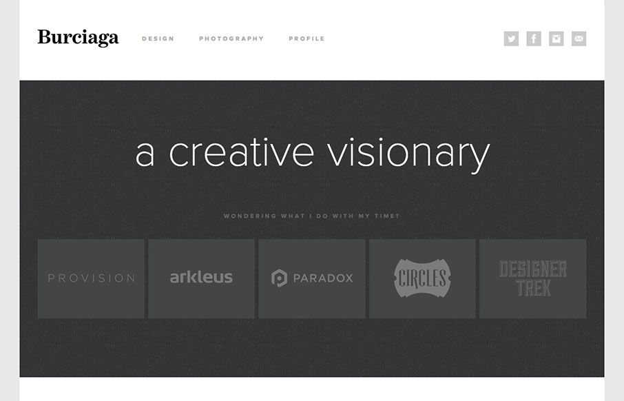
Burciaga & Co.
Super sleek and fairly minimal the Burciaga website looks great. I really like how it starts off primarily muted in colors with the grays, then as you interact with it and scroll you get colors. The design is primarily made up of the examples of work samples which is...
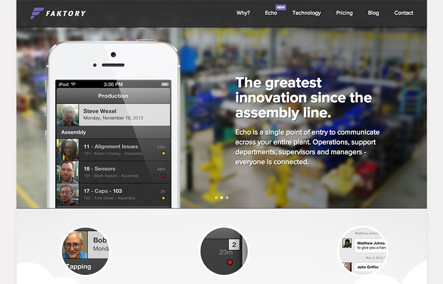
faktory
I really dig the smooth nature of this layout. It looks visually complete as you scroll down and/or click through different sections of the page. I do think it lacks in content, for example I want more on the pricing section. I get that they need to consult with you a...
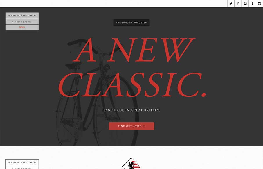
Vickers Bicycles
The Vickers Bicycles site is a small one that has one clear purpose: promote and sell the English Roadster Bike - a beautiful machine, if I do say so - and does so wonderfully. The simple, open layout has a slightly mechanical feel that doesn't feel overwrought. The...
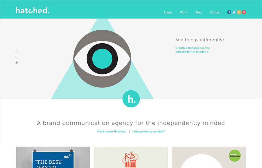
Hatched
The Hatched London website is a simple, elegant site. It's flat, minimal and strongly graphic. Everything you'd expect from a great design house.
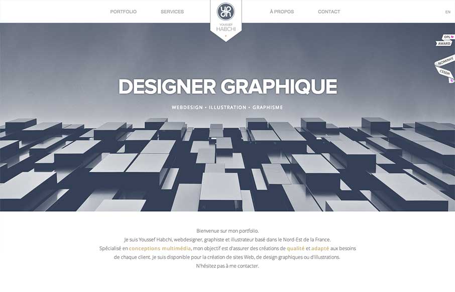
Youssef Habichi
While I'm not a hug fan of loading screens, youssef-habchi.com is a really nice responsive portfolio site. It balances low contrast grays beautifully and incorporates a fast, animated transitions that polish the interactions nicely. The splashes of color in the work...
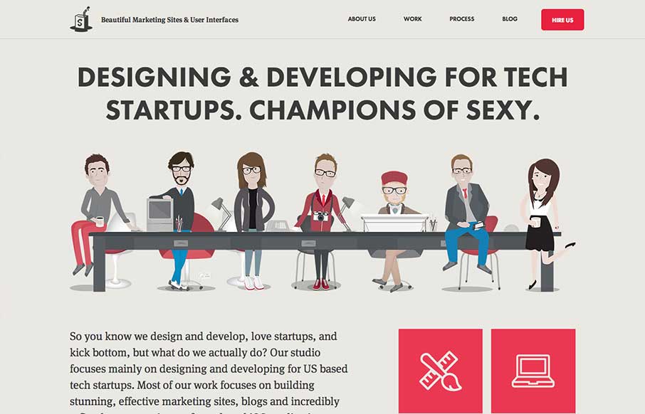
Simple as Milk
The Simple as Milk website packs a lot onto one page! The site is strongly illustrative, which is perfect, one you see the portfolio; you certainly know what you are getting when you hire this agency. I really enjoy the playful quality of the artwork and interface...
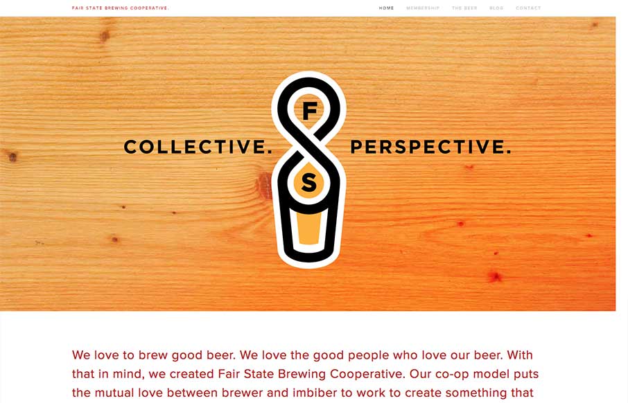
Fair State Co-op
Fair State Co-op is a really nice site filled with warmth and dominated by a simple graphic style. The site doesn't have all the bells and whistles that we often see in the gallery, but its got rock solid design and readability. It's a very friendly site.
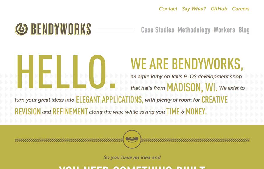
Bendyworks
I really dig the simple yet clever design of the Bendyworks website. It's largely made up of text, but it's well written and clearly defines what Bendyworks does for you and what they're looking to do. I also really love the hot dog graphic, who doesn't love a good...
Squarespace
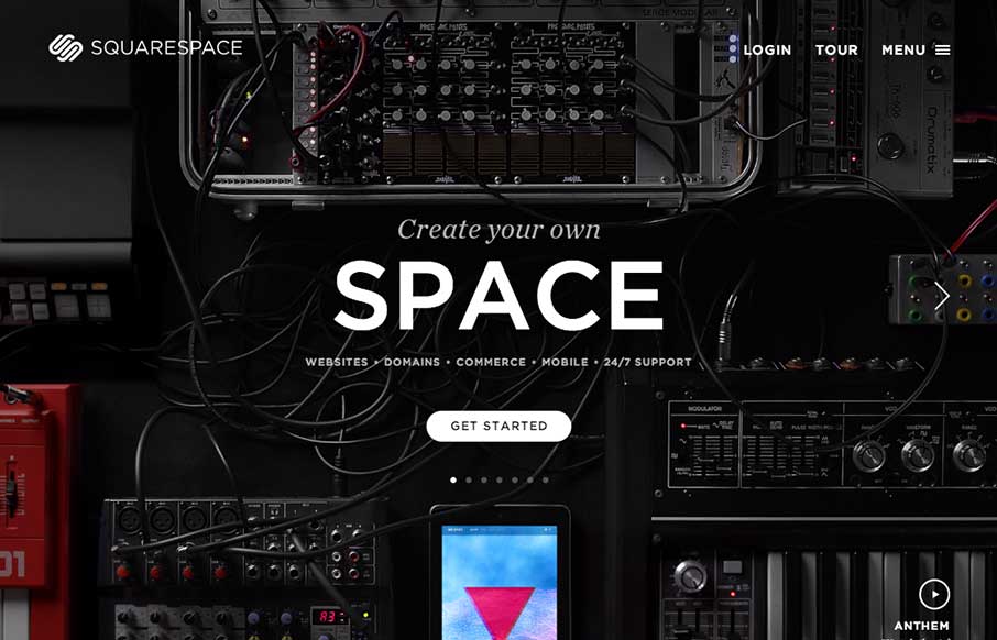
The updated Squarespace website design starts off with a homepage that's pretty much just a giant slider. It's a super clean, sleek and beautiful design across the board for sure. One question I have about it though, and i've seen this on a lot of new sites is the...
Mailchimp
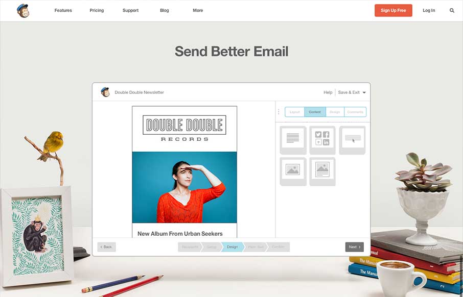
The new Mailchimp site is superb to say the least. The simplified layout on the homepage really sets the tone for the rest of the design. Incorporating the video of how the app works into the homepage like this is smart and works very seamlessly, you almost don't even...
Kettle Cuisine
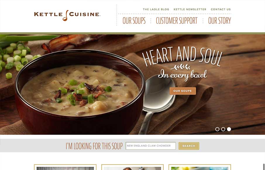
What a great website design. It's clean and precise and keeps a level of corporate appeal while still having a nice craft vibe. It pulls out all the trends in its detail work for sure and they're all done very well, from the parallax(ish) section to the really visible...
Loft City Church
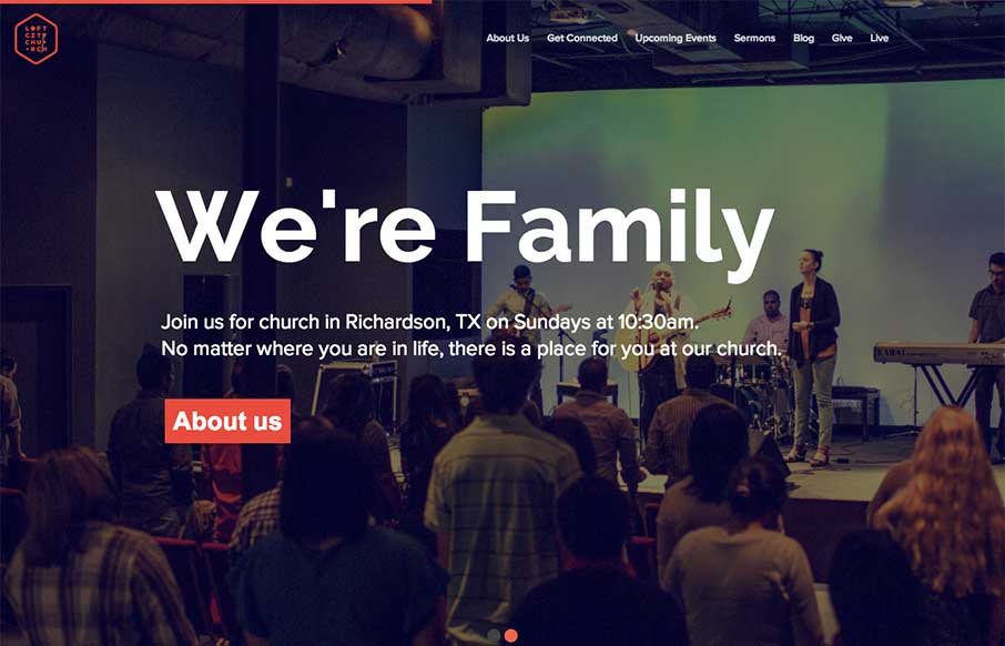
The loftcitychurch site strikes a wonderful balace between it's use of images, typography and color. At large screen sizes the site feels big and open, which is perfect for a church, and at mobile sizes everything feels compact but not cramped. The use of fixed...
House
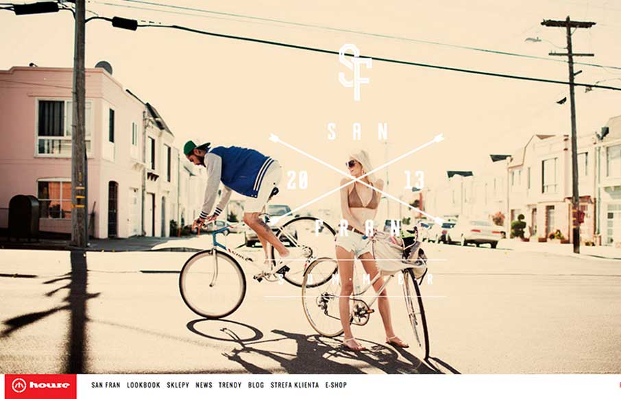
House is strongly structured, albe it a little noisy design. The strong use of bold red and imposing lines is wonderfully graphic and paires well with the style of photography. The site is adaptive, which seems to work well enough in this case. Dig it.
Wootten
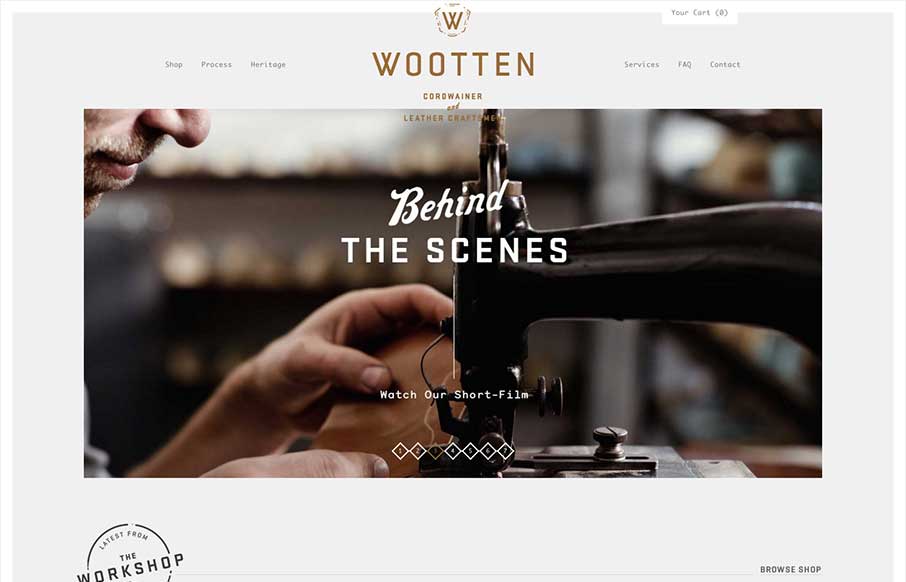
Man this is a beautiful site. The photography really sells it. Just check out the heritage page. The mix of fixed imagery and scrolling text is beautiful and the transition between content blocks is perfect. The site has a handcrafted feel that perfectly compliments...
Bold
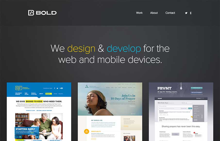
So excited to announce our new, responsive @bold site:hellobold.com#rwd #mfn— Noah Stokes (@motherfuton) June 7, 2013 Really great looking simple approach. I love it so much. Good responsive design and great decisions on how they present their work. It's really...
Carrera
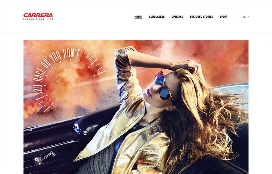
I really like how carreraworld has broken the grid. The site is well structured, but has loosened the hard lines of the grid it uses to create a more free flowing and energetic design. Nothing feels static. Even thought the design is wildly varies throughout the...
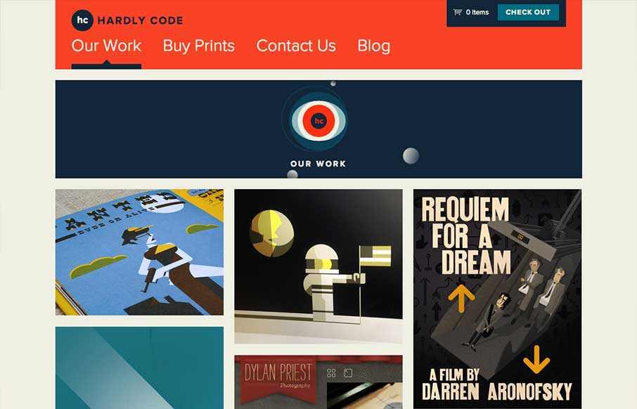
Hardly Code
I love a simple layout that just works. In the case of Hardly Code, they sell stuff that looks awesome. They show you stuff that looks awesome and get the hell out of the way. Bravo.
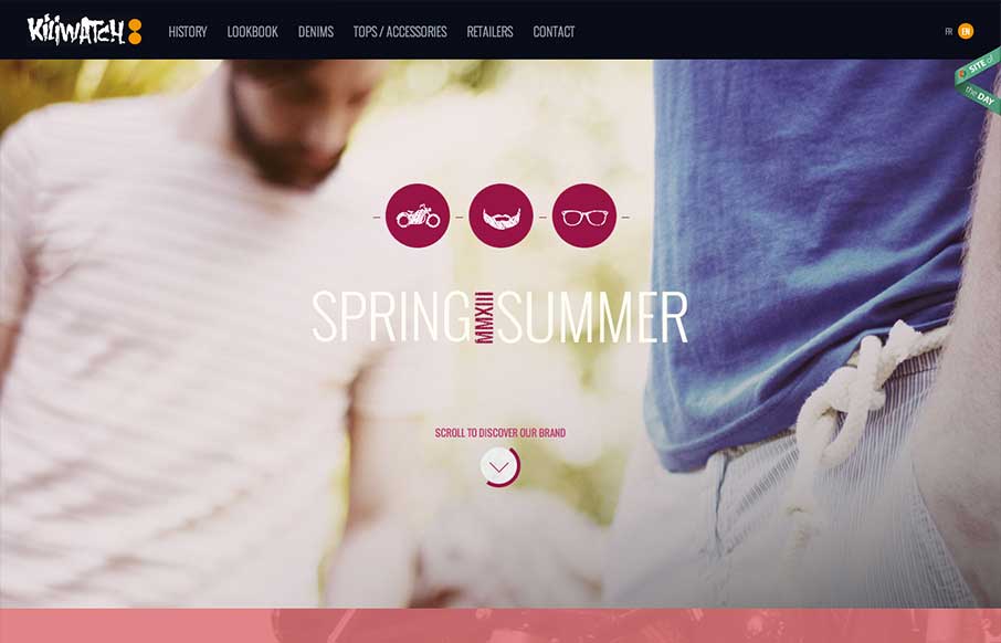
Kiliwatch
Yet another beautiful product site, strongly driven via amazing photography. Can't say enough about how beautiful I find the mix of colors, imagery and typography. I'm a little worried about all of the loading screens we've been seeing lately, but kiliwatch is only...
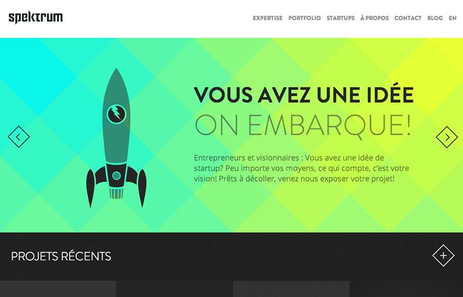
Spektrum
Spektrum is a beautiful site with tons of eye candy. The canvas animations on the homepage are stellar. They overflow with character and cleverness. I can't get enough of that kind of thing. I really enjoy the way that they've worked up the 'expertise' page as well....
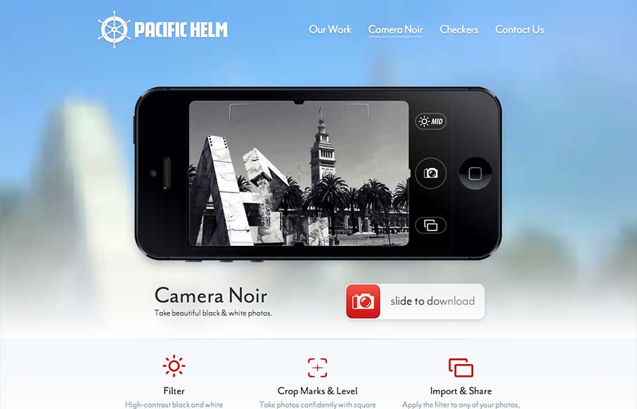
Camera Noir
Great touch here… The background and the shot in the camera are the same: pacifichelm.com/cameranoir (via @uptonic)— Jason Fried (@jasonfried) June 4, 2013 I like the idea of this page design, use elements of the photos from the iPhone display of the app in the...
mengto
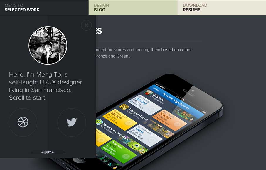
Mengto is a study is awesome transitions. The work is clearly beautiful and conceptual. I love the texture and open design. Designers often talk about creating 'delight'. The animations that slide every element into place upon page load creates that for me.
Riot Industries
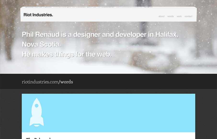
Some really nice fun subtle design stuff in the header of this site: riotindustries.com— Chris Coyier (@chriscoyier) June 4, 2013 I couldn't agree more with Chris. The header is a beautiful example of adding a dimension of animation/interactivity and not going...
I Shot Him
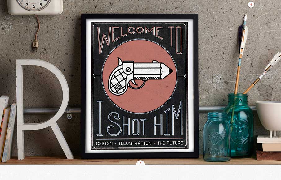
I pretty much love everything about this site. The art, the colors, the subtle type sensibilities and spacing. The site's architecture is interesting as well with beautiful landing images for every project and content area. Truly inspired stuff. Plus, the...
Magician Slider
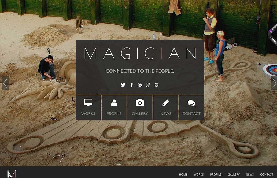
We don't post a lot of templates here. But I just dig this one enough to post for some reason. Maybe because it has a bit of everything you might need in it. Good starting point if you were to customize it. Though I didn't look too deeply at the code behind it. What...
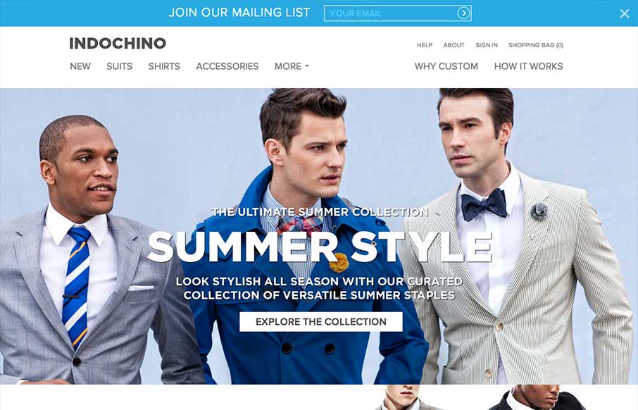
Indochino
Nice responsive site design that relies pretty heavy on large images. Somehow they're able to make the images scale down and not have all the type completely cover up the product and make it look easily done at the same time. Love that.
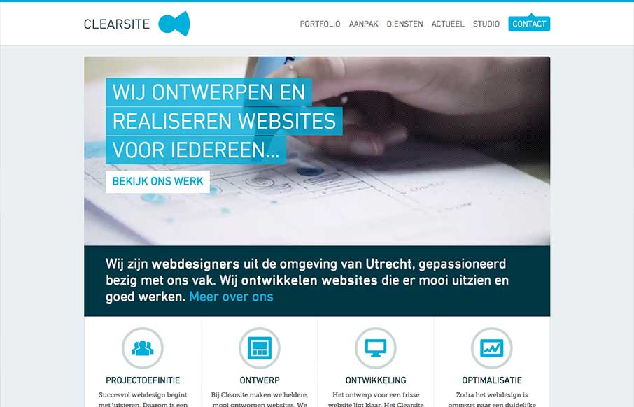
Clearsite
Nice clean design. I like the hard angles across this design mixed with the cool colors that make it up. This layout feels very high end which is clearly the character this company is trying to portray - they nailed it.
Dunked
I think what I like most about this design is that it's "flat" - just kidding. Was that funny? Seriously, what I like most is the vertical rhythm of the site as you scroll down. The way the pieces of the layout are positioned feel very nice and weighted just right....
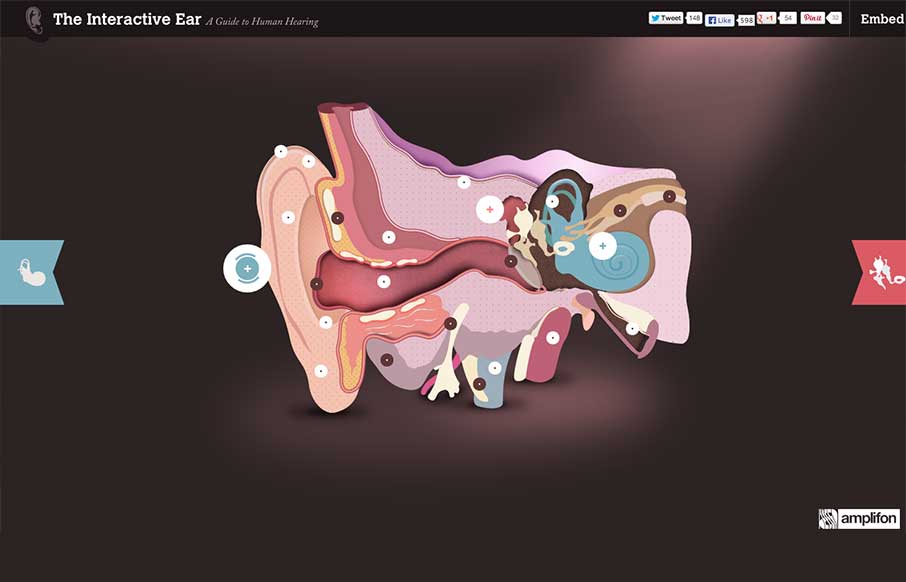
Interactive Ear
This site is wonderful. It's a perfect marriage of incredible art, information, and interaction. I often find that designers working with information make an arbitrary distinction between content and artwork. The artwork is treated as a supplement to the 'real'...
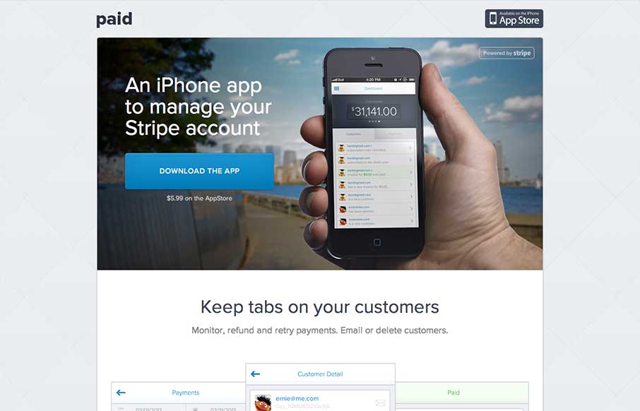
Paid
Super great simple layout that is close to that "apple" feel but kind of only uses it for the good stuff and then brings in it's own good stuff. I really love how the page just keeps it simple and shows you the screens of the app, like BLAM there you go, snag it. It...

