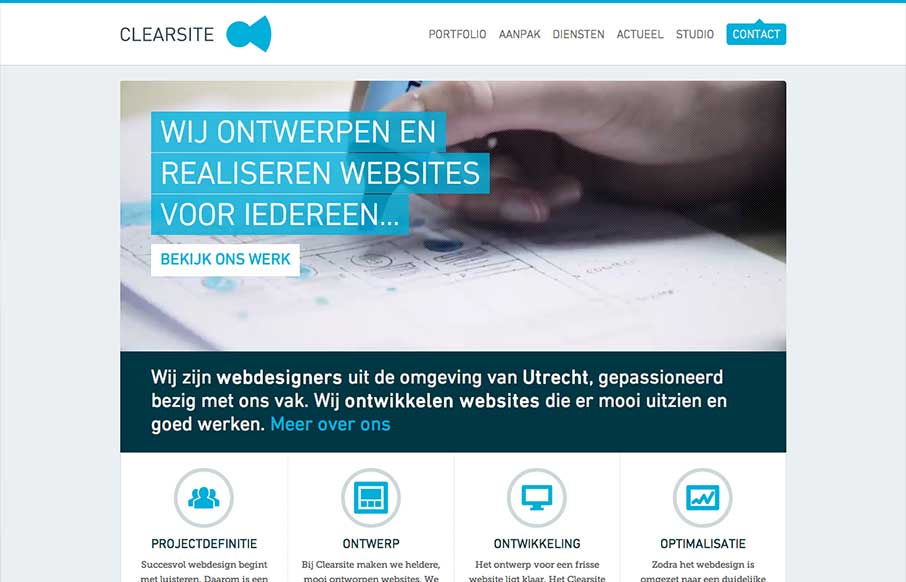
Nice clean design. I like the hard angles across this design mixed with the cool colors that make it up. This layout feels very high end which is clearly the character this company is trying to portray – they nailed it.


The Call to Action, Revisited
The Call to Action hasn’t changed in a decade, but the bar has. A fresh look at prominence, copy, mobile tap targets, and accessibility, with lessons from three major design systems.


0 Comments