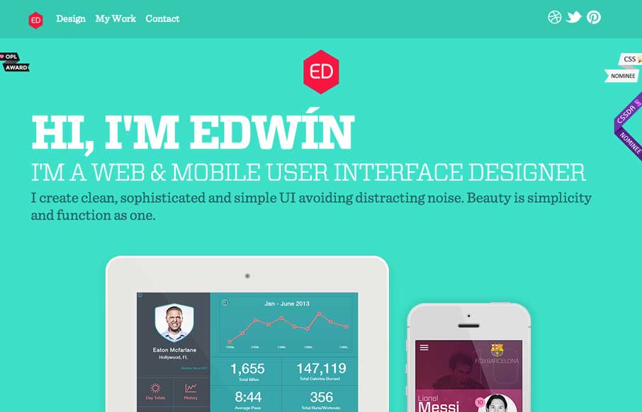
Nice clean look to this portfolio site. I like the about text on this site, typically on portfolio websites it's largely useless but on Eddie Diaz's it's actually informative. Bravo!
Alice in Videoland
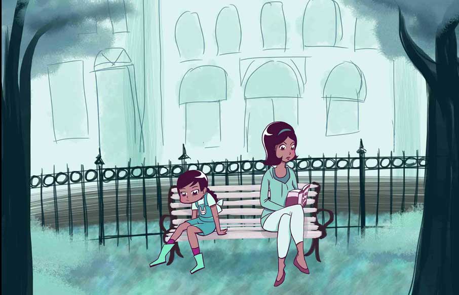
A very intriguing site by Rachel Nabors, an interactive telling of the Alice in Wonderland story. You'd better just take a look and see what you think for yourself. An interactive take on Lewis Carroll's classic tale, lovingly crafted in HTML5, CSS3, and JavaScript. I...
3 One Seven
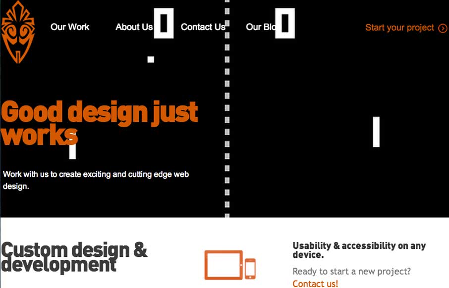
Overall the layout of 3 One Seven is intense visually. There's blocks of imagery competing for your attention - which as I review this site appears to be the point of the design. It's successful in that the images are actually compelling visually and the interactions...
Webflow
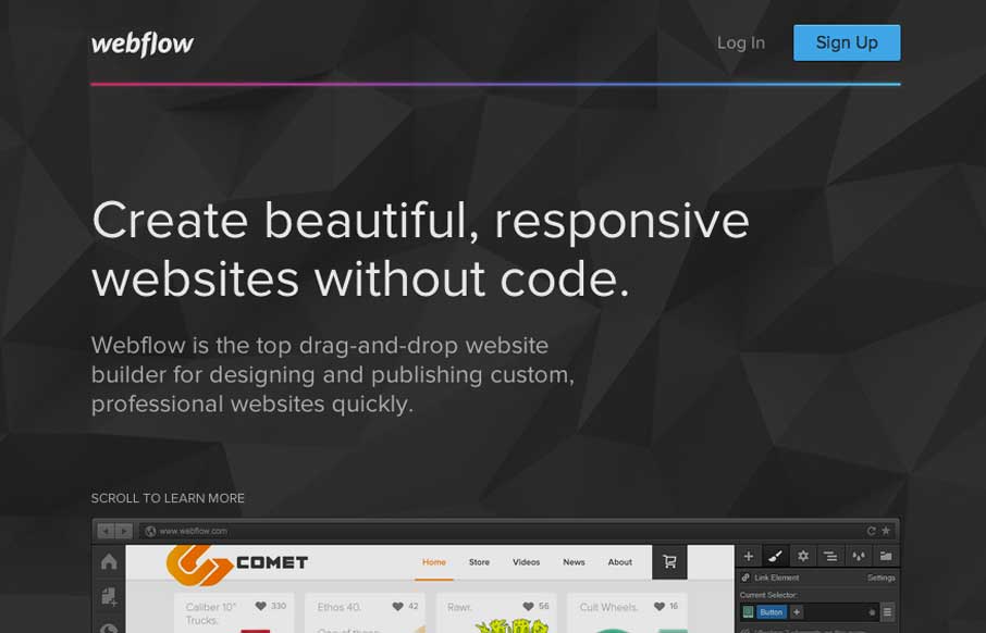
Pretty much a flat organized page here with the Webflow site. It works well in this case, considering their audience. I love how the main featured image fades out as you slide down the page. The signup form all lined up horizontally looks very quick to get through -...
Montgomery
I like the way the main featured content area on this website is utilized. There's a nice block of well written copy and their featured departments near it. I also like how "main menu" is displayed when you scale the page down to mobile widths. Very smart stuff here...
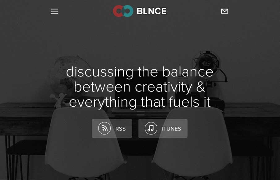
The BLNCE
Really nice simple layout for this podcast series. There's been a swath of podcasts being created the past few years and as a result we get to see lots of different looks at how people handle the site designs. This one is one of my favorite designs.
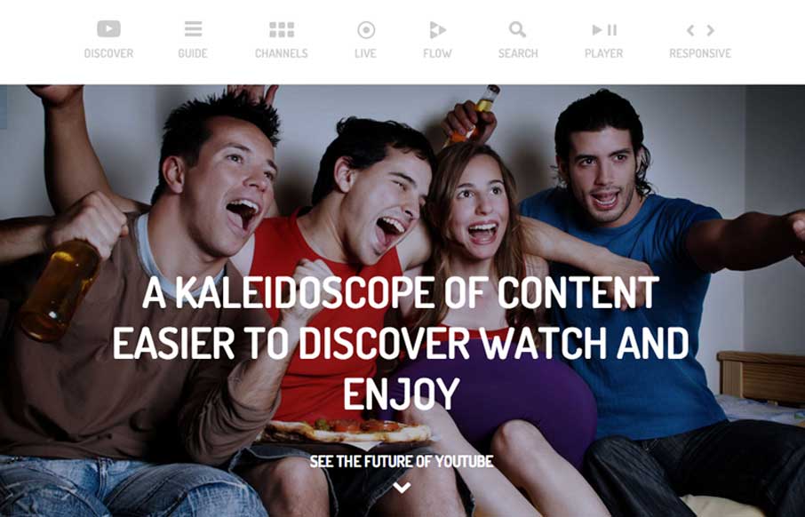
YouTube Kaleidoscope
Like with the vimeo player page this shows off a type of view of YouTube videos. The page is a great way to show off all the features and get you through them fast. It's a long single page with fixed spots you can glide to from the top nav - pretty standard stuff but...
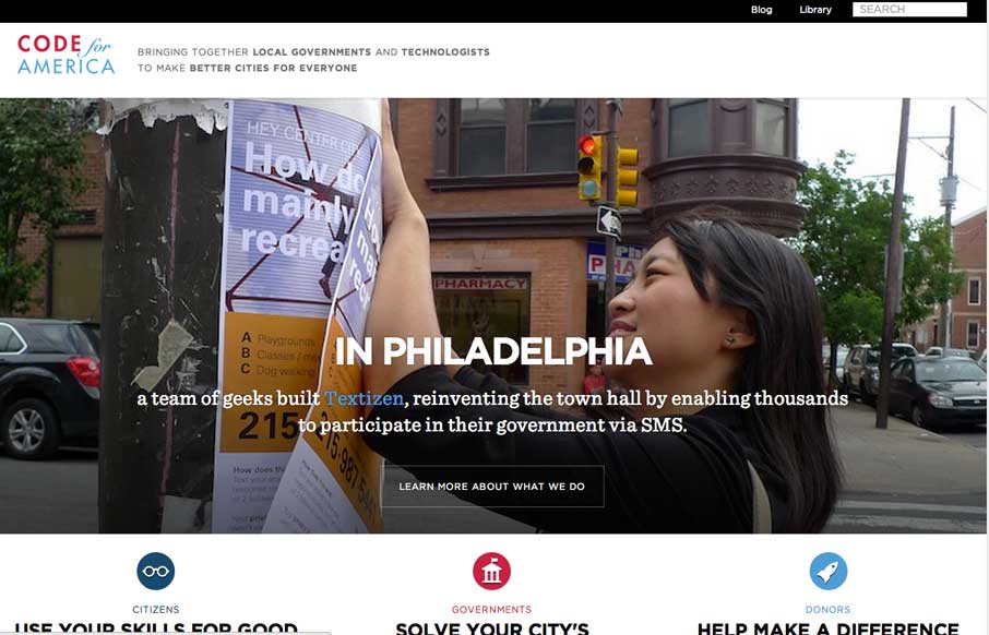
Code For America
A very nicely executed and clean responsive site design. Pretty sure the team behind this website utilized a mobile first approach, I can feel it in my bones when I scaled it down and the mobile widths are easier to use than the desktop size.
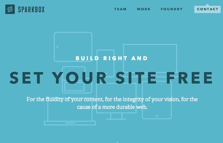
Sparkbox
The new Sparkbox website has so much of the awesome going on I can't cover it all in one sitting. It's been a long time coming but they've really delivered a great responsive website design. Spend some time really digging through this one folks, there are some great...
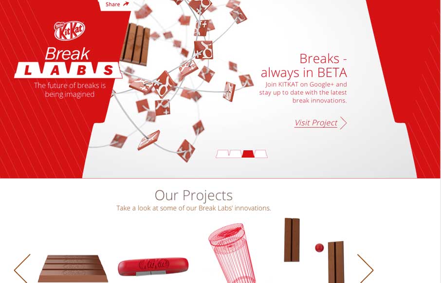
Kitkat
This site isn't "new" to everyone but it's definitely worthy of being in the gallery here. There's a lot going on with this site, like the slight movement and different projects they've launched. Likely this one is the one most people in our industry have seen - it's...
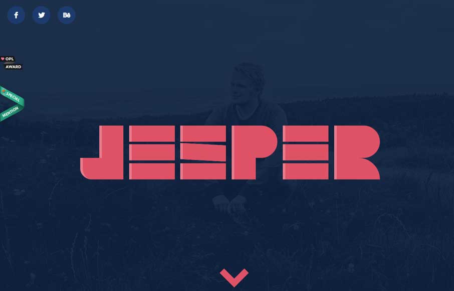
Jesper Landberg
I love this portfolio site design. It has all the stuff you expect from a designer site and done pretty well. I like the skills graphs and the little interactions. The stark bold design esthetic is quite nice as well. Lovely.
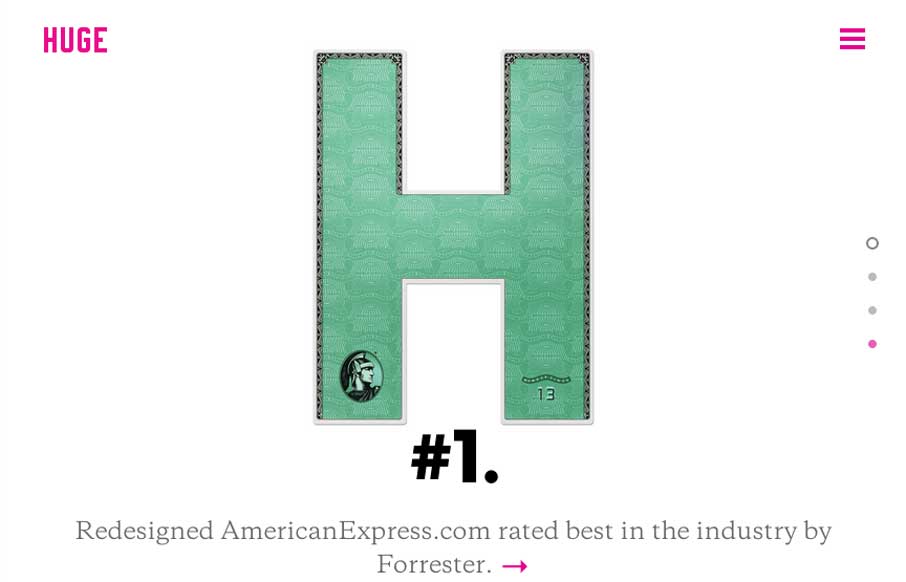
Huge
Huge has always been about the experience. Their new website is nothing short of great expectations as far as i'm concerned. Good experience, and good mental model of the website - backed up by the overlay navigation. I also kind of dig the way the main projects work...
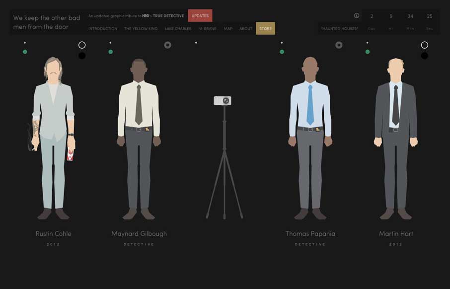
True Detective Tribute
We Keep The Other Bad Men From The Door is awesome. Damn fine art. Detailed and interesting content. It's just cool. 'Nuff said.
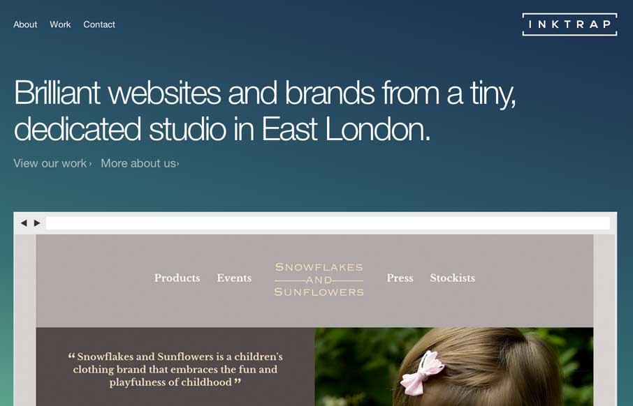
Inktrap
Inktrap is a beautiful site with great details. I'm really digging the simple structure and the near perfect balance between elements.
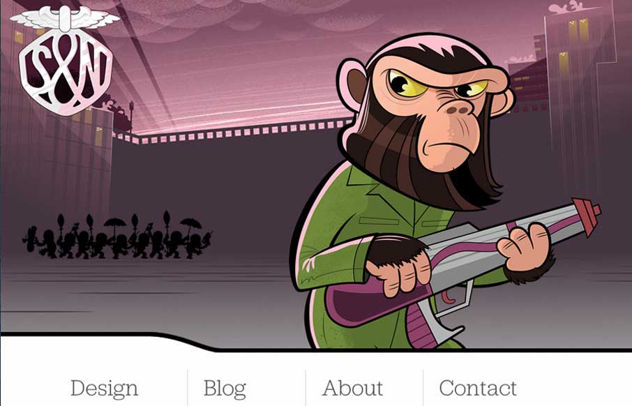
Stuff & Nonsense
It isn't that "new" of a re-launch now but the new Stuff & Nonsense website is as always wonderful. I love the responsive header illustrations. Both informing and entertaining - which is how Mr. Clarke always is.
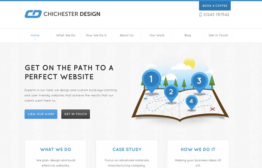
Chichester Design
The Chichester Design website is deeply invested in it's content. Every page has a custom structure and the content is coupled with a variety of illustration to convey a message clearly. The tight design and friendly aesthetic are engaging and easy to read. Plus,...
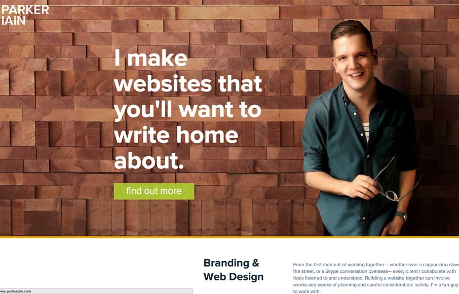
Parker Iain
Parkeriain.com is a portfolio site with a simple, but well conceived structure. I like how the footer has been strategically used to create a call to action on every page. It's a small detail, but effective when flipping through the portfolio detail pages. Solid...
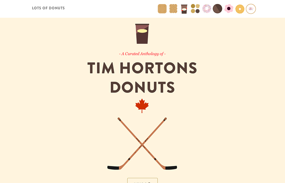
Lots of Donuts
Lots of Donuts is fun as hell. It's beautiful and simple, which I love. The parallax effect has gotten a lot of play in the last few years, but it's cool and fits the tone of the site. The art is great, too. Now, I just want donuts...
Kin HR
Beautifully designed product site here for Kin HR. I like the bold nature of the layout with all the screen/interaction displays down the page. I also dig how the nav slides up with you and fixes into place. That little bit of movement makes it really obvious to the...
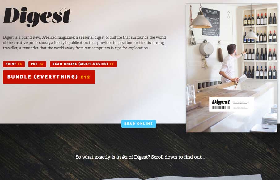
Digest
The Digest is a beautifully editorial site that displays a tight print design sensibility. It's a site that takes the idea of a magazine and translates the best of that medium to the web. The pages are fairly heavy at 4-5 MB, but the lush photography is largely worth...
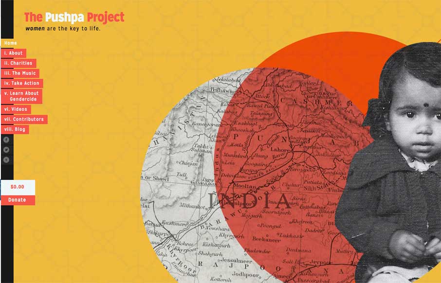
The Pushpa Project
The Pushpa Project is a narrative site that seems to draw strongly from print design. The minimal color does a great job of focusing the reader's attention on the text. I really enjoy the site's primary navigation, which does a great job of reenforcing the content's...
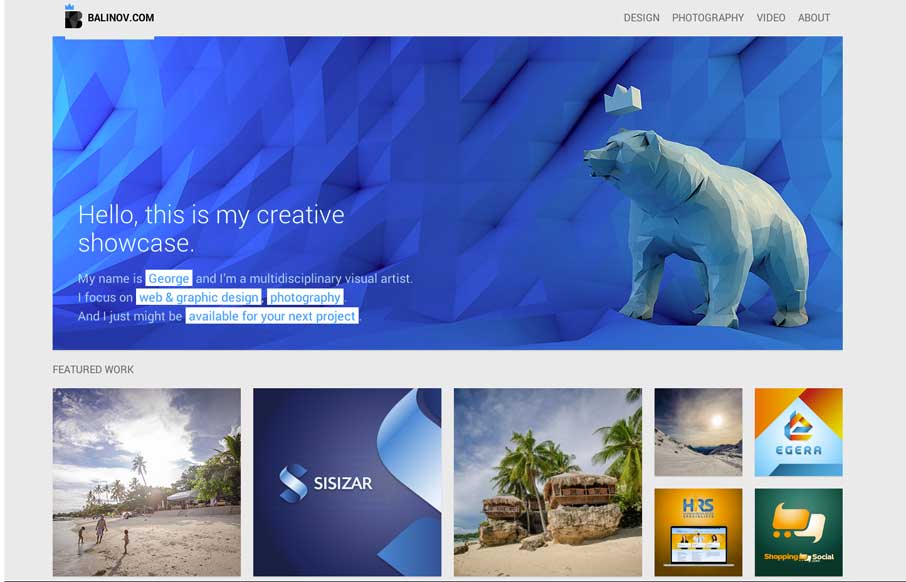
Balinov
Clever looking design. I like the Isotope interface piece and how it's used, in that the design isn't just based on using it. Beautiful work too.
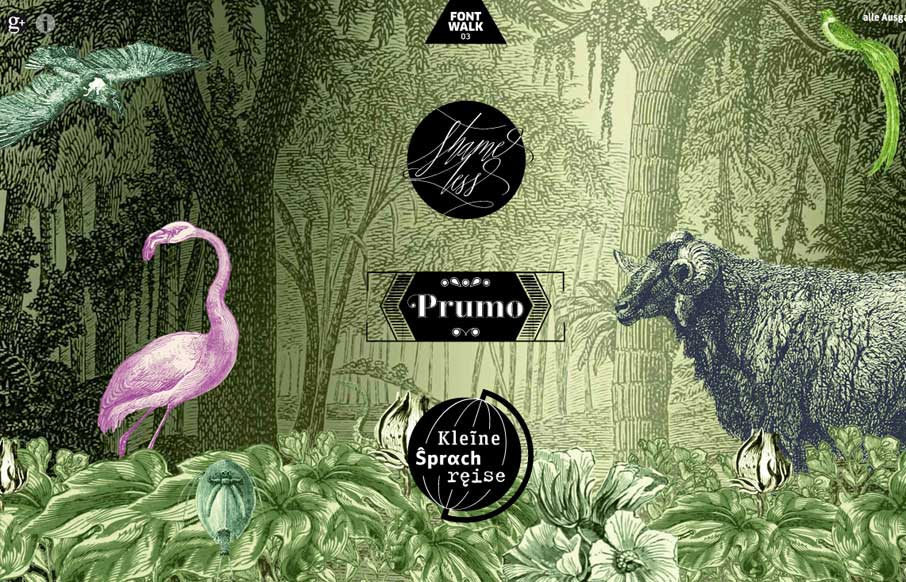
fontwalk.de
Really cool way to show off the fonts. It is almost indeed like taking a walk or a tour. Lovely.
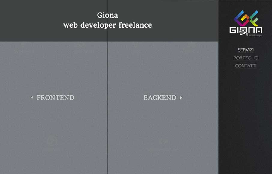
Gionaf
Really nifty interaction design. I like how the interactions allow you to play, the left and right sides of what this person can do are represented pretty well with this design too. It's also responsive which looks like it was a lot of work.
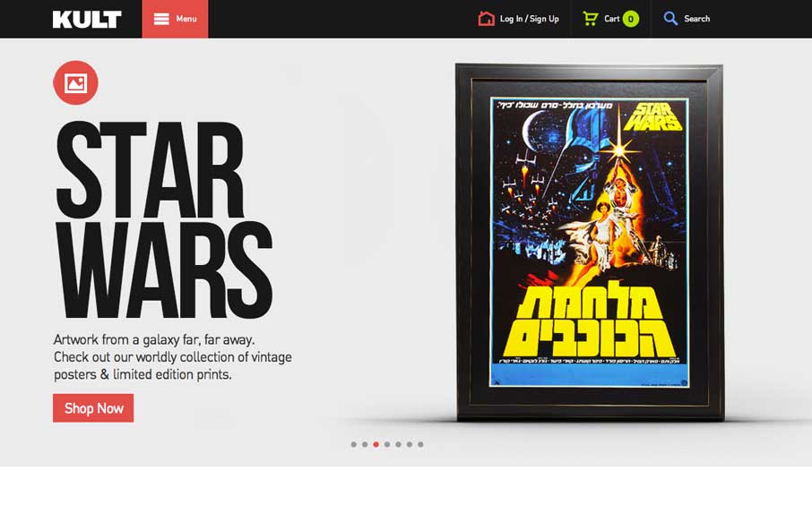
Kult
Good simple layout, just kind of a blocky and bold presentation of stuff. What's interesting to me is how when you interact with the menu it grays out the content, keeping you focused on the menu navigation itself. What do you guys think of that?
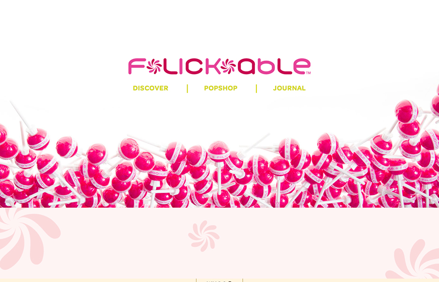
Flickable
You don't see too many "fashion" sites that are decently done. If you have, please send 'em in to us. This one is of course over the top with all the "pop" stuff but it is well done. It's responsive, and has some nifty interactions when you scroll to make it...
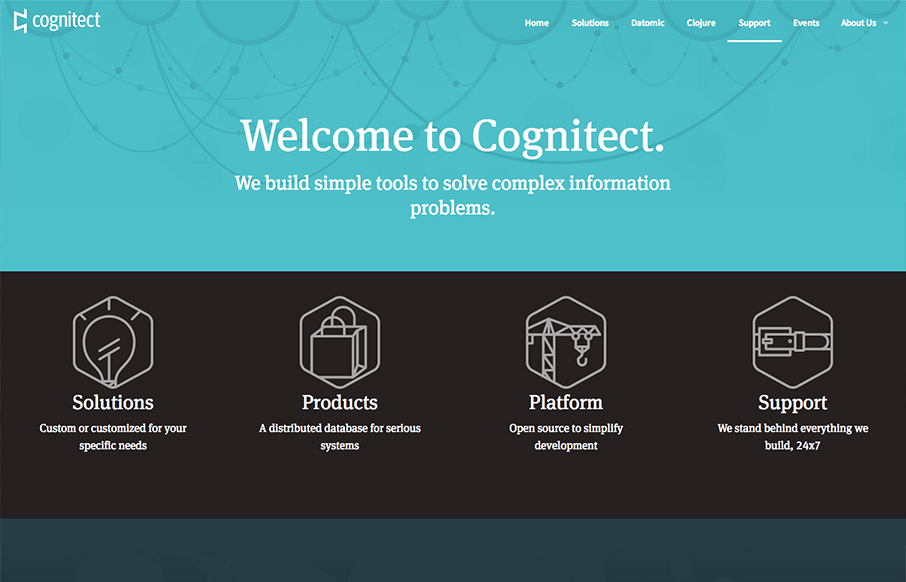
Cognitect
Pretty slick looking design. I love the colors and illustration work a lot. I also really dig the interactions/animations on the main marquee blocks - those are just great. Overall a really great and simple experience picked up by some clever illustration and...
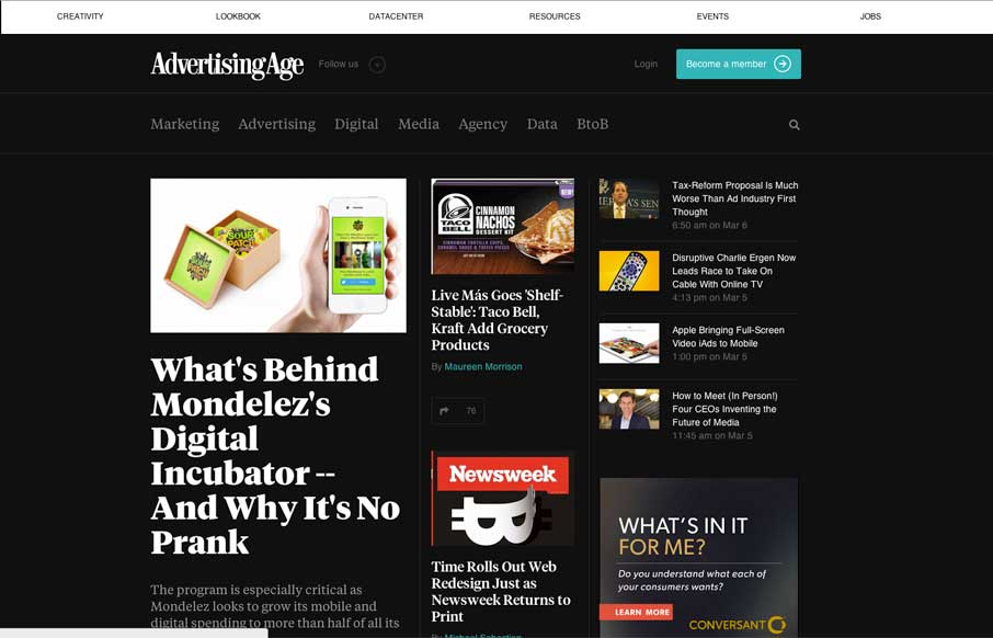
Ad Age
I dig the new Ad Age website. I like the top section that has the black background and how it uses that section for featured content. As you make your way down the page there's some nice "sectioning" of specific styles of content. I love how the header section changes...
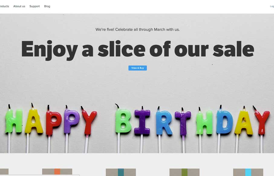
Five Simple Steps
The Five Simple Steps isn't one of those sites that has tons of interactions and moving elements. But the design is simple and effective. I really like how the main hero image/area isn't just a big JPG, that'd be lazy, they add the extra effort and make the text...
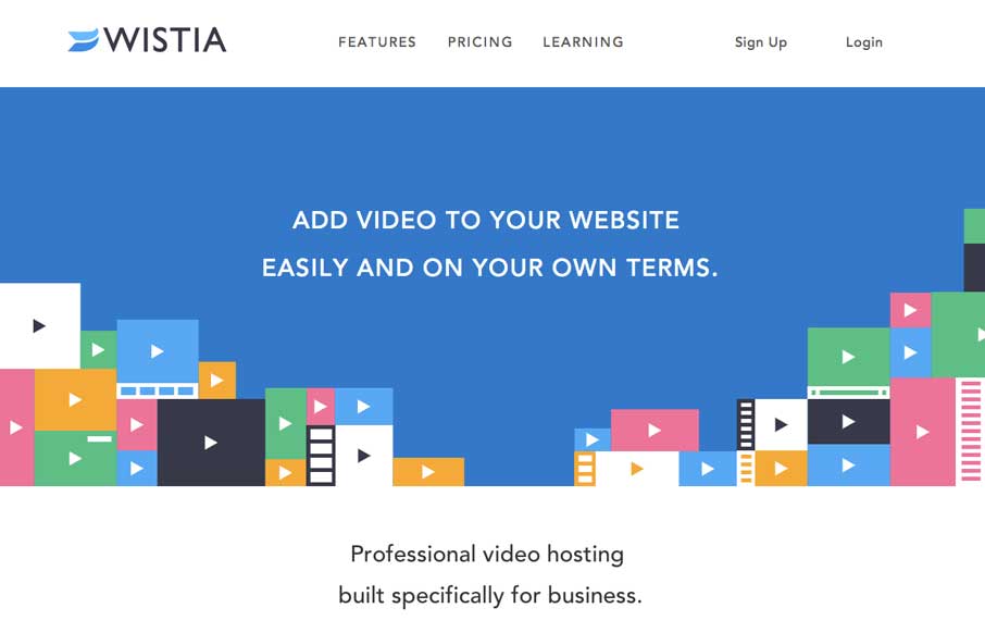
Wistia
This is a great example of how you can use a simple game like experience to create something memorable. Go ahead, click the colored boxes, they "pop" like one of those addicting games on your phone. The overall website experience is superb for a product/company site...

