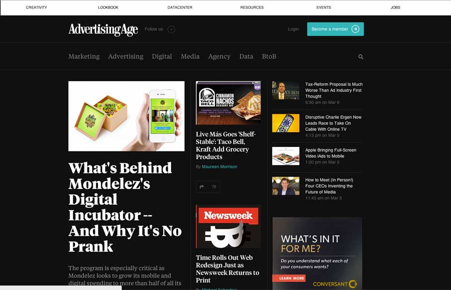
I dig the new Ad Age website. I like the top section that has the black background and how it uses that section for featured content. As you make your way down the page there’s some nice “sectioning” of specific styles of content. I love how the header section changes over from what’s there on initial page load to what you get as you scroll. The logo positioning changes to create more space – even switching to the “AdAge” moniker instead of “AdvertisingAge”. Brilliant.
Glassmorphism: The Transparent Design Trend That Refuses to Fade
Glassmorphism brings transparency, depth, and light back into modern UI. Learn how this “frosted glass” design trend enhances hierarchy, focus, and atmosphere, plus how to implement it in CSS responsibly.


0 Comments