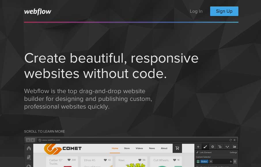
Pretty much a flat organized page here with the Webflow site. It works well in this case, considering their audience. I love how the main featured image fades out as you slide down the page. The signup form all lined up horizontally looks very quick to get through – one of my favorite ways to design a signup form 🙂


The Call to Action, Revisited
The Call to Action hasn’t changed in a decade, but the bar has. A fresh look at prominence, copy, mobile tap targets, and accessibility, with lessons from three major design systems.


0 Comments