I love the speed of the Oyyo website out of Stockholm. The transitions are quick, and the site is neat and simple.
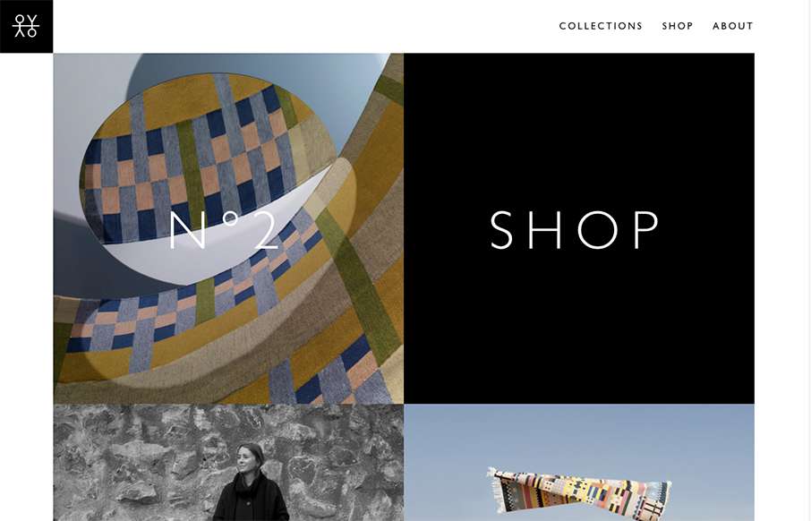
I love the speed of the Oyyo website out of Stockholm. The transitions are quick, and the site is neat and simple.
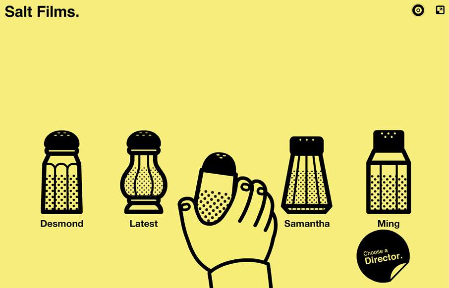
Very unique way to interact with the website, i'm 50/50 on liking it or what. I do think it's very memorable and probably converts clients very well.
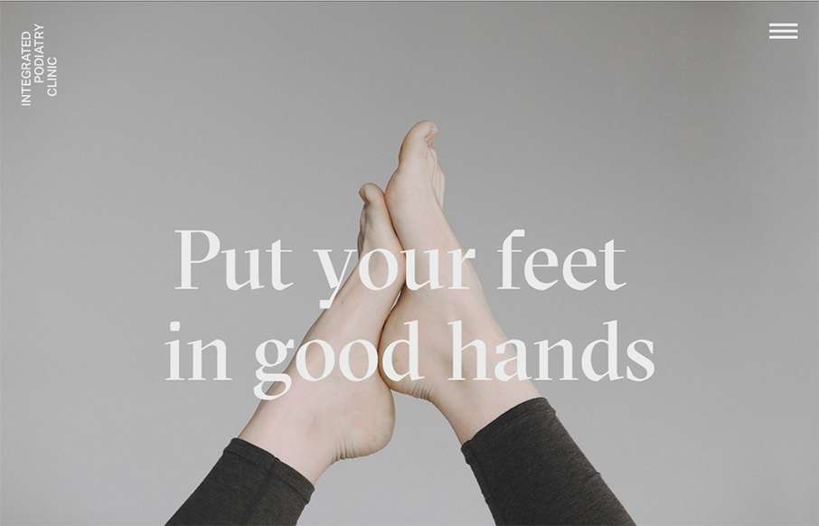
Super rad website for a Podiatry clinic. You just don't see this type of design being brought to client's like these. Superb work on making something mundane feel really hip and new.
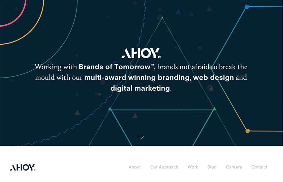
I love the dark field with the geometric shapes art. Pretty snazzy stuff. I really dig the way the content is blocked out on the home page too. I've never seen something like they're doing with the "call our account director" content block before either, that seems...
If you like lavish visuals and solid yet simple typography then the DK site is for you. It's chock full of custom videography and really is a clinic for us all to see how to use it within a web page. Solid work and really solid website for this digital firm. (This is...
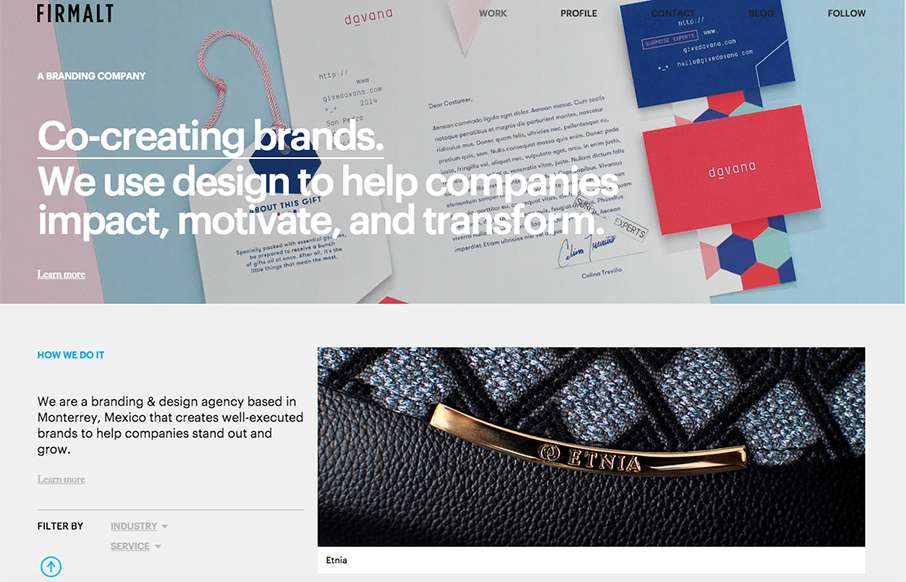
Nice grid based layout for Firmalt. I like the Masonry like treatment of the main image blocks as you scroll down the page and shift screen sizes. Nice solid simple layout always wins!
Holy hell I love this site design. The way the main hero area/image merges into the main site is brilliantly done. Then the rest of the layout is invigorating. Do me a favor, just spend some time on this site and tell me what you think!
Holy cow I love this. I love the interactions and the pieces that move around as you scroll. It feels quick to respond and looks pretty dang unique too. Definitely a memorable site design. Also, I want to go. 🙂
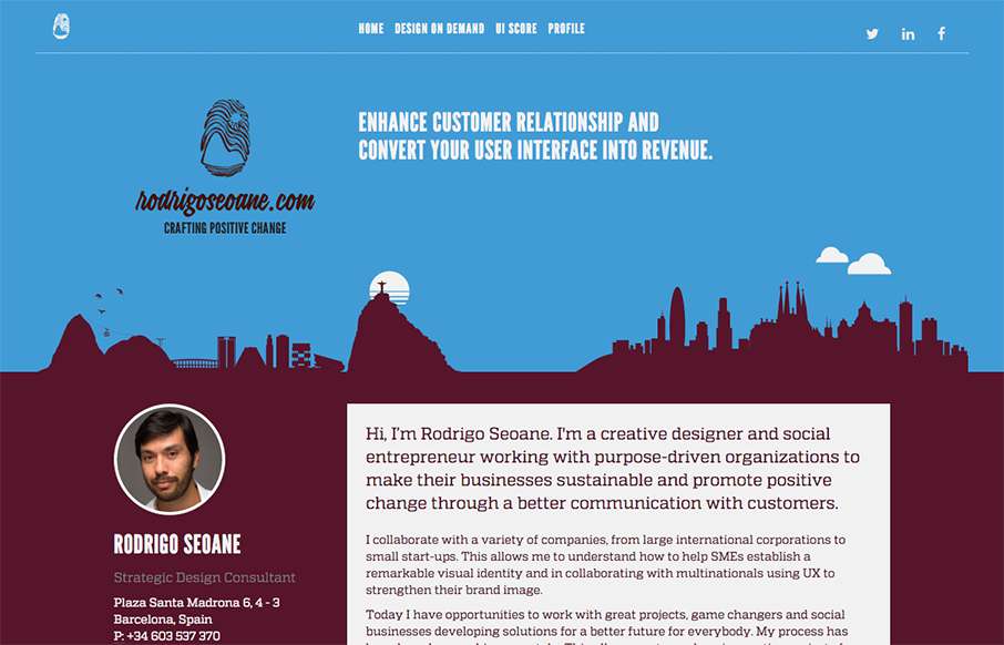
At first this site design looks fairly classic in its layout. I dig the smaller changes to it in that respect. Some good looking graphic devices to help communicate what he does is smart. I also dig the colors. From the Designer: Hi, I’m Rodrigo Seoane. I'm a creative...
Some great photography set fixed in the background like this can go a long way for engagement. I also dig the first run animated fade in images down the page. Pretty strong layout. From the Designer: This beautiful site came to be after months of trial and error. We...
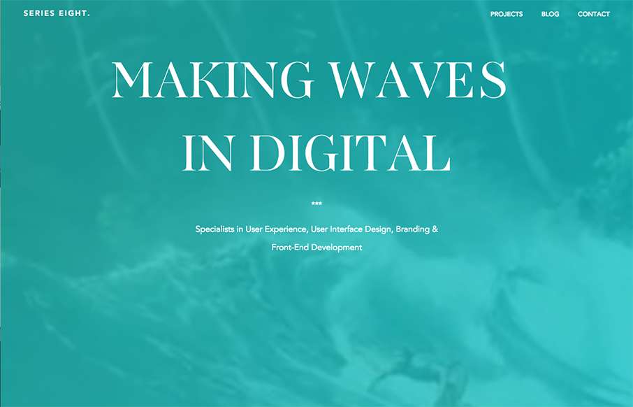
Really nice type based design to get you excited. I love the simplicity and the centered text layout too. Beautiful typography FTW!
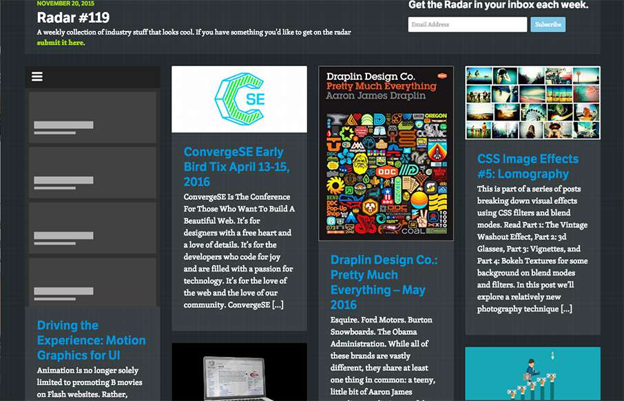
In this week's 119th Radar: Driving the Experience: Motion Graphics for UI Animation is no longer solely limited to promoting B movies on Flash websites. Rather, animation is quickly assuming a useful and important role in user experiences. Now, users can rely on...
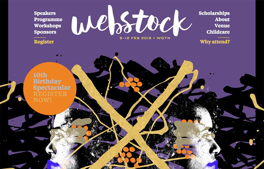
Pretty rad layout for Webstock 16. I really love the main image area and how it moves with my mouse movements. It really gives it some visual depth and fun. I also like the typography of the speakers list on the home page. Dig this, and dig the event! Super stoked...
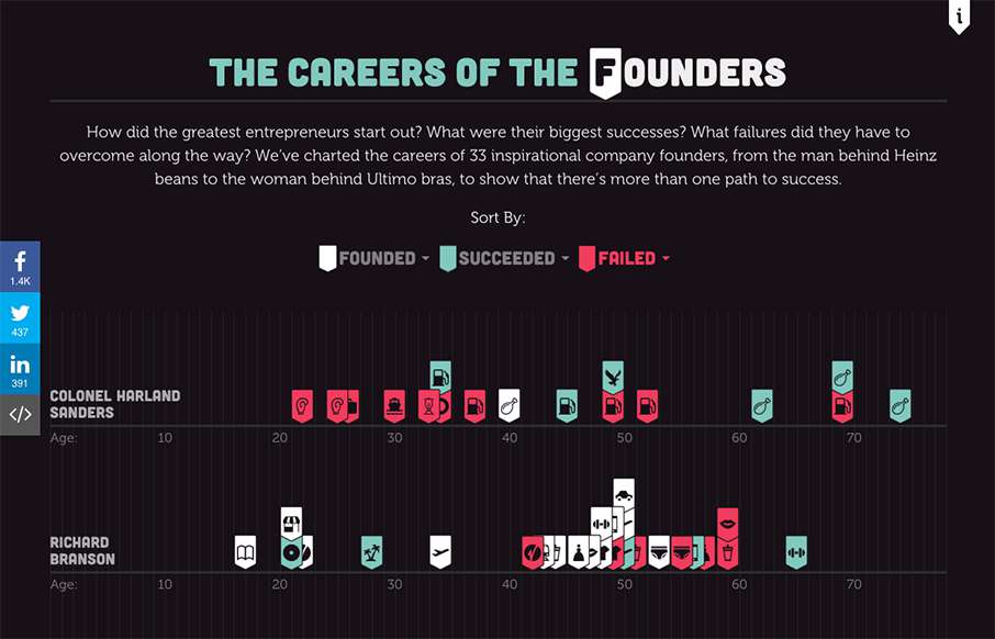
Design-wise - it's cool - but as a success and leadership buff - freakin love this infographic of "The Careers of the Founders", done by Fleximize out of London. Looks really good in mobile btw. Love to see the utter failures that eventually lead to success - that's...
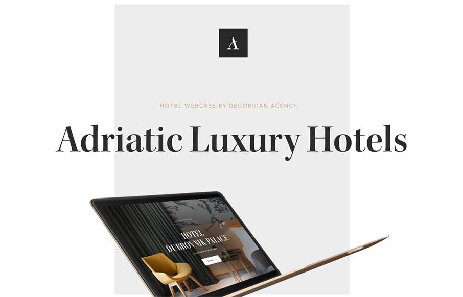
Great 1-pager case study by Degordian out of Croatia for a site they did for a group of hotels in Dubrovnik. Love the movement as you scroll down, how the transitions vary. The view on mobile (check your phone - device detection) is really good too. Good stuff.
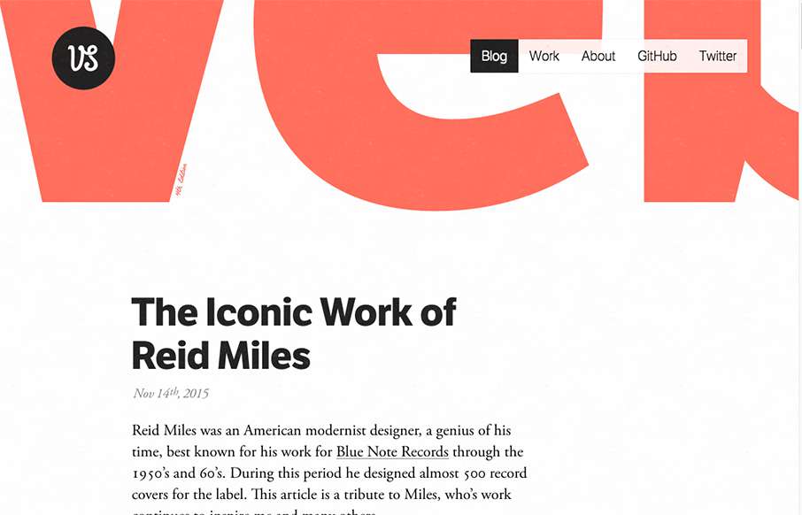
Many designers skip straight to their Work on their portfolios, and the art of the Blog is been pushed to the background. So I like how Viljami Salminen's portfolio site does the opposite. Sometimes - if you have good posts - this can be a more effective self-branding...
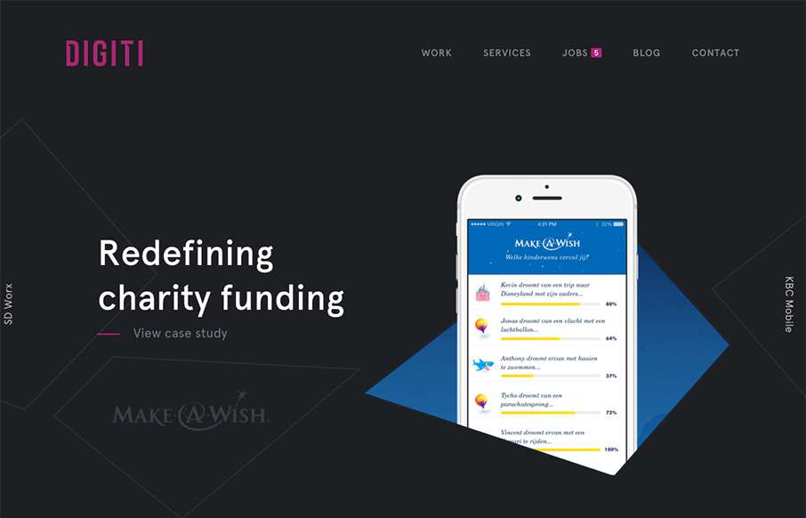
Slider / carousels are dead right? Not if they are done well, with a dash of novelty - like in this agency site by Digiti out of Belgium and New York. (as an aside, I've noticed a lot of good development work on websites out of Belgium this year) I admit, I get a...
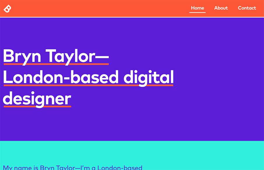
Great, bright, wonderful contrast on this portfolio site by Bryn Taylor. Think the Work pieces flow great. Simple and clean - great way to present your work! From the Designer: The brand new portfolio of London-based digital designer, Bryn Taylor. A vibrant and...
At first glance I felt like this site design was for an architecture or law firm or maybe some kind of financial consulting company, but it's a dentist. It's beautiful and feels very modern, like modern architecture does. I love the interactions and the asymmetrical...
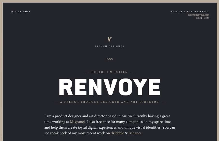
What a beautiful yet simple website to show off your work. Julien Renvoy's portfolio site hits on all the right notes to make me swoon a little bit. I love the dark colors and little animated interaction details. This is what it's supposed to be! 🙂
Beautiful design, I love the typography especially. It's a super long page but the different sections' design makes you keep scrolling, which is the brilliant part to this design. Then the detail work, like the "time to read" mouse over is so cool.
What a great vibe this site design gives off. I love the structured yet disparate looking sections. The way the logo overlaps the scrolling content is visually intriguing as well. Strong stuff.
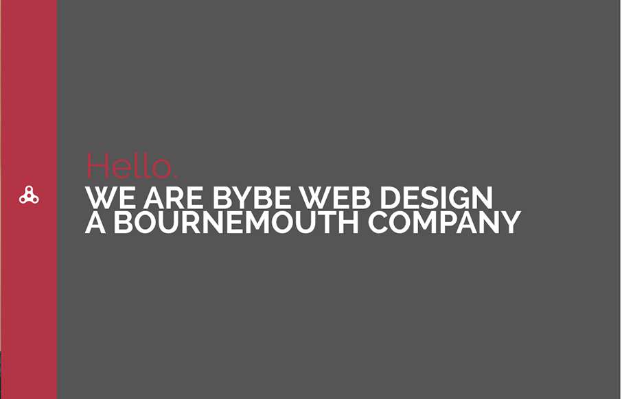
Pretty nifty fixed nav design. I dig the colors and simple approach too. Good stuff. A modern website design that was recently made for BYBE, the design incorporates a slide bar menu that provides users with a different experience, away from the typical mainstream...
Beautiful website. I luuuurve the big type based sections and the strong/bold colors. The way you scroll mostly acts like a slideshow, which works in this instance. Then the big reveal of the logo at the bottom is killer.
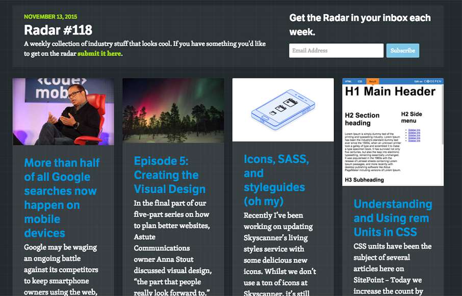
In this week's 118th Radar: More than half of all Google searches now happen on mobile devices Google may be waging an ongoing battle against its competitors to keep smartphone owners using the web, but recent evidence suggests it’s making progress. Google’s Amit...
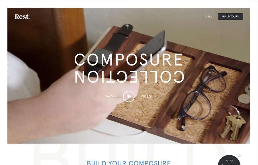
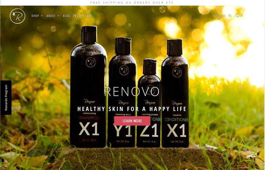
Everything has it's place. Just like with the product the website for the product has the same vibe and tone. I like the way they show off each different type of product and when you hover over them you can see people's stuff on it. The website is very clean and...
Very thoroughly done website design for this portfolio site. I love the look and feel from top to bottom. The subnav flyaway is pretty cool and I love the "card" part for the work section. Brilliant work.
I love the "vibe" of this website. The way the main section changes across screens is smart and subtle. I also love the way they used the fixed background image as you scroll to keep a nice rhythm going for you. The play between muted and strong colors goes a long way...
I love the linework and colors used in this design. There is a lot of really interesting interactive details and small animations like the process section that help make this site memorable. They also show plenty of work in the projects section and they show them in...
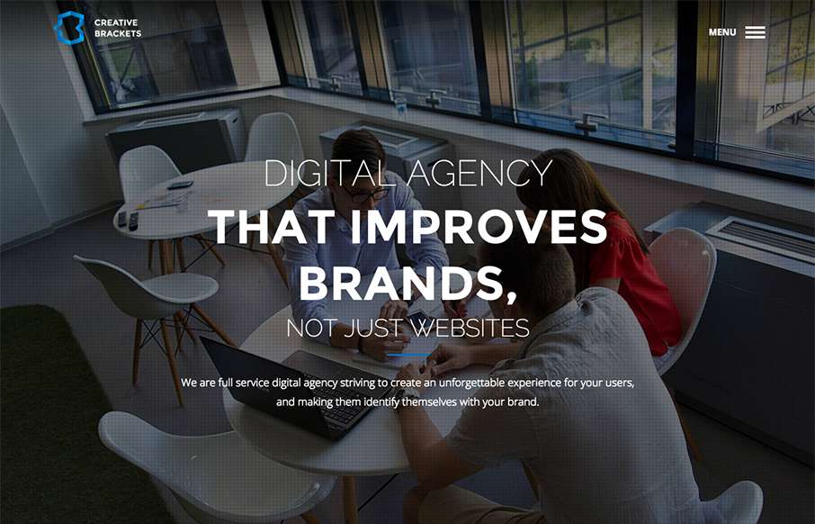
I really like this website design. It's very straightforward and we've all seen similar layouts, but they've managed to just execute it really cleanly and visually strong. I like the details and the solid approach. Things like spacing and timing are important and...
