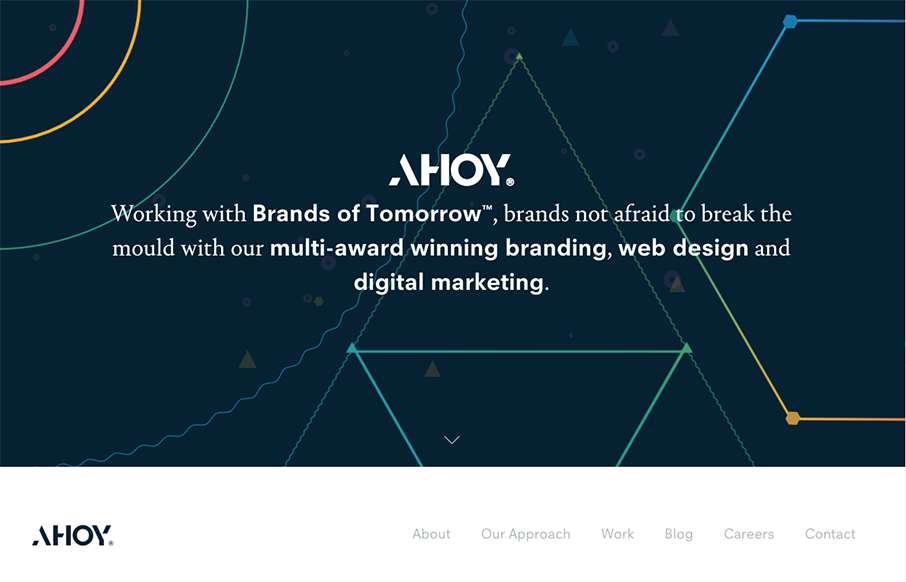
I love the dark field with the geometric shapes art. Pretty snazzy stuff. I really dig the way the content is blocked out on the home page too. I’ve never seen something like they’re doing with the “call our account director” content block before either, that seems really smart and inviting to me.
Glassmorphism: The Transparent Design Trend That Refuses to Fade
Glassmorphism brings transparency, depth, and light back into modern UI. Learn how this “frosted glass” design trend enhances hierarchy, focus, and atmosphere, plus how to implement it in CSS responsibly.


0 Comments