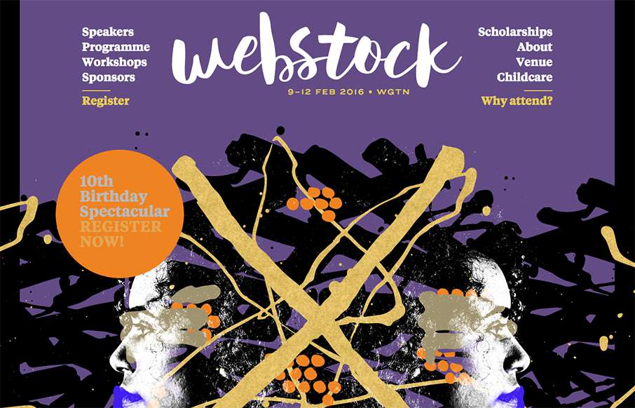
Pretty rad layout for Webstock 16. I really love the main image area and how it moves with my mouse movements. It really gives it some visual depth and fun. I also like the typography of the speakers list on the home page. Dig this, and dig the event! Super stoked that it’s on its 16th year!
Glassmorphism: The Transparent Design Trend That Refuses to Fade
Glassmorphism brings transparency, depth, and light back into modern UI. Learn how this “frosted glass” design trend enhances hierarchy, focus, and atmosphere, plus how to implement it in CSS responsibly.


0 Comments