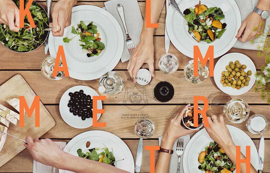
Holy hell I love this site design. The way the main hero area/image merges into the main site is brilliantly done. Then the rest of the layout is invigorating. Do me a favor, just spend some time on this site and tell me what you think!
Glassmorphism: The Transparent Design Trend That Refuses to Fade
Glassmorphism brings transparency, depth, and light back into modern UI. Learn how this “frosted glass” design trend enhances hierarchy, focus, and atmosphere, plus how to implement it in CSS responsibly.


What a fantastic vertical visual layout. Makes me want to be sitting at that table.