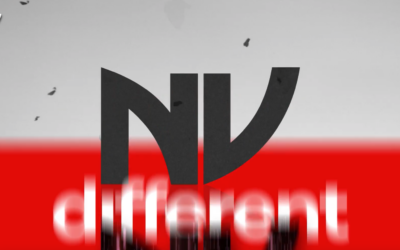
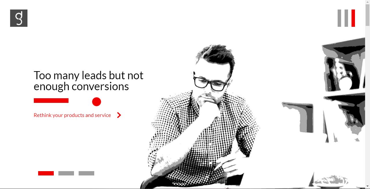
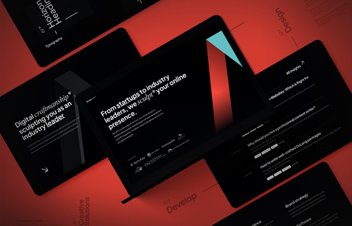
NV design experiential learning programs for business, make corporate films and supply professonal actors for role-play training . They wanted a personality-driven website that showed them off as more of a free-thinking agency than yet another training company
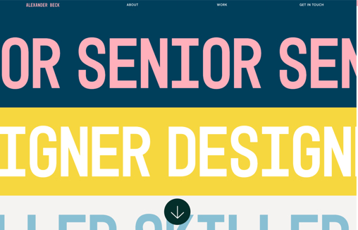
Portfolio of Alexander Beck – Digital Designer and Art Director
Hands down 1# most challenging project for most designers: creating a portfolio website. Whenever I worked on 'portfolio-stuff' in the past, I found myself in a deep state of anxiety, insecure about my design choices and struggling with impostor-syndrome. This time...
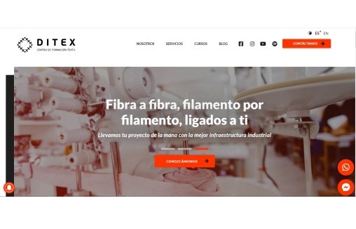
Centro de formación textil DITEX
We designed this page to attract entrepreneurs in the textile industry for the company Ditex, through the exhibition of the capabilities and resources of the company. Thus, our work shows and efficiently reports the capacity of the services offered by Ditex, which can...
Paloma
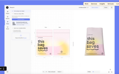
Paloma is made up of three separate business units working in harmony as a product and venture creating machine Paloma Digital is our full-service digital product studio, designed to take the pain out of building and launching new digital products.
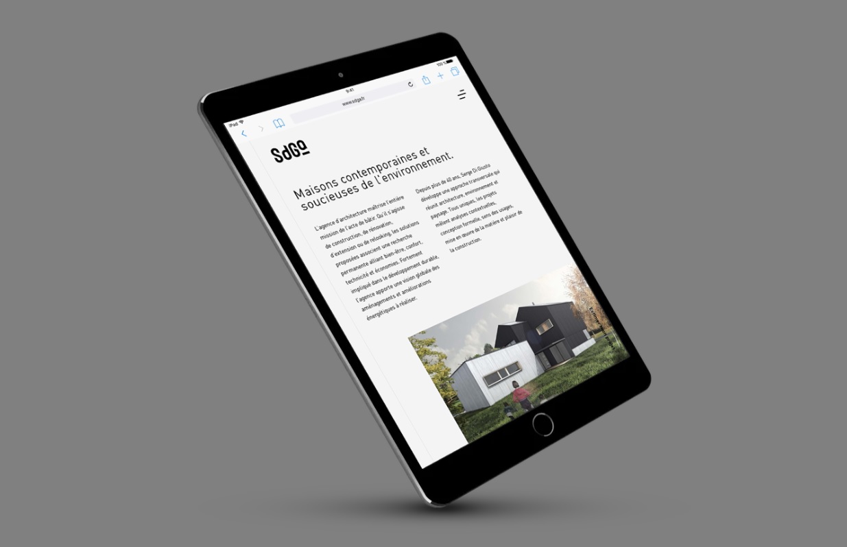
Serge Di Giusto Architecture
Pretty neat scrolling animation on the body copy as you move the site down the window fast. Some crazy interaction going on with the mouse/hover over the "hamburger" menu.
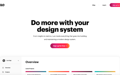
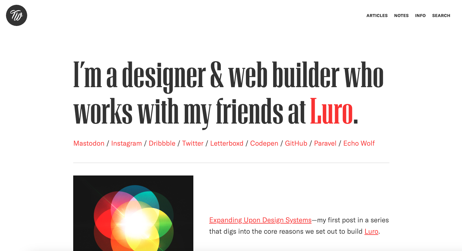
Luro
Do more with your design system
From insights to metrics, Luro tracks everything that goes into building and maintaining a modern design system.
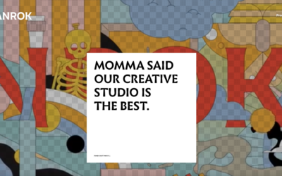
SANROK Studio
It's my small Indonesian studio's portfolio website. I thought it could be nice to show around the varied spectrum of Indonesian design scenes through our glasses—hopefully to add some different insights from a Southern Hemisphere's point of view.
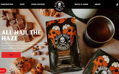
Deathwish Coffee
The ecommerce website for Deathwish coffee. Bold in visual style just like their coffee. Derp.
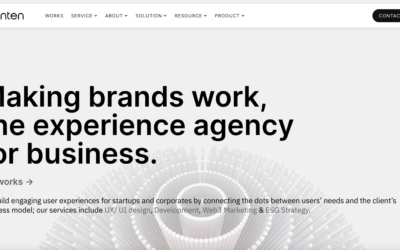
Tenten
Tenten Creative is an award-winning design & digital agency based in Taipei, Taiwan.
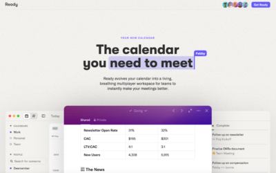
Ready
The Ready website uses a nice contrast between headline and body copy, like in the Luro design. Then balances screenshots of the app and other details quite well.
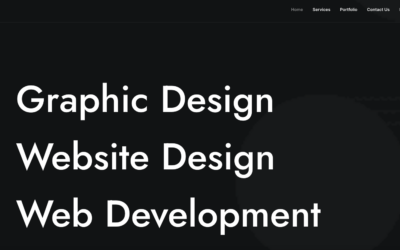
Cre8ivemind
We, at Cre8ivemind, have been assisting clients to achieve their dreams by providing high-quality Web & Graphic Designing solutions which are tailor made to suit their products and services.
Venture Labs
The Venture Labs website uses both visual rhythm via the font sizes and weights, but also extra-emphasizes it with scrolling based image loading and lazy animation to great effect.
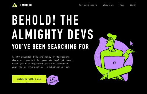
Lemon.io
Lemon.io is a marketplace of vetted freelance developers created with early-stage startups in mind. Perfect for all the founders who need an extra pair of hands yesterday.
Gaatha Design Studio
GaathaDesign Studio, a design-led innovation organization, creates solutions with a focus on people and the future. They build brands, products, and spaces, delivering ideas that drive rapid growth. They collaborate with IBM India and government projects in India. KalpCorporate and GaathaDesign Studio are sister companies, one dedicated to design and the other to development.
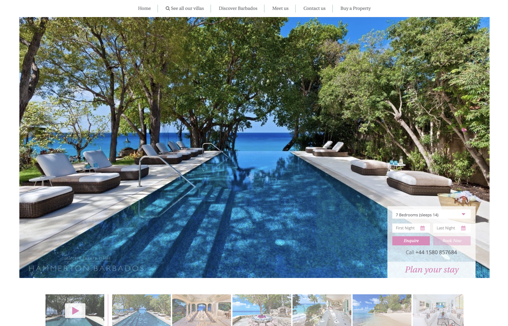
Hammerton Barbados – Luxury Villas
Modern clean website designed for use by a range of it competencies. Property listings put photographs and information front and centre with easy discoverability and use of CDNs for performance and a great UX for users on mobile devices.
Trent Walton
Love the simple and minimal approach to Trent’s personal website and blog. Minimalism is very difficult to pull off well and this website gets it.
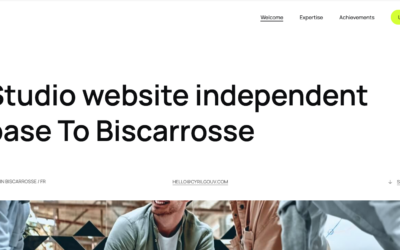
Cyril Gouv
https://youtu.be/N07dSzhxwKo A portfolio and professional design website for Cyril Gouv.
Atelier Disko
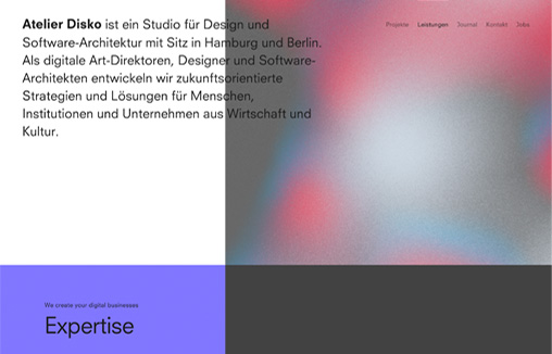
Website relaunch for Hamburg and Berlin based digital branding agency »Atelier Disko«.
Creative Navy
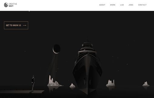
The Creative Navy website uses a mix of typography and imagery to convey the maturity of the UX design agency. The focus is on the content, with case studies featured prominently. Visitors are guided through projects to a significant level of detail, including methodology , results and snapshots from the process.
Xrilion
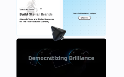
The rise of no-code software can be viewed as a natural evolution in the history of digital development. We are dedicated to helping new business and website owners get to MVP as fast as possible without a single line of code.
Parkipsum’s Generator
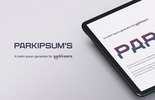
Designers, creatives and web architects; they are just some of the people who see ‘Lorem Ipsum’ daily. Yet many don’t realise it derives from the Latin ‘dolorem ipsum’, roughly translated to ‘pain itself’ . Two words that people living with Parkinsons know all too...
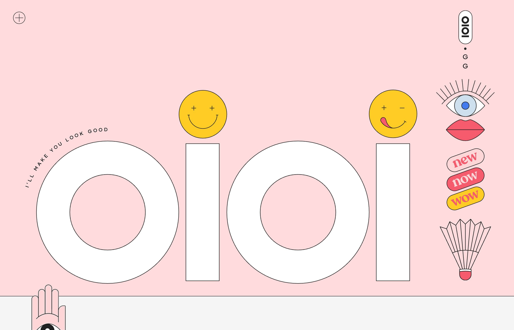
oioi.gg
Personal portfolio website featuring some of my recent work in creative consultancy, design and direction. After a decade of procrastination, turns out all I needed was a global pandemic and national lockdown to get my shit together.
Nimble
We are a team of software engineers, designers, and product managers building outstanding web and mobile applications for companies of all sizes, from 1-person startups to Fortune 500 companies.
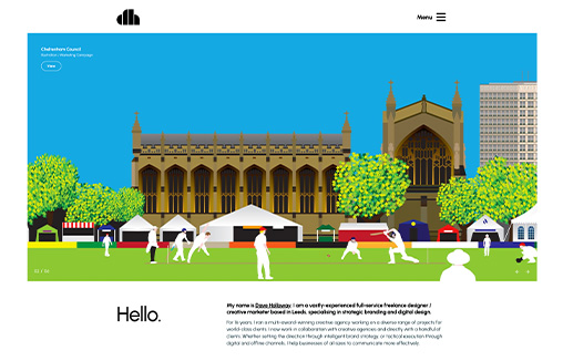
Dave Holloway
Portfolio website for Dave Holloway – a vastly-experienced full-service freelance designer and strategist based in Leeds (UK) specialising in strategic branding and digital design. Also features a cool Blog / Midjourney AI image gallery
Percept
Percept – Branding, Design & Creative Agency in Sydney. Brand Identity, Packaging Design, Visual Communication, Advertising, Digital & Website Design.
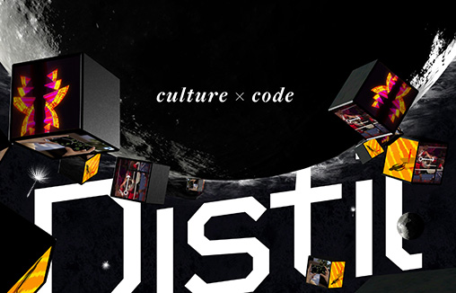
Distil Immersive
We are Distil Immersive, a multi-award winning studio forging a new approach to digital. One that brings stories and culture to the centre of a creative-technology process. Based in Sydney, Australia.
ainsley.dev
Coupling state-of-the-art technology with stunning designs, ainsley.dev creates bespoke websites & custom in-house software from startups to established brands.
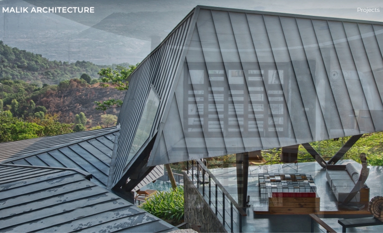
Malik Architecture
Malik Architecture is an esteemed architectural firm dedicated to creating innovative, sustainable, and visually striking designs. With a passion for pushing the boundaries of architectural creativity, Malik Architecture is committed to delivering exceptional...
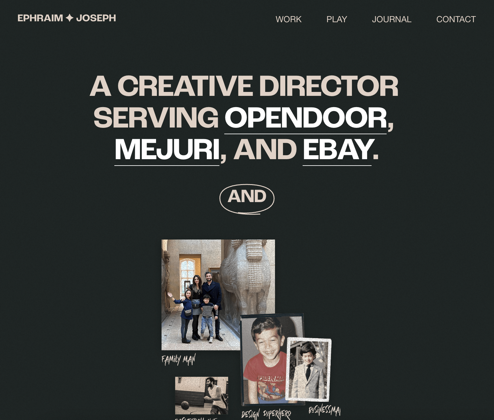
Ephraim Joseph
Modern design and easy to navigate!
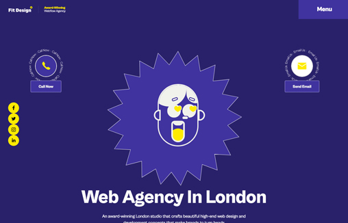
Fit Design
We are a creative web design agency in London, that specializes in bespoke and affordable website design, web development, SEO service, and eCommerce solution.

