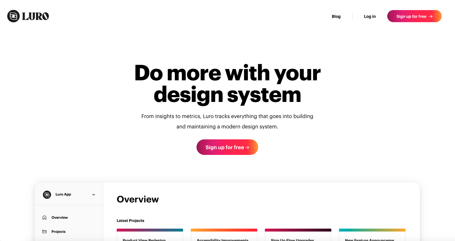
The Luro website uses great type headline to body text weight differences to make it super scan-able. Then it balances the images very well as you scroll down the page to give you a nice sense of visual blocking to take the app in and understand what it’s all about.


The Call to Action, Revisited
The Call to Action hasn’t changed in a decade, but the bar has. A fresh look at prominence, copy, mobile tap targets, and accessibility, with lessons from three major design systems.


0 Comments