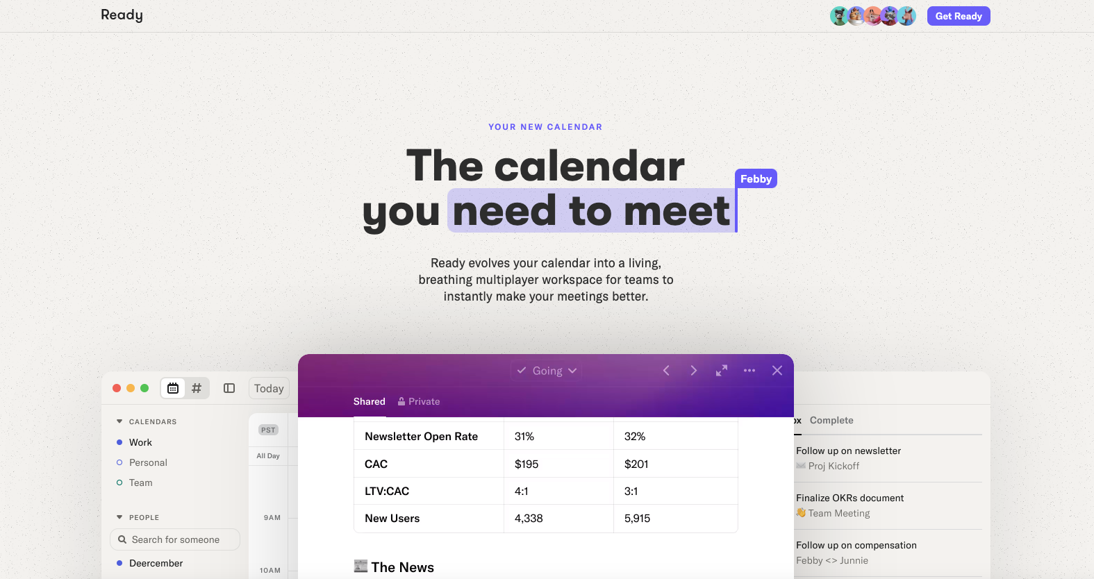
The Ready website uses a nice contrast between headline and body copy, like in the Luro design. Then balances screenshots of the app and other details quite well.


The Call to Action, Revisited
The Call to Action hasn’t changed in a decade, but the bar has. A fresh look at prominence, copy, mobile tap targets, and accessibility, with lessons from three major design systems.


0 Comments