Web Design Inspiration Curated
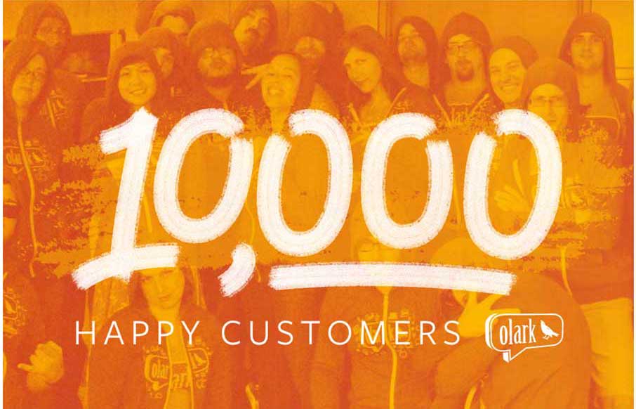
Olark at 10,000
Ah the power of compounding numbers - it's really cool to see the journey of companies, from back of a napkin, through acceleration, and into adulthood. Olark, at live chat customer service app company out of San Fransisco, uses this page to tell that story. It's a...
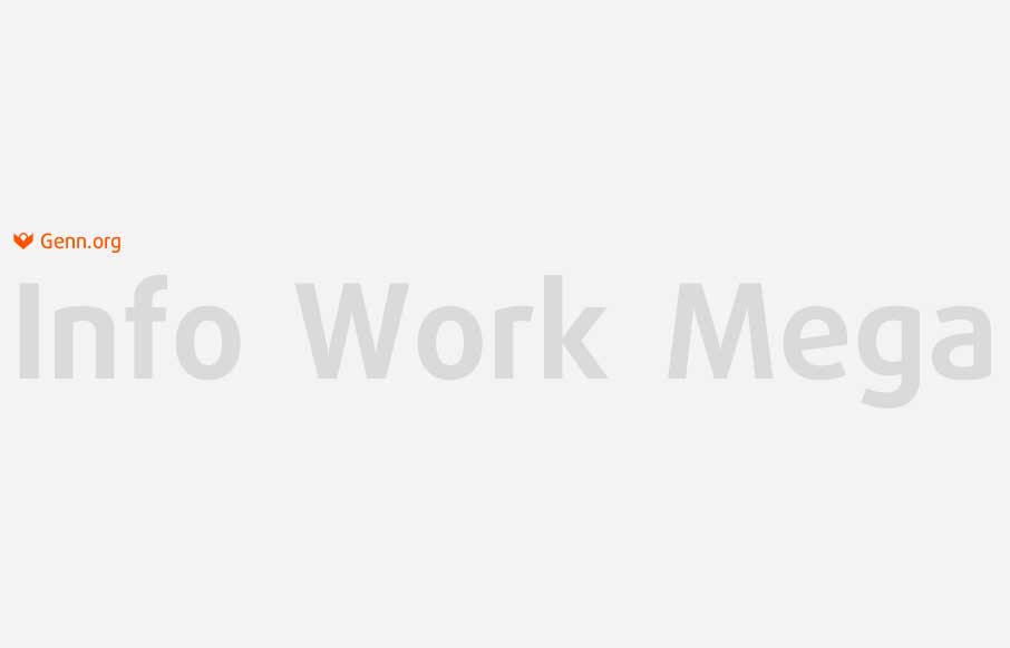
Genn
It took me a couple of times to get into this site - but revisiting it now to review it, I'm digging this portfolio site by Genn out of Kiev. The stark nakedness of the opening is very very cool, and the hover-state that leads to navigation is a nice surprise. Good...
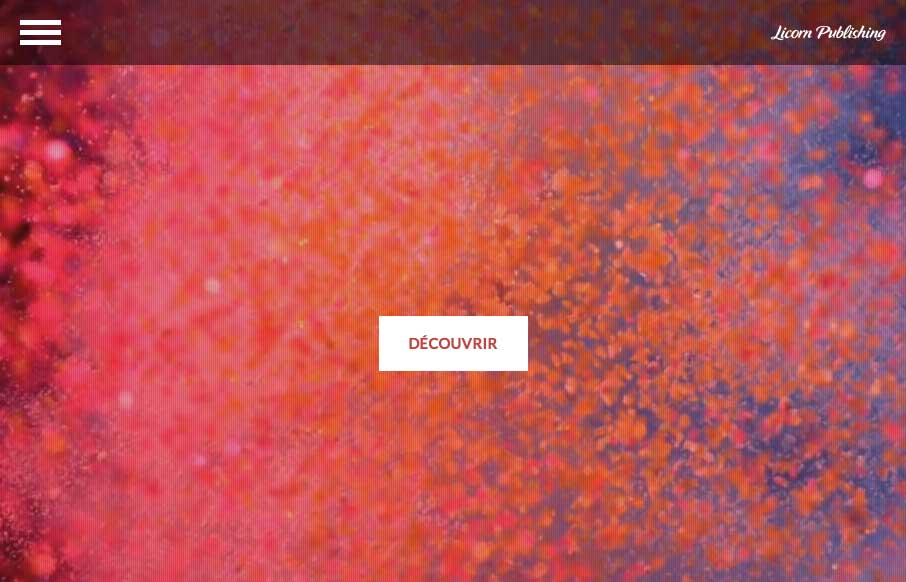
Licorn Publishing
Love this site out of Paris for Lincorn Publishing. The intro page with the video background and movement of the text is very cool. The Services (Prestations) page deserves the scroll-jacking so that you can soak in the images - then it has great transitions. From the...
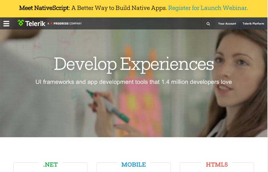
Telerik
Between Sitefinity and Kendo UI, we've been watching Telerik for a good time now. With the new release of Kendo, we figured we'd look at their site for a little review. I'm always interested in what developer intensive companies do with their websites design-wise....
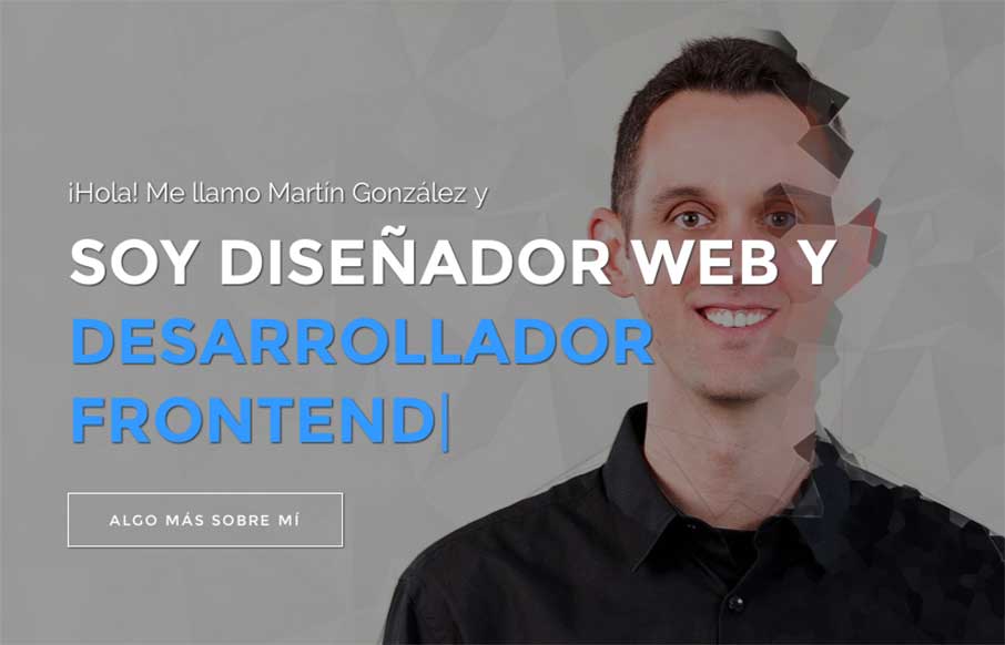
Mediamartin
Good one-pager portfolio site from Martin Gonzalez out of Barcelona. Like the play of the headline copy over the slideshow and the on-scroll fly-ins. It might scroll a little too fast, but it's well thought and laid out. Submitted by: Martin Gonzalez Twitter: @saretdm...
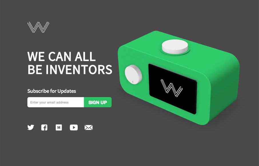
Wattage
Good site and great idea from Wattage.io out of Toronto. Like the integration of the video demos to give you a feel for how the app really works - this is a case where showing your app on your one pager is actually a good thing. Simple, clean, and useful - that makes...
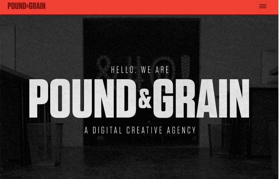
Pound & Grain
I really like the movement of the Pound & Grain site, out of Toronto. The subtle use of parallax with background shapes and colors, coupled with the images and copy make for a great experience. Also like the little vibrance of the animated gifs hero images, that...
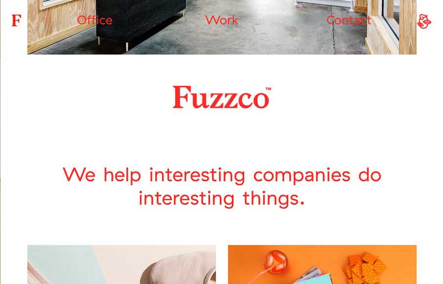
Fuzzco
If you don't like Fuzzco, then you're probably just jealous you didn't come up with that first. I've read some reviews of their new site - both good and bad - and hey, we all have opinions (insert colloquialism here). And why am I writing this like an opinion (or...
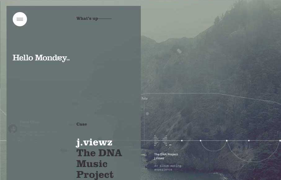
Hello Monday
Excellent way to start Monday - with the agency site from Hello Monday, out of New York and Copenhagen. They do some really cool work, and their site is definitely different than most web design firms. From the parallax slider that rotates vertically, to the smooth...
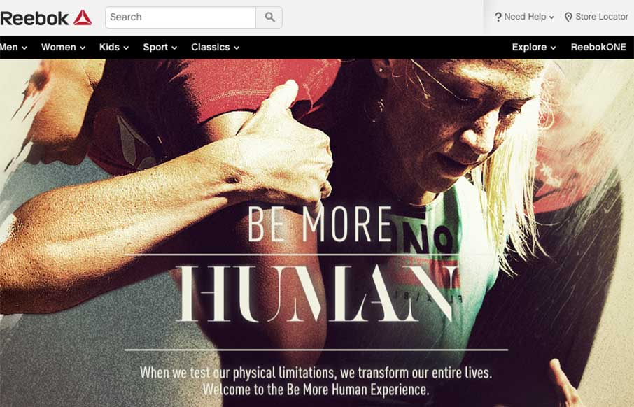
Reebok – Be More Human
Some of us here at Unmatchedstyle are fan-boys of Reebok (planning our Spartan Race Tri-fecta for this year). And when Reebok released this one page / video, it makes us glad that we have a 12k trail run tomorrow - like watching football (both kinds), and then running...
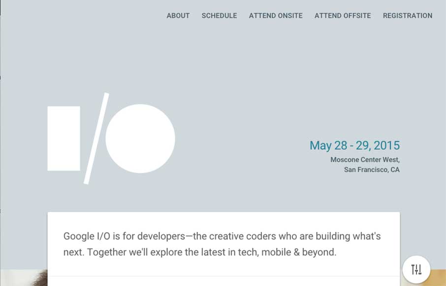
Google I/O 2015
The countdown is on, registration for Google I/O 2015 is open in 33 days. The site (right now) seems a little scaled down from last year - but cleaner in approach, but not traditional. Either way, looking at the photos from Google I/O 2014, it's something I would want...
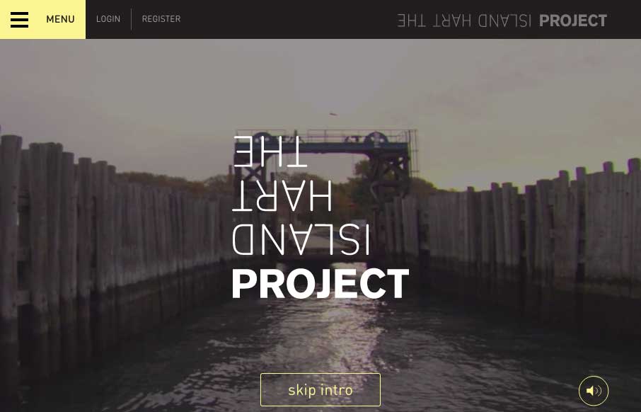
The Hart Island Project
While the subject matter may be a little shocking, and the tone is something akin to True Detective, The Hart Island Project website is pretty incredible in a design sense. The video intro - don't skip it - it sets the tone that is continued through out the site. And...
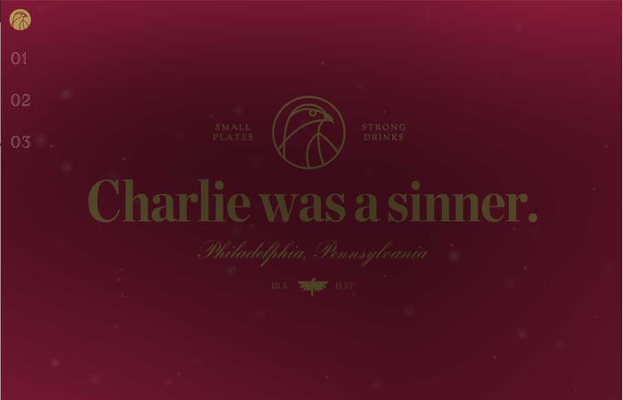
Charlie Was A Sinner
It took me a minute, and still don't know who Charlie is (they don't talk about Charlie) - but if I'm in Philadelphia (maybe this summer), I'm going to check out this vegan restaurant, that boast of "small plates and strong drinks" - Charlie was a Sinner. The site,...
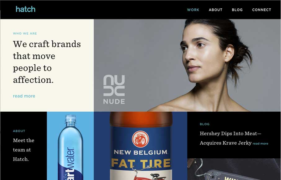
Hatch
Really like this sleek design from the Hatch agency out of San Francisco. It's a cool way for an agency to show their work and present themselves as innovative and cool. I'll keep watching this site to see how they update the images, if they change the shape of the...
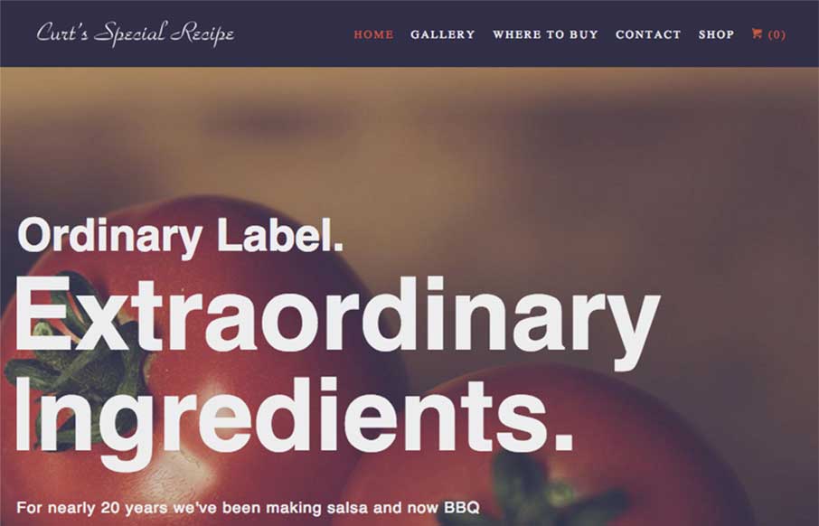
Curt’s Special Recipe
This site is all about the tone for me. Big bold text on the home page set in a simple none fancy sans-serif font. Bold, earthy, homely imagery - love whatever filter they’ve used on these. The design could have easily gone down a more handcrafted/organic/market stall...
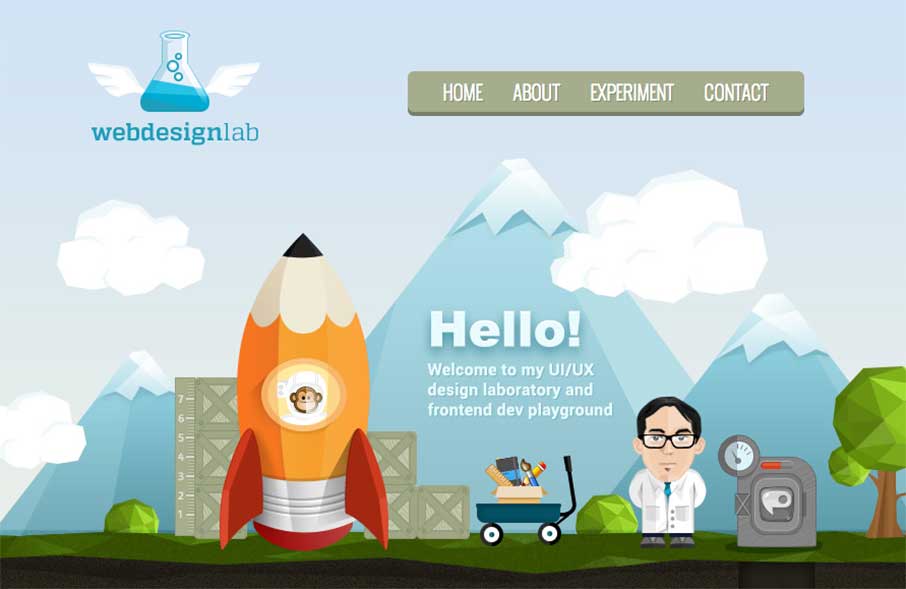
Carl’s Jr Portfolio
I like this one (ok, two) pager. It's fun and has a cool concept. Cool illustrations and even some CGI on the rocket (well, kind of). And no.. not that Carls Jr. From the Designer:This is my portfolio site to showcase my design work. Hopefully it can be approve :)...
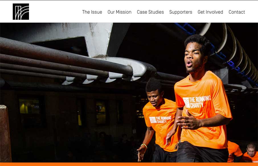
The Running Charity
Some of us at Unmatchedstyle are runners. In fact, Gene and I are running a 12k this weekend that benefits the state forest we run a couple times a month. The Running Charity, out of London, is taking running and charity to a different level, not just raising money...
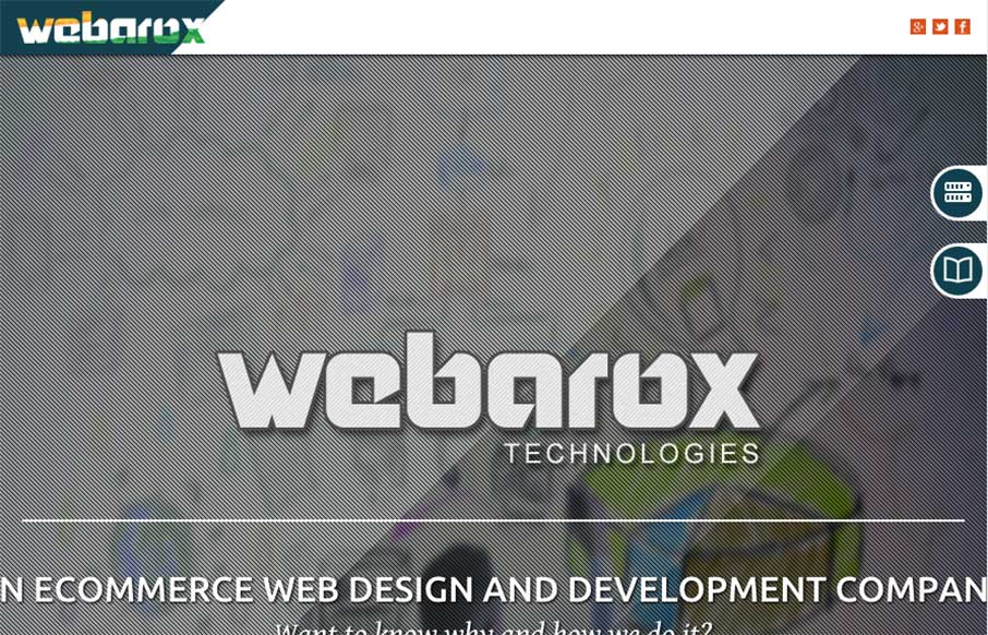
Webarox
There are some really cool pieces/parts to this design. I like the graphic way they tell the specific pieces of the story about their company. I also like the pattern used over the images.
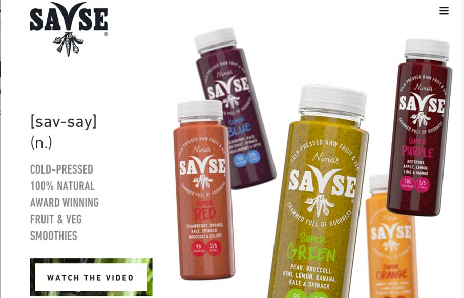
Savse
Pass the kale and beetroot, time for something good! Whether you like great tasting fruit and veggieGreat one-page site for Savse (sav-say) Smoothies done by NEVERBLAND out of London. Like using the animated SVG to transition from above the fold to below. The link to...
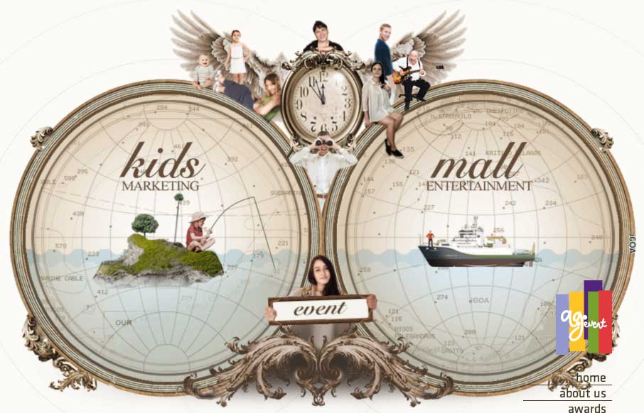
AG-Event
Woah... there is so much going on here that I can't even catalog it all. I think most of the site by AG Event out of Istanbul is in canvas, and gives a different experience than you're used to on agency type sites. Be warned - it may slow your computer to a halt - but...
EMAIL NEWSLETTER
News & Articles
John Ferrara on The NBSP Show
![]() This episode’s guest is John Ferrara and is hosted by Christopher Schmitt and Dave McFarland.
This episode’s guest is John Ferrara and is hosted by Christopher Schmitt and Dave McFarland.
Draft Episode 07: Copyright, Patents & Design
 Draft is a podcast about the craft of designing for the web, in this episode we discuss how copyright, patents and staking a claim on certain types of design elements compares to inspiration and influence you get form other’s work.
A Newb’s Guide to Syntactically Awesome Stylesheets (Sass) – part 1
 All about Sass and how to get an understanding of it and how to dig in and start utilizing it.

HARD WORK. CLEAN FUEL. NO EXCUSES
Use “WARRIOR2023″ for 10% off.