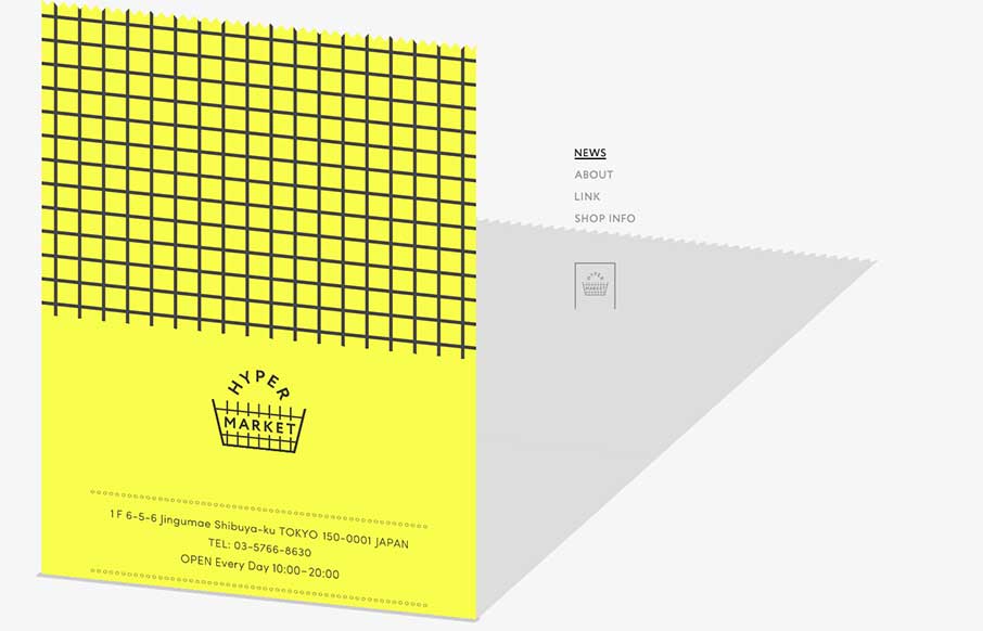
Ok – it took me a minute to see what Hyper Market’s website was doing here. Scroll all the way down, and you see the gray on the right is a shadow of the yellow that’s scrolling up the screen – which is a cool effect. To accomplish that, it looks like they used an iframe on the yellow part, and the skewed shadow is part of the regular html. So is this a new way to use an iframe? A good or bad use? I’m not sure, but it provides something that’s a little different than what you see every day – which is always good.


The Call to Action, Revisited
The Call to Action hasn’t changed in a decade, but the bar has. A fresh look at prominence, copy, mobile tap targets, and accessibility, with lessons from three major design systems.


0 Comments