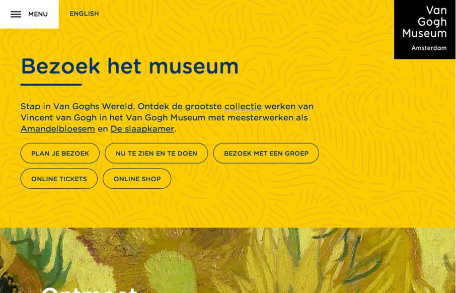
There is really a lot going on here with the Van Gogh Museum website. From the different design decisions made across the different screen widths to the navigation details. You really need to go spend some time clicking through this one guys.
Glassmorphism: The Transparent Design Trend That Refuses to Fade
Glassmorphism brings transparency, depth, and light back into modern UI. Learn how this “frosted glass” design trend enhances hierarchy, focus, and atmosphere, plus how to implement it in CSS responsibly.


0 Comments