Web Design Inspiration Curated
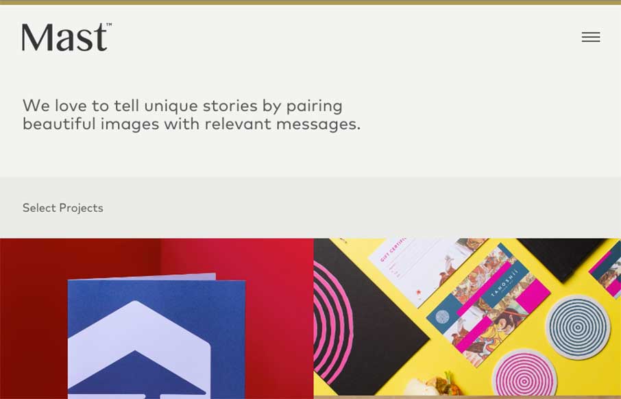
Mast
We're starting to see a trend with some agency sites lately: Header -> Agency Logo -> Little bit of intro copy -> Straight to client work / portfolio Man, is that effective - and Mast out of Denver, Colorado is doing that to a T. Love the block design (that doesn't...
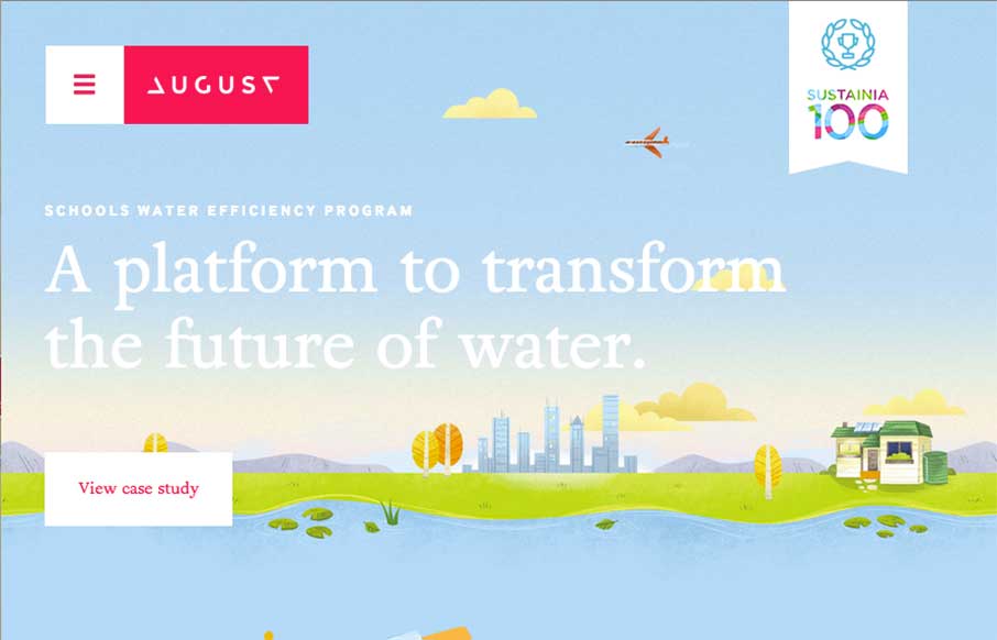
August
Man, what a beautifully executed design on the August website. Fun layout and some super slick illustrations and animation really drive this design home for me. The main navigation is very interesting too. It's one of those that take over the design but I really dig...
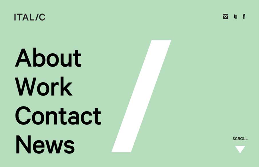
Italic Studio
The more I played with the Italic Studio website, out of Los Angeles, the more I really dig it. The whole work on the About / Home page is cool and fairly seamless. Their Work is pretty darn good too - I remember seeing the Reebok Rally women's magazine / catalog when...
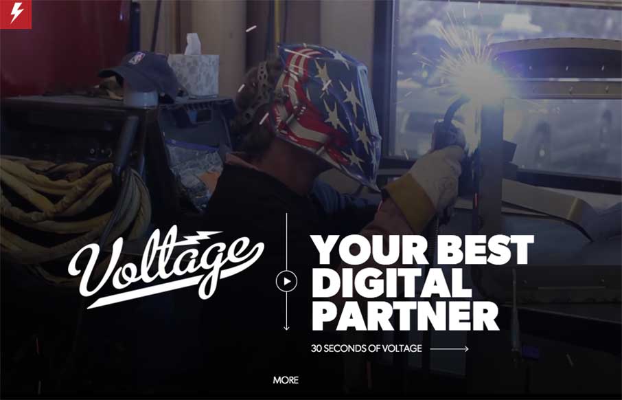
Voltage
Continuing with Reebok day - Voltage, out of Colorado, just worked on the Reebok site we reviewed this morning. When we searched for who did the work - we found their site, and man is it good. The video background and the full-width images - with some good scroll...
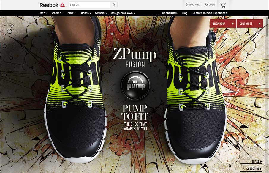
Reebok – ZPump Fusion
Today is Reebok Day. It could be that Gene and I are fanboys of Reebok, and in fact just ran our third Reebok sponsored Spartan Race this past Sunday in Atlanta (awesome images below). Plus, there's some good design on the site and in the companies associated with...
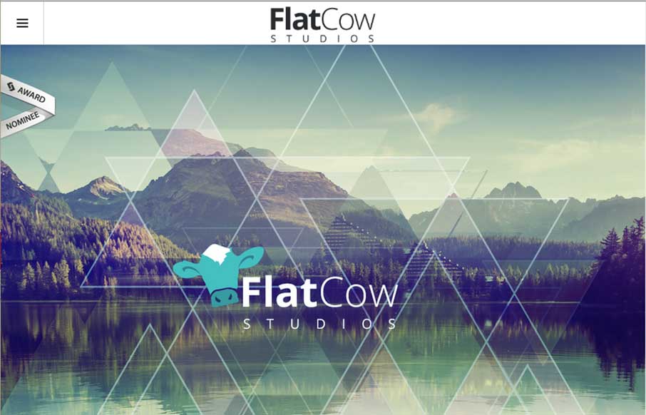
Flat Cow Studios
I'm not sure if the name Flat Cow is a play on an oxymoron, but design-wise, I like the contrast between the flat design, coupled with robust design - it plays well on this site. Also, the full-width design on the Work page is also pretty cool - and like the different...
C2
Cool and different agency site out of Croatia for C2 - Ana and Sergej. Really enjoyed the opening sequence that turns into your initial navigation with the block C. Also like the use of the slider, plus side scrolling in the Work section. Finally - I like the...
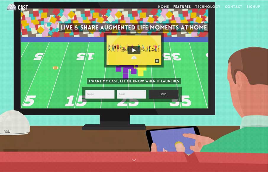
Cast by Genii
Cool new product and website for Cast (by Genii). While I'm not sure who Genii is, I get Cast right away - and the animated video background helps (except for that one dancing dude on the right - reminds me of the Katy Perry Left Shark... but I digress). Good use of...
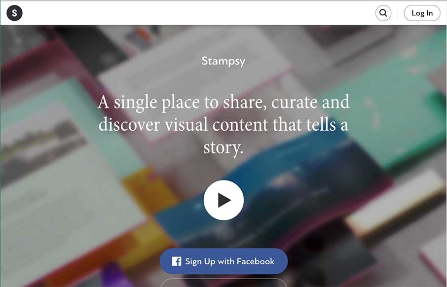
Stampsy
Really like the movement of the Stampsy site, a photo story / mood board / visual essay site, especially from the second to the third frames of the site. Everything is very well designed, and simple - using the video to tell their story. Also think the fourth frame is...
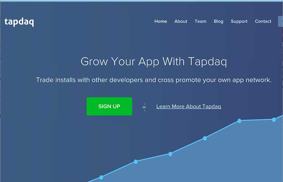
Tapdaq
I always like to review product websites and Tapdaq is an interesting study in keeping things simple. I dig the way the graph loads the first time you visit the site. I also really like the simplicity in the overall approach to the design of the site; yet at the same...
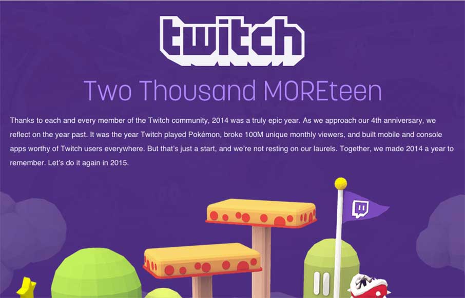
Twitch 2014 in Review
I've said before that we really like these year-end summary sites for different companies - and Twitch's is a good one too! Pretty cool that you can have a multi-million dollar company based on watching other people play video games - but aside from that, I like the...
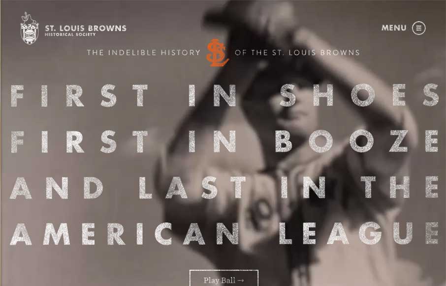
St. Louis Browns
My 9yo son has his second baseball game of the season tonight. I showed him the St. Louis Browns website last night at 8:30pm (his bedtime) - and I found myself explaining the site and the team to him until 9pm (my bedtime) - Satchel Paige, 3'7" Eddie Gaedel, and yes,...
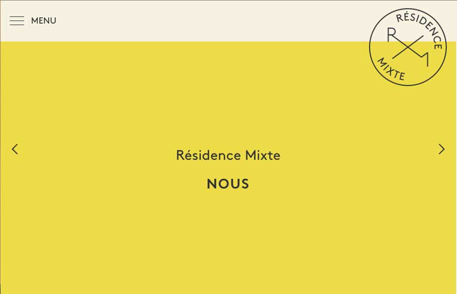
Résidence Mixte
Lovely type based design for the Résidence Mixte website. I dig it in so many ways. Kind of cool how the slider actually changes the whole page - an added level of navigation. The colors are soft and also the French. 🙂
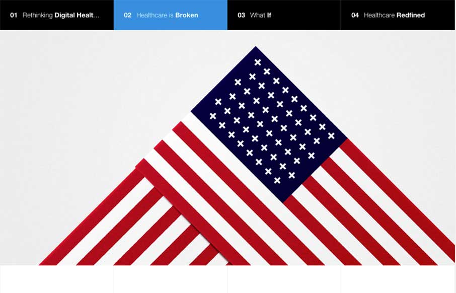
Rethink Digital Healthcare – By Fantasy
No matter what your political slant, we could probably agree with the statement that digital healthcare, with all of our technological and interwebs advances, could be seriously improved. So I really love Fantasy, a digital design agency out of San Francisco and New...
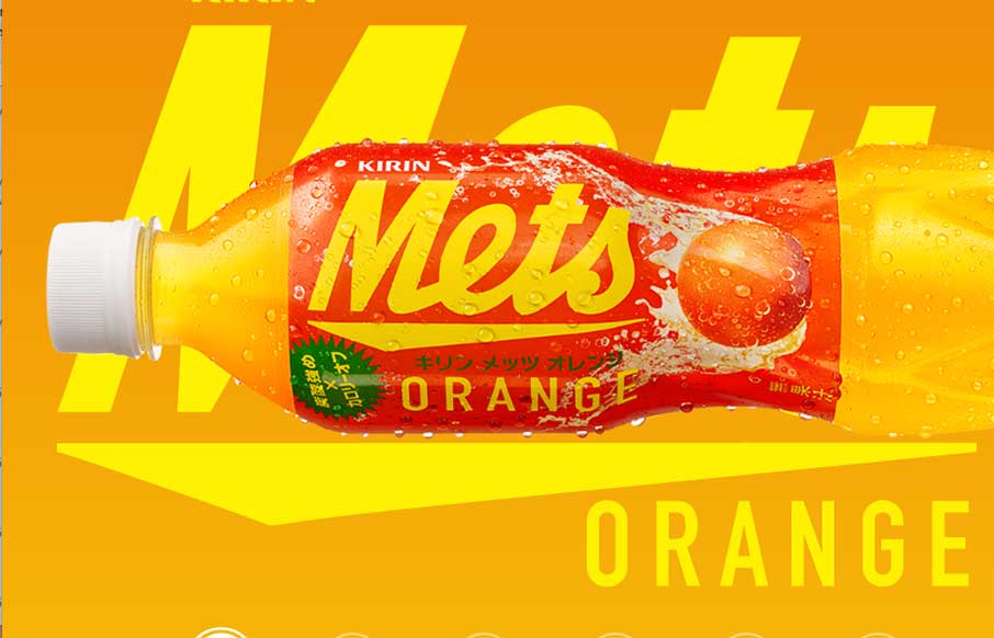
Kirin – Mets
"We Want Mets - We're the funky, spunky, younger generation..." is now in my brain for the rest of the day - well played Kirin - well played. I've been a fan of Kirin, out of Japan, since before I can legally say. They have a soft drink called Mets - and it's website...
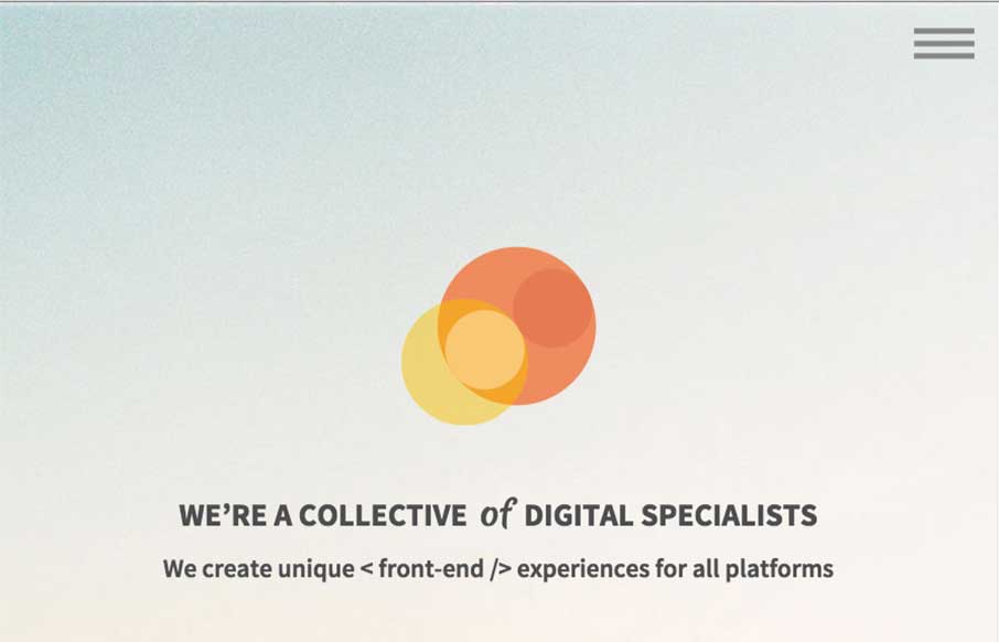
Prollective
This Prollective site is a theme, that they made - they note it at the bottom of the page. It's a pretty dang good looking site and template too, just thought you would enjoy checking out what these guys do with it. We’re a collective of handpicked web specialists who...
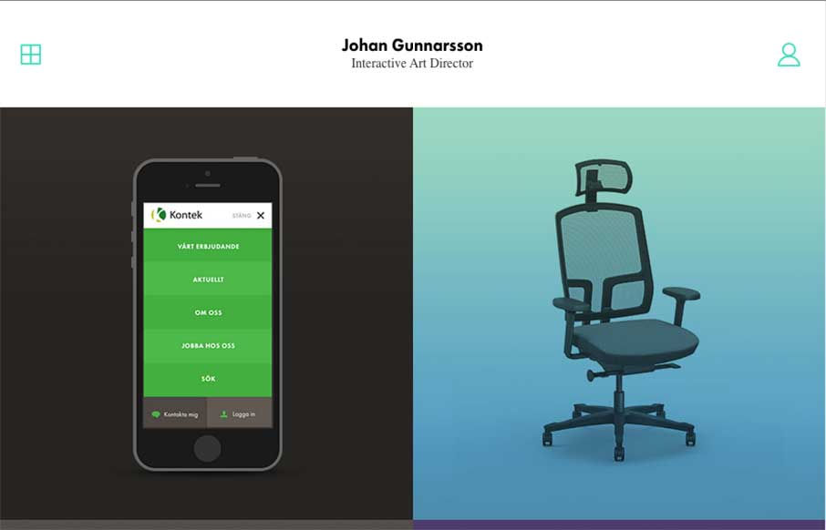
Johan Gunnarsson
Something about a classic looking simple design. Johan's portfolio website has "it". I dig it greatly! Submitted by: Johan Gunnarsson @nahoj Role: Designer
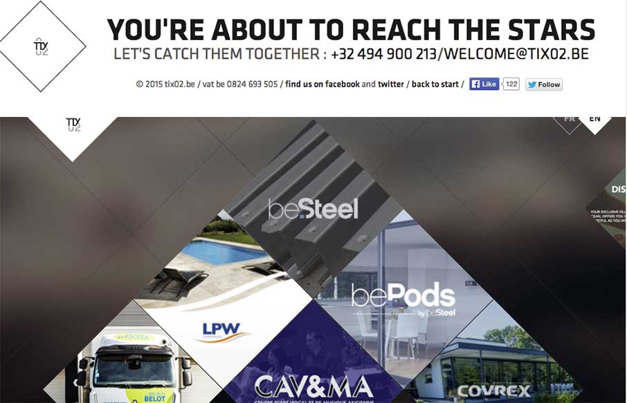
tix02 design studio
Cool and kind of trippy agency site out of Belgium, from tix02. The scroll is reversed, and the Work section through me off guard for a second; but it's definitely unique in it's design, and should stand out to potential clients. I really like the section on "Building...
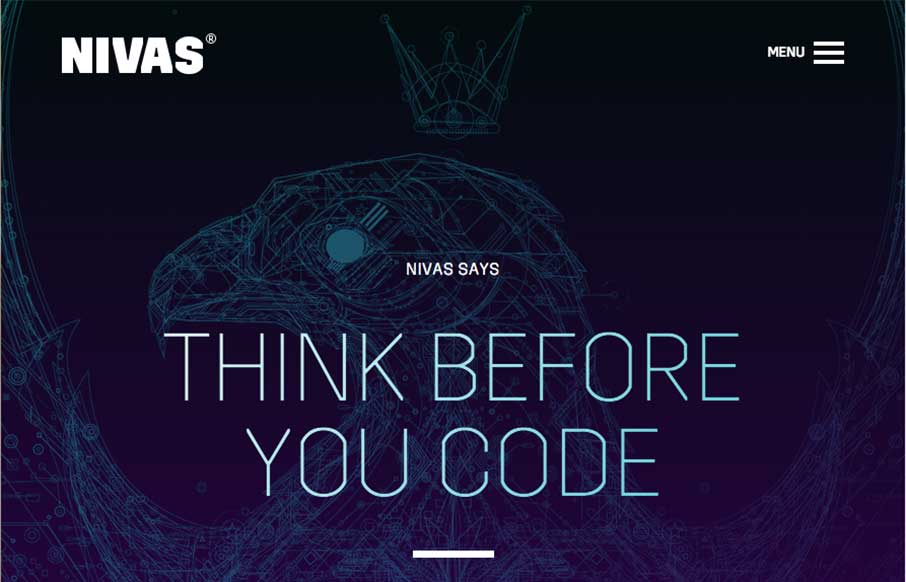
Nivas
Dynamic and bold design from Nivas out of Croatia. The multi-hued chevrons really make this site - and the line art illustration is a great background to start the page. Also like the Work page, and how the chevron shape is included in the work portfolio.
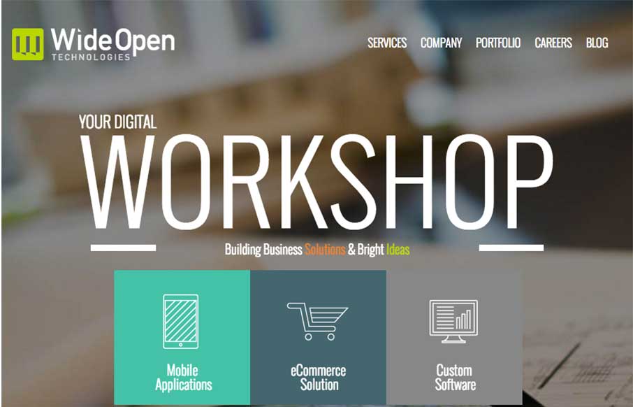
Wide Open Technologies
I was looking up some information on one our ConvergeSE speakers - Adam Smith - and took a look at his company's website, a Wilmington, NC based firm - Wide Open Technologies. This is a solid site, that is clean and easy to follow. I especially like the Services page...
EMAIL NEWSLETTER
News & Articles
Draft Episode 09: Breaking through barriers to create great work
 Draft is a podcast about the craft of designing for the web, in this episode we discuss how you have to take yourself out of your own little world to be able to honestly create great work.
BizCraft Episode 10 – Live at RemixSouth
 Episode 10 was recorded live at RemixSouth in Atlanta. We talk about managing remote teams, watching out for bad clients and Carl’s tweet.
Full Interview with Dave Rupert – Ep.81
 The full interview we did with Dave Rupert of Paravel and the ShopTalk Show while at Front End Conference in St. Pete, Florida this summer.

HARD WORK. CLEAN FUEL. NO EXCUSES
Use “WARRIOR2023″ for 10% off.