My 9yo son has his second baseball game of the season tonight. I showed him the St. Louis Browns website last night at 8:30pm (his bedtime) – and I found myself explaining the site and the team to him until 9pm (my bedtime) – Satchel Paige, 3’7″ Eddie Gaedel, and yes, it’s the St. Louis Browns, not the Cardinals.
This is a great site by HLK, out of St. Louis, Missouri – and with the first week of MLB Spring Training going on right now, we thought we’d go a little in depth on this new / “old fan club” site:
Preloader

Most pre-loaders are pretty standard, Bootstrappy looking – not this one. And if you’re on a slower connection, you’ll even be thrown “Out!”
Home Page

Great video background to start the Home page – especially when you consider the video is 80+ years old.
Header

Little Easter Egg in the Header – mouse over the off-screen Menu for a cool little / no-hamburger icon.
Navigation

Like how the Menu modal is semi-transparent so it keeps the video background available for the subtle movement, keeping the life in the site.
History
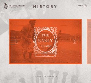
The History portal is a cool horizontal scrolling slider – like how each page title is unique in look and feel, and appropriate descriptive images.
History Detail
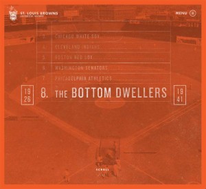
Four great detail pages on the History of the St. Louis Browns. There is some parallax transitions as you scroll down – and even a little mouse-over parallax on the top image.
Players
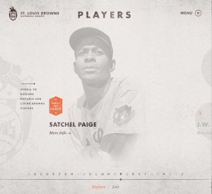
The Player page is a horizontal slider again. I think it gets a little glitchy when you get to the S-Z area – could have been my connection at the time. Either way – great way of highlighting the players without be a caricature of a baseball card – just went through it again – it’s just cool.
Player Detail
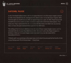
Like the Player Detail modals – could spend hours reading their stories – so glad it also looks nice.
Blog / News

It’s a little different than the rest of the site, but the blog / events / news page has a really good look, both in desktop and mobile.
So go and enjoy the St. Louis Browns fan club website – It’s fun and really like when someone takes time to present something of historical value in such a beautiful way.
Interested in Unmatchedstyle profiling your website in-depth? Just fill out the form – “need the info” – make sure you talk a little about the design so we can quote you. We can’t guarantee it to be fully analyzed like this one, and can’t guarantee it will get reviewed (we get a lot of requests, and try to have some standards) – but we’re making this type of long form gallery post part of our weekly editorial calendar. Let us know what you think!




0 Comments