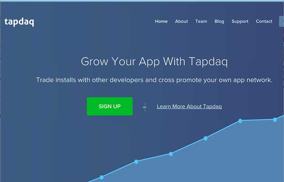
I always like to review product websites and Tapdaq is an interesting study in keeping things simple. I dig the way the graph loads the first time you visit the site. I also really like the simplicity in the overall approach to the design of the site; yet at the same time it’s chock full of good visuals and needed info.
Glassmorphism: The Transparent Design Trend That Refuses to Fade
Glassmorphism brings transparency, depth, and light back into modern UI. Learn how this “frosted glass” design trend enhances hierarchy, focus, and atmosphere, plus how to implement it in CSS responsibly.


0 Comments