
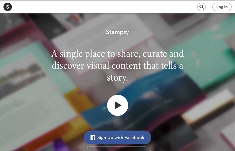
Really like the movement of the Stampsy site, a photo story / mood board / visual essay site, especially from the second to the third frames of the site. Everything is very well designed, and simple – using the video to tell their story. Also think the fourth frame is pretty interesting, the “Feed” are all individual images that scroll.


Fitts’s Law: Why the Easy Button Wins
Large, close targets are faster to hit than small, distant ones, that’s Fitts’s Law. A look at the 1954 rule behind buttons, prime and magic pixels, thumb zones, and dark patterns.


0 Comments