Web Design Inspiration Curated
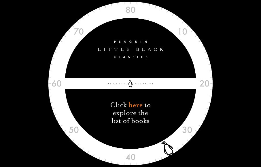
Little Black Classics
How do you market books that have been around for 50 to 300 years? Put their famous quotes into a web based, literary "guess the book", spin the bottle (most likely drinking) game. Maybe that's not the full intent of Penguin Books' Little Black Classics site, they say...
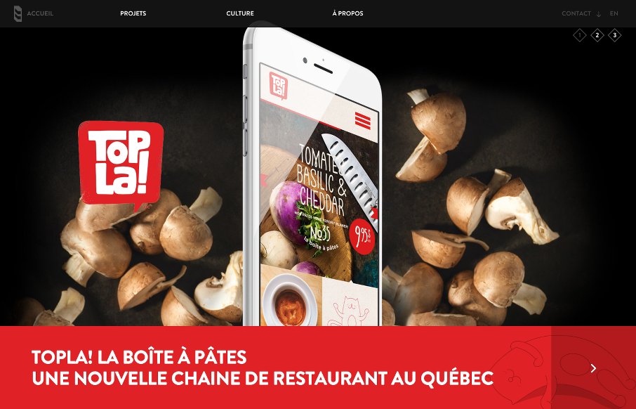
8 Bis Branding
Dig the full-width, parallax slideshow on the home page of the 8 Bis Branding site out of Montreal. Found it interesting that they went for filtered search on two pages - Projects and Culture - but the categories on each make sense. There's also some nice animated SVG...
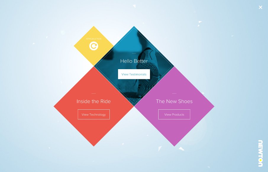
Newton Running : Run Better
This site has been out for a while, but while looking at shoes for races coming up, we found the Newton Running site - wow. From the cool navigation and transitions on the "home page" after the intro, to the interactive parts when viewing the shoes - this site has...
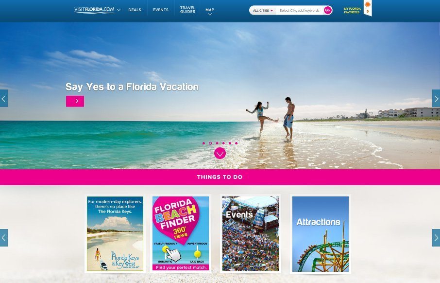
VisitFlorida.com
John has been helping us work on posts for UMS, and left me some comments that I figured were more relevant for the Visit Florida site than what I would have written - so here's his first post: Heavy on the card design and utilizing images works well for those longing...
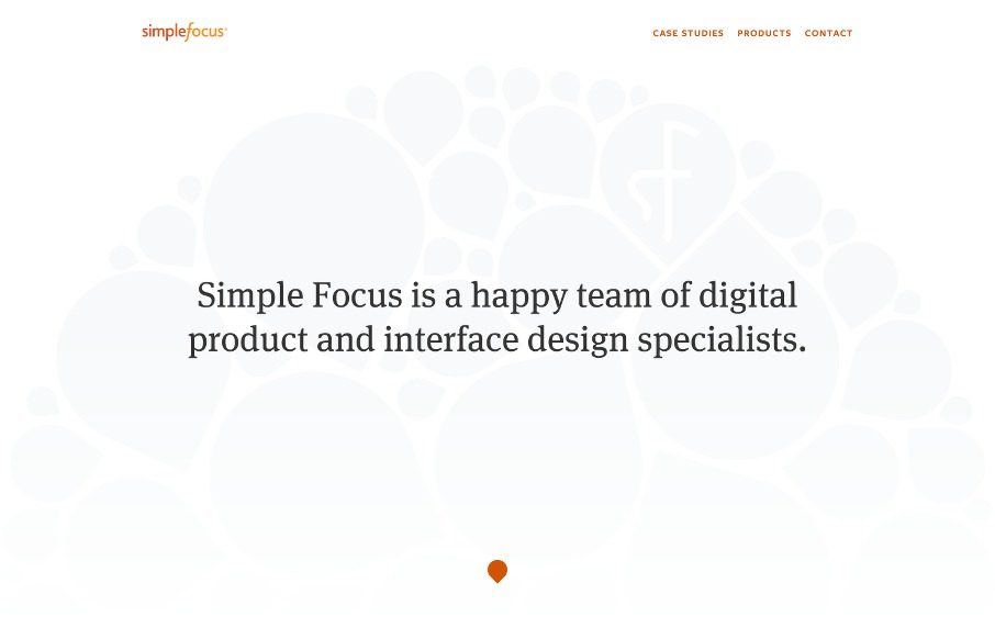
Simple Focus
Folks from Simple Focus have spoken at events in the past and at our own ConvergeSE we will see JD Graffam speaking on how "Micro-Interactions Matter". Simple Focus uses eye-tracking with their customers to help create good UX - so their research to build their UI is...
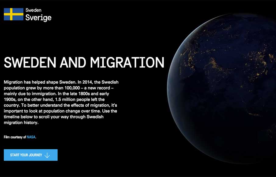
Sweden and Migration
We came across this site, Sweden and Migration last week - and since we're kind of fans of Sweden (seen partially by what hangs in our office - Thor's Hammer Mjölnir below), we thought "perfect"! The site is a huge interactive infographic about how, "migration has...
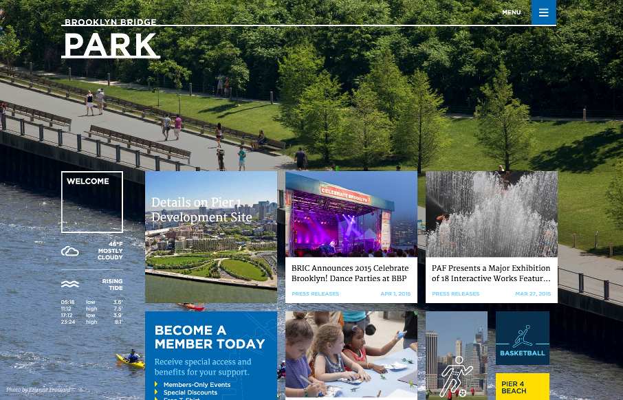
Brooklyn Bridge Park
The new Brooklyn Bridge Park site, done by Kettle NYC, is kind of a monumental achievement, like the bridge and park themselves. There is a lot going on here, from the infinite scroll card design on the home page, to the three - four different forms of navigation...
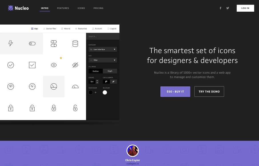
Nucleo
We hadn't reviewed an app product site for a while, and at first I wasn't sure to just keep this one as a resource for Radar, but I liked the basic clean look of Nucleo's site. With suped-up intros and pre-loaders becoming a new trend, I like the fact that this site...
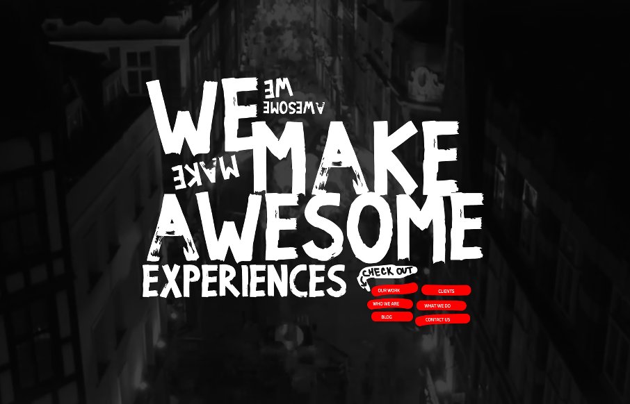
We Make Awesome Sh
This is a clever site from We Make Awesome Sh, out of the UK. Besides the duck and beach ball css-transitions, and transparent svg in a div, with the class of "scribble" that is set to be a fixed overlay over the entire page (below) .. there is a "Don't like swearing...
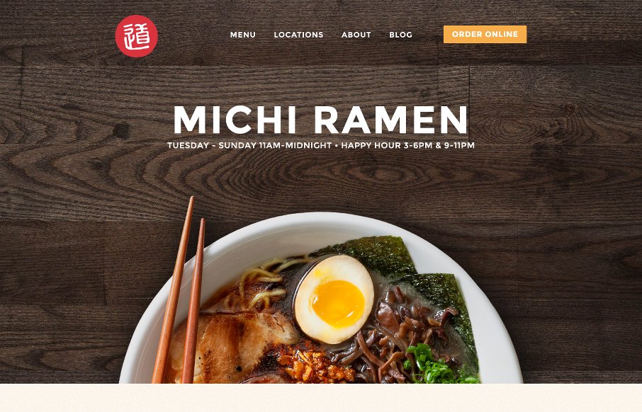
Michi Ramen
The thought of going to Austin for ramen? Well, based on the design of the Michi Ramen site by Sputnik Creative.. yeah sure. Love the simple look and feel of this site, with cool textures that give some depth to this site. Remember, restaurant sites are usually...
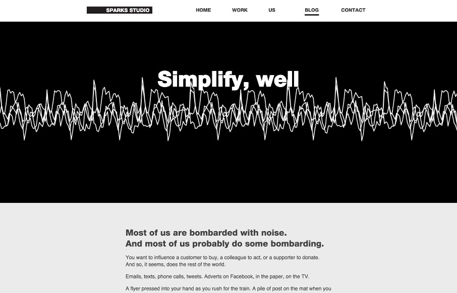
Simplify, Well
"If you want to be heard through the din, try being clearer, not louder." We don't normally showcase too many blogs anymore - and never do that for a blog post - except this one. From Sparks Studio in London, Michael Gough has a cool blog post that could be a stand...
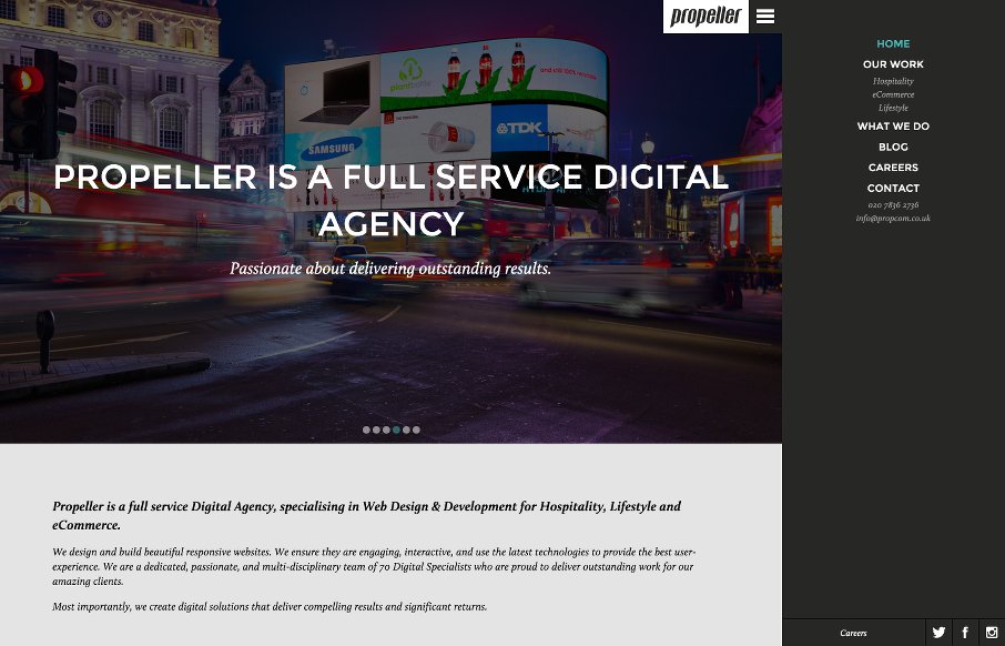
Propeller Communications
Like how Propeller Communications out of London uses the off-screen nav hamburger - but with a caveat - they start the site with with the hamburger open in vertical nav, that you can decide to close to gain screen real estate. From the Designer: Propeller is a full...
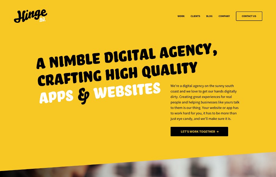
Hinge Ltd
Cool and quick one-pager, full-width site from Hinge out of the UK. Like the slightly off-kilter script lettering, along with the regular copy - accented with the same angular thing going on with the color sections. From the Designer: We're a new digital agency, less...
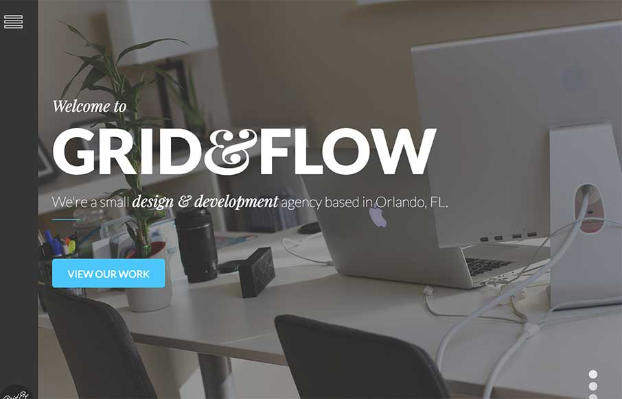
Grid & Flow
Cool site from Grid & Flow out of Orlando - like the off-screen / vertical navigation on the left side - different than most. Also like this trend again of Instagram feeds that make up a section of the site - makes for a better look and feel with those filters....
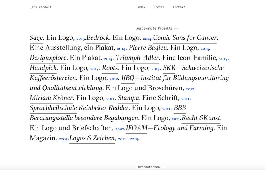
Jens Windolf
Well - I like clean and simple - and not too many are going to be more clean and simple than Jens Windolf's portfolio site out of Hamburg. I love the text treatment here, and the fact that you can change over to a portfolio view that is image based too. And like how...
The Pixelage
Clean and quick agency site out of Singapore from The Pixelage. Like the video background and the non-scrolling that basically gives you an A or B option to find out about the company, or look at their work. I think too often, we beg people to contact us, without...
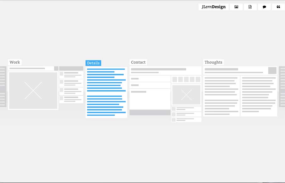
JLern Design
Really dig this portfolio site from Justin Lerner out of Philadelphia. It's fairly unassuming at first, where everything is grey and looks like wireframes - but on hover and then on click, with cool transitions, open up into strong, flat design. It's a nice concept...
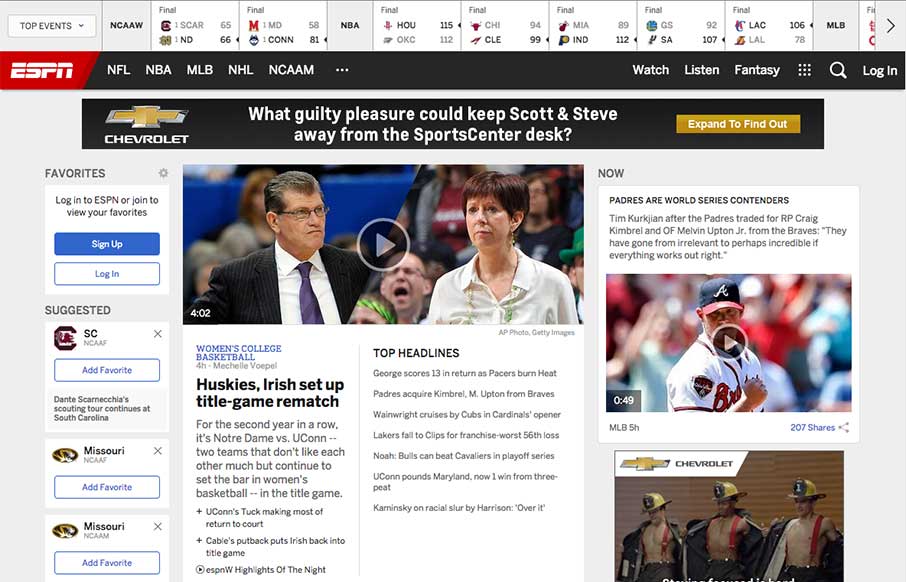
ESPN
In the US today it is the official Opening Day of baseball, and tonight the championship game of men's college basketball - so appropriately we look at the 20th Anniversary redesign of a site that is now ubiquitous with sports in the US: ESPN.go.com With as many or...
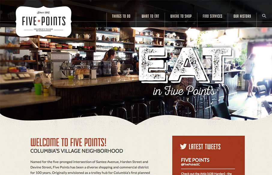
Five Points Columbia SC
We see so many local websites that are just, well, not good. Our buddy Joe Lemmons @joslemmons just finished this site for the Five Points Association in Columbia, SC - and friends aside, we were pretty wowed with the work. So we decided to go a little more in-depth...
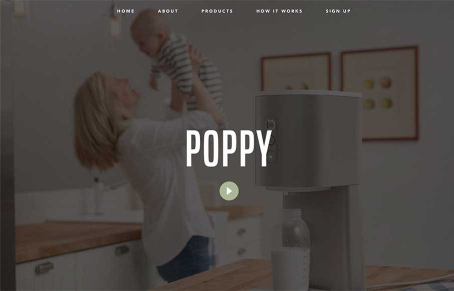
Poppy
Poppy, from Quirky out of New York, caught my eye because once upon a time I was COO of a start up that tried to do some of the same things in the pet industry before we had a lot of technology that is ingrained into our daily lives today... Besides some awesome...
EMAIL NEWSLETTER
News & Articles
BizCraft Episode 13 – Guest Jason Blumer CPA & Strategist
 We discuss accounting, pricing and business strategy with our guest Jason Blumer a CPA who only works with creatives.
Draft Episode 11: Skeuomorphism
 Draft is a podcast about the craft of designing for the web, in this episode we discuss Skeuomorphism, specifically if it can be useful in visual design or User Experience.
ConfNotice #8
 Every week, we publish a short list of the upcoming web-focused events going on around the world, highlighting call for speakers, ticket sale dates, and a quick summary of the event.

HARD WORK. CLEAN FUEL. NO EXCUSES
Use “WARRIOR2023″ for 10% off.