VisitFlorida.com

http://www.visitflorida.com/en-us.html

John has been helping us work on posts for UMS, and left me some comments that I figured were more relevant for the Visit Florida site than what I would have written – so here’s his first post:

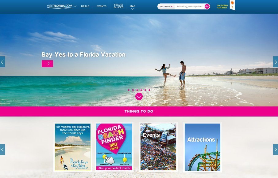
Heavy on the card design and utilizing images works well for those longing for a Florida experience getaway.

Social Media page( labeled #LoveFL) with tabbed content, allows you to easily see all of their social media in one place (utilizes Tint)

Certain pages, like the front page, slide you to the next section when you begin to scroll, it’s subtle and easily overpowered by stronger user input. I tend to lean against scroll jacking, but this is more like ‘scroll-aid’. Even though I like it I could see where some users may be very against it.

alt screenshot:

20150410-VisitFlorida-pool

0 Comments

Submit a Comment

Your email address will not be published. Required fields are marked *

News & Articles

Sign-Up: Enhancing Conversions through good UX

Sign-Up: Enhancing Conversions through good UX

Optimize your website’s sign-up process by focusing on clarity, ease, and user mindset. Clearly explain the purpose, benefits, and steps, and use social proof to build trust and drive conversions.

The Essential Guide to Getting Started on Freelance Writing

The Essential Guide to Getting Started on Freelance Writing

Explore the lucrative and fulfilling world of freelance writing with our essential guide. Learn about specialties like blogging, social media, article, and technical writing. Build a portfolio, find work, set up your business, and discover the potential earnings. Embrace the freedom of working from home and follow tips for success in your dream career.