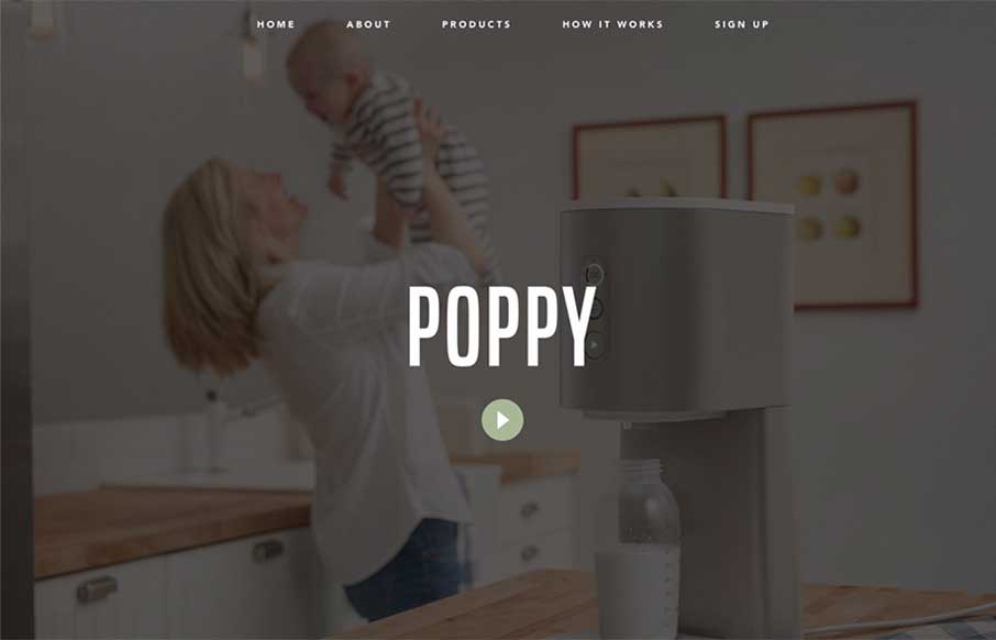
Poppy, from Quirky out of New York, caught my eye because once upon a time I was COO of a start up that tried to do some of the same things in the pet industry before we had a lot of technology that is ingrained into our daily lives today… Besides some awesome product concepts – Poppy’s site is smooth and flows beautifully. With the three products, it’s trying to hit three really unique markets – chic mom – dog owners who treat their dogs as their children – and hipsters that NEED the perfect pour-over coffee. So the site has to be smooth to appeal to these three groups – I think Quirky accomplishes this.
Glassmorphism: The Transparent Design Trend That Refuses to Fade
Glassmorphism brings transparency, depth, and light back into modern UI. Learn how this “frosted glass” design trend enhances hierarchy, focus, and atmosphere, plus how to implement it in CSS responsibly.


Not chic dads?
Well played Chic Dad… well played.