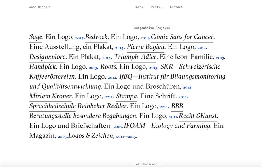
Well – I like clean and simple – and not too many are going to be more clean and simple than Jens Windolf’s portfolio site out of Hamburg. I love the text treatment here, and the fact that you can change over to a portfolio view that is image based too. And like how the selected portfolio work becomes a secondary navigation when you go through the Work detail pages.
Glassmorphism: The Transparent Design Trend That Refuses to Fade
Glassmorphism brings transparency, depth, and light back into modern UI. Learn how this “frosted glass” design trend enhances hierarchy, focus, and atmosphere, plus how to implement it in CSS responsibly.


0 Comments