We came across this site, Sweden and Migration last week – and since we’re kind of fans of Sweden (seen partially by what hangs in our office – Thor’s Hammer Mjölnir below), we thought “perfect”!

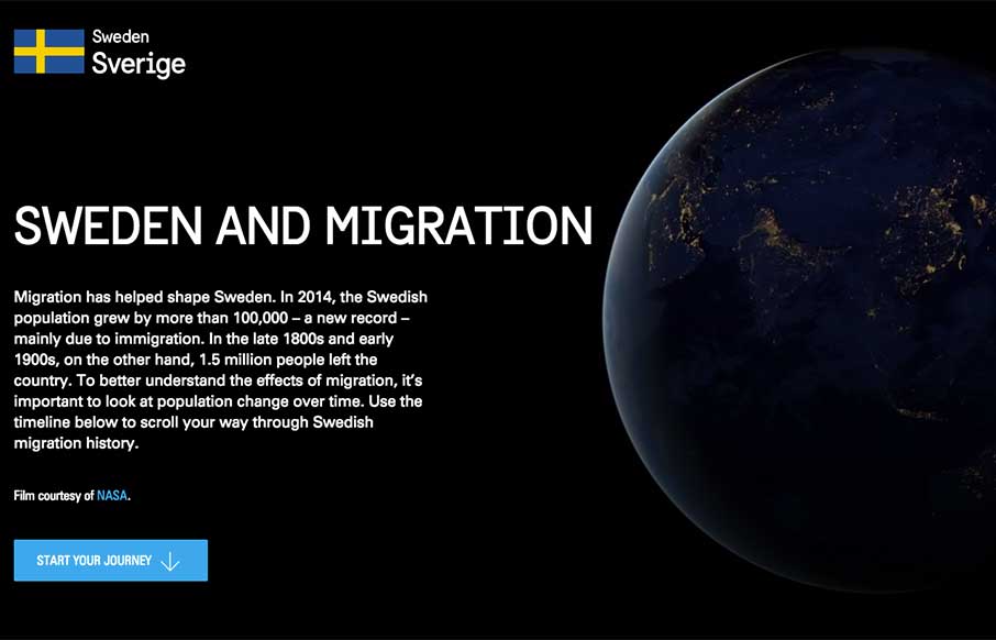
The site is a huge interactive infographic about how, “migration has helped shape Sweden. In 2014, the Swedish population grew by more than 100,000 – a new record – mainly due to immigration. In the late 1800s and early 1900s, on the other hand, 1.5 million people left the country. To better understand the effects of migration, it’s important to look at population change over time. Use the timeline below to scroll your way through Swedish migration history.”
Here were some elements we thought were cool, considering everything that’s going on in this site:
Intro

Like how they’re using the NASA video as part of their video background in the intro to the site.
Instructions

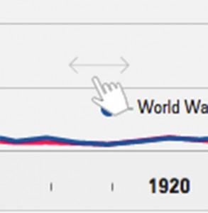
It’s subtle, but useful to have this visual cue that you can play with the timeline by sliding it left and right.
Timeline Navigation – Slider

Like this timeline – the functionality of it (sliding and using nav arrows on sides) – plus the quick info on emigration vs immigration.
Timeline Navigation – Period

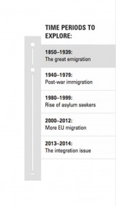
Since the migration stories are really in chunks of time periods – it’s nice to be able to jump with additional functional nav.
Population Infographic

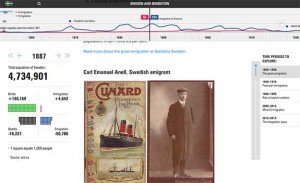
This is cool how the infographic changes as you slide through the timeline above.
Profiles – Travelers / Migrants


A couple of examples of how they approach the meat of the content with full-width vs copy and image combos.
RWD

Aaaaannnnddd…. the site is responsive – most experimental / infographic sites we see usually stay away from responsive design because they want to (have to) preserve the design aspect to relay the info – this one gets away with both.
Interested in Unmatchedstyle profiling your website in-depth? Just fill out the form – “need the info” – make sure you talk a little about the design so we can quote you. We can’t guarantee it to be fully analyzed like this one, and can’t guarantee it will get reviewed (we get a lot of requests, and try to have some standards) – but we’re making this type of long form gallery post part of our weekly editorial calendar. Let us know what you think!


0 Comments