Web Design Inspiration Curated
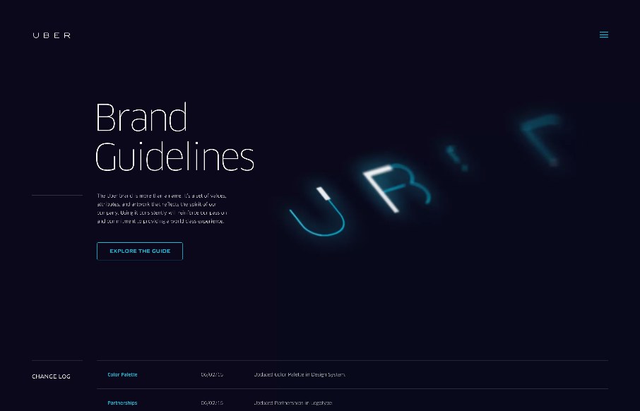
Brand Uber
Always interesting to see brand / design / style guidelines from companies and products you use on a daily basis, like this one from Uber. Very clean and minimal, but with a few little interaction pieces - you can see they've taken time to make this section of their...
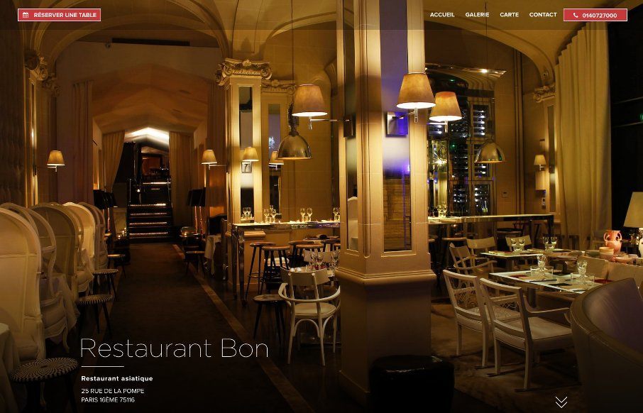
Restaurant Bon
Elegant and simple site for Restaurant Bon out of Paris - designed by Uniiti also out of Paris. Two things to point out - on the Food Menu (Carte) page, the use of the sticky positioning of the side bar is smart. Also, like the reservation modal and how it fits in...
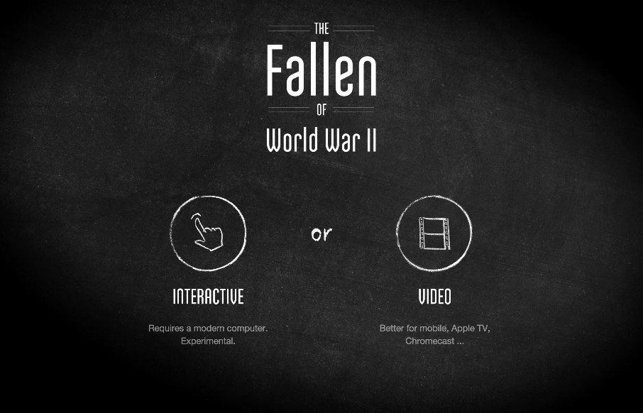
The Fallen
The Fallen is an interesting website, especially to a history and WWII buff like me. Granted, the majority of the site is video based - but as the author / coder Neil Halloran points out, "In the interactive version, the interactions are at around 7:21, and 16:17. And...
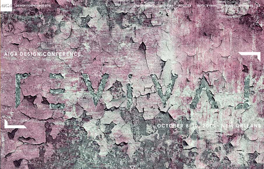
AIGA Design Conference 2015
AIGA just released their site for the AIGA Design Conference 2015 (in October). Lovely all the way around - from the "revival" art (that might be changed out periodically? See the current site and the image below) - to how everything works on-scroll. Looking at the...
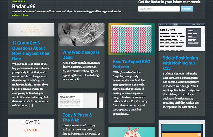
Radar #96
In this week's Radar: 12 Gurus Got 5 Questions About How They Set Their Rate Why Web Design is Dead How To Export SVG Patterns Sticky Positioning with Nothing but CSS Copy & Paste & The Web How To Center In CSS Page Scroll Effects How To Design Social Media...

Channel Islands Surfboards
What says "cool" better than a surfboard? Really besides the spectacular images of surfers and the surf community, the best part for me is the informative pages for surfboards themselves (including some with a 3d preview) and the interactive customizable 'Board...
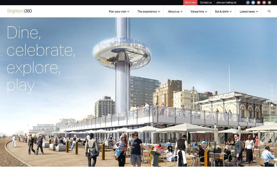
Brighton i360
Starting to really enjoy things and sites coming out of Brighton, like this one for Brighton i360. Good grid-centric design - clean and simple. Looking forward to it being built and visiting.. next time I'm in the UK. @TheBrightoni360 made by @wearetilt
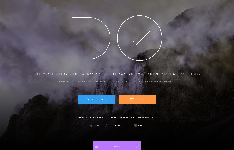
To-Do App UI Kit
Cool landing page from InVision with their new To-Do App UI Kit. Love the intro - the CSS animation of the cloud .png overlaid on the mountain .jpg makes it look like the mountain and clouds are a video background. Looks like they share every single possible layout...
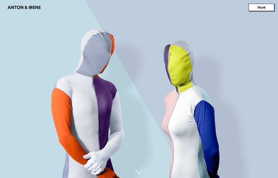
Anton and Irene
Pretty stellar agency/non-agency site from Anton and Irene, built by Oleg Chulakov. Avant-garde was the first thing that came to mind when landing on the site - pretty darn cool was the next thought. Love the different pieces of the site, but equally love the...
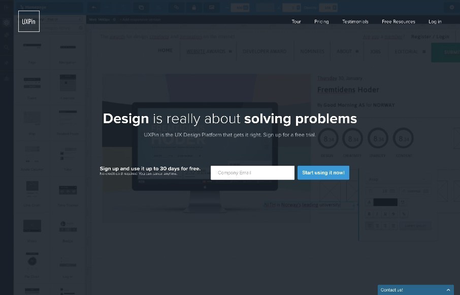
UXPin
"Design is really about solving problems" - Amen. I can see that UXPin's philosophy, matches the way they go about their design for their site too. Love the simple home page, that is still layered with a video background of the product, but more as texture than a main...
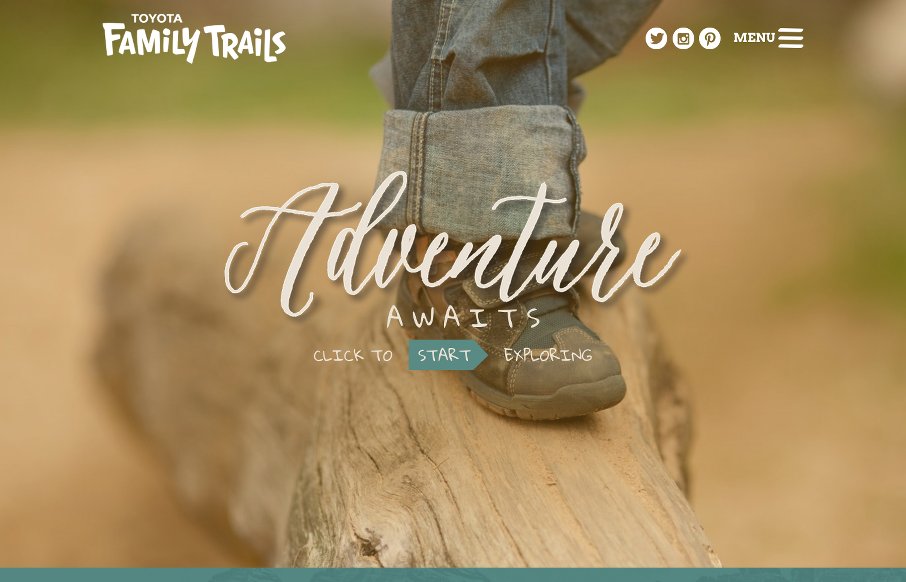
Family Trails
Good looking "Family Trails" site from the National Center for Families Learning. It's a very social site, and essentially it is a travel type blog, which seems to work very well for what the NCFL is trying to accomplish. @Family_Trails
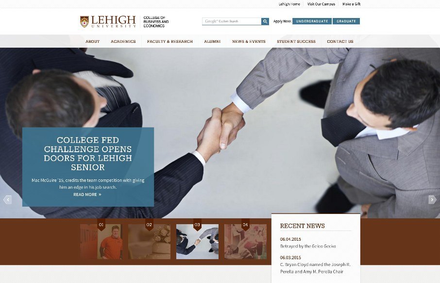
Lehigh CBE
Like the clean site from Lehigh University College of Business and Economics - think it has good (and appropriate) UI / UX, even down to the main content / sub-pages. Like how they have the hamburger menu below the hero image so that you can go into more detail on the...
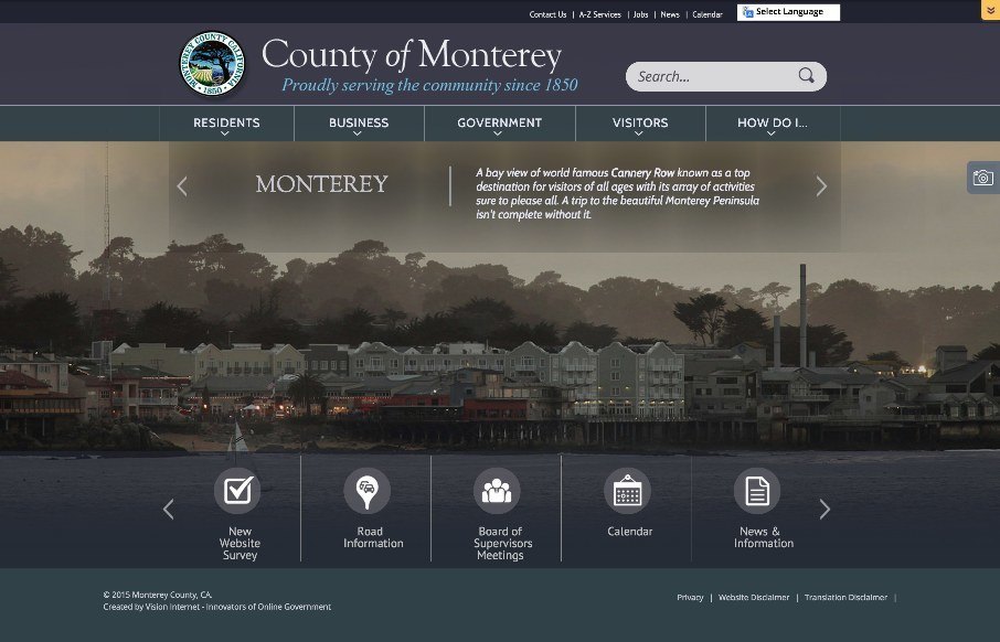
County of Monterey
The above screen shot from the County of Monterey's new website may be the single best feature of their website - that's not to say that the site isn't pretty decent on it's own (don't know if you know that government sites usually, well, stink...) - but a government...
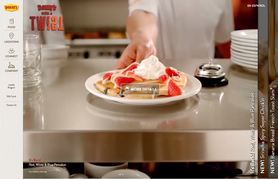
Dennys
It's breakfast time in Nashville, Tennessee where we're putting BDConf (www.bdconf.com) on this week. we just finished setting up, and I'm watching the dude get the breakfast ready for the attendees... and then I see this site in our inbox - Denny's. We have one in...
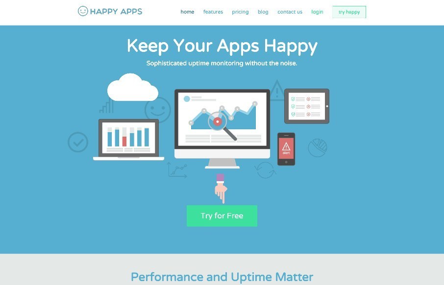
Happy Apps
Pretty fun scrolling animation of the wires/tubes that connect the sections for you visually. I like that part of it, it makes what is fairly standard fun. Would be extra super great for it to be responsive, but there's always reasoning behind stuff so I won't judge...
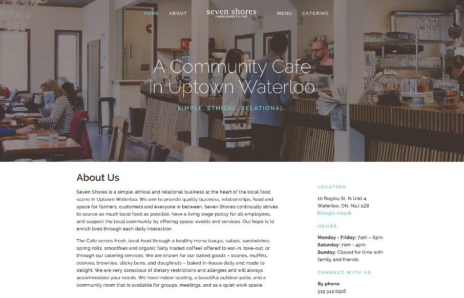
Seven Shores
It's not often you see a restaurant or cafe website made entirely out of HTML/CSS. I know that's crazy right? This one isn't spectacular but it's efficient and perfect for the need. That's why I think it's beautiful, really! Also... it's made using squarespace.
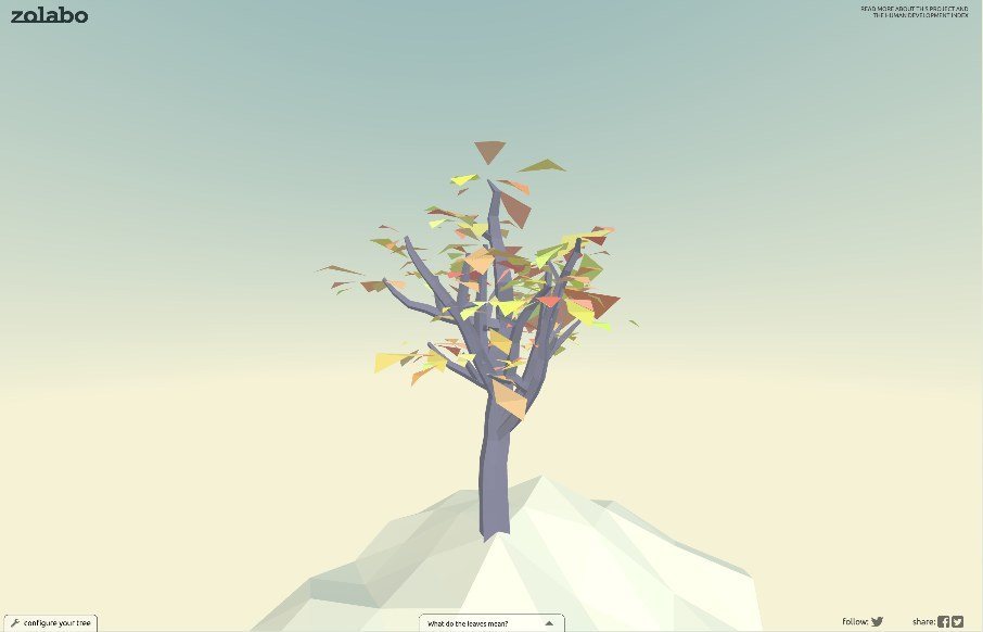
Tree of Human Development
Pretty rad interactive element here. The tree that you get after completing the form is brilliant. Go take a peek and play around with it.
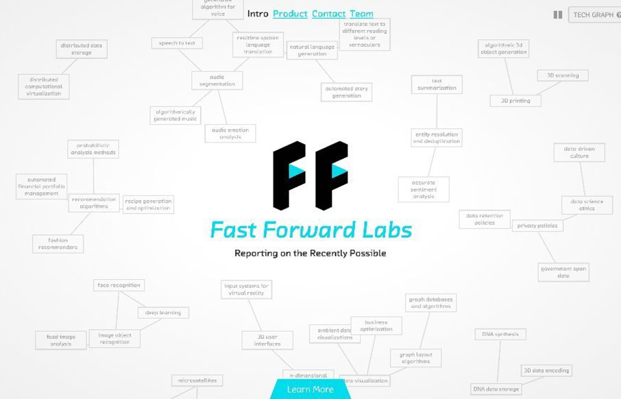
Fast Forward Labs
I dig this simplified layout approach of the Fast Forward Labs website. At it's core it's straight forward and simple, but lay on some neat visuals like the animated mind map graphics and it's pretty darn cool.
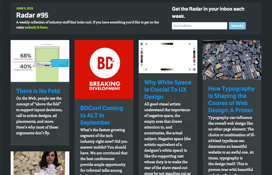
Radar #95
In this week's Radar: There Is No Fold BDConf Coming to ALT in September Why White Space Is Crucial To UX Design How Typography is Shaping the Course of Web Design: A Primer Exploring the Hero Image Trend in Web Design A Designer’s Checklist For Designing Awesome...
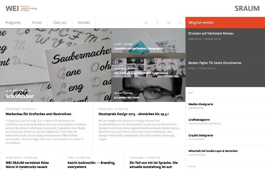
WEI SRAUM
There is a lot going on here to get this website responsive visually. The grid is pretty core to its layout and it flows really well from screen to screen width. I also really dig how the header/nav stays fixed and moves up visually as you scroll down. From the...
EMAIL NEWSLETTER
News & Articles
BizCraft Episode 16: Special guest interview with Daniel Pink
 Carl and Gene talk to best selling author Daniel Pink about how he runs his business and approaches the life of an author and speaker at the level he is at.
Chris Coyier on The NBSP Show
![]() This episode’s guest is Chris Coyier and is hosted by Christopher Schmitt and Dave McFarland.
This episode’s guest is Chris Coyier and is hosted by Christopher Schmitt and Dave McFarland.
ConvergeSE 2013 Lineup
 We’re psyched to announce the lineup for this year’s event too! You’ll find some new folks and other Converge veterans coming back to hang out and share some knowledge with us.

HARD WORK. CLEAN FUEL. NO EXCUSES
Use “WARRIOR2023″ for 10% off.