
Web Design Inspiration Curated
soyuzno.com
There isn't a lot to this website, he really keeps it simple. Just a bunch of work samples and some quick copy about the designer and we're off. In a way I like portfolio sites like this, it's almost like a resume.
rawsterne.co.uk
Another really great simple/minimal style portfolio website. This is a great example of really using your content to the fullest, with only work samples and testimonials this site really makes each stand out. I'd suggest really fleshing out the about page, so we can...
designedbyable.com
This site goes against every convention on building websites that I adhere too, but I don't care I love it. I actually like the horizontal scrolling, I really love that the logo is see-through too. The "here's to optimism" section on this site made me smile. Overall...
havocinspired.co.uk
This is more or less a personal website for Ryan Taylor. I quite enjoy coming across sites like these, that are as much 'life-stream' as much as a traditional portfolio website. The site itself is quite nicely designed, good type treatment and nice almost...
koodoz.com.au
Really liking this website the more I look at it. I love the typography work on it and I like the general feel/vibe the site gives off. I think it's the interactions that do it for me, the clever rollover extras in the main nav and the rss feed item in the top right...
chancegraham.com
The simplicity in this design is genius, the only thing I really want to get to is the work and he's delivered it first class for me in this design. I love the main view, the grid view and how I get a short overview of the project then in some cases many large views...
rdbrown.me.uk
I really love this portfolio/blog site for Richard Brown, its full of nice simple little interactions and it's a darn good blog to follow as well. I like the top half of this site most of all, the blocks of imagery that roll over to reveal the links are well done and...
afaxys.com
Fairly simple and clean website. There's really not a lot here content wise but it really looks great. This is a case where visual design can really pump up and impress you about an otherwise boring subject. I like the typography and simplified color palette, a little...
songkick.com
This is a really cool idea, share your live concert experiences with others. The home page really does look great, the imagery and the type overlays in the boxes look really cool and gives it just the right vibe. There is a "london events" link in the main navigation...
sligerconsulting.com
This site uses a clever little visual metaphor in the cork board, it's a cool idea given that the company this website is for is all about helping companies learn and generating ideas. I also love the second half of the site, the bottom half, those icons and other...
handcraftedcss.com
I absolutely love the simplicity of the layout with this site. It's so clean and neatly organized. This is an excellent example of "less is more". The color use is very subtle, it's quite different enough to be memorable but there's nothing really loud about this...
daveharrison.net
Submitted by Dave Harrison, @daveharrisonnet. Well I am biased but i think it makes good use of semantics, typography it is usable and accessible and hopefully communicates what i want. I see some weaknesses but am looking for some constructive criticism from people...
BugWorld Experience
Submitted by Steve Hanson, @slightlysteve. A great blend of video, css and cool design. I love the feel of this site, the video pulls me right in (at least it did my kids) and then the imagery and design elements of the rest of the site keep me in that "buggy" state...
Cuisine Saine, recettes bio
Submitted by Karen Chevallier, @KarenChevallier. This is really a well designed layout. I don't speak the language but can tell what the subject of the site is and can even see how the ingredients for the recipes are displayed. Well thought out graphic elements and...
darrenhoyt.com
Submitted by Darren Hoyt, @darrenhoyt. Designer & Developer. This is a very well designed website, I have to say the content is also top notch. I really enjoyed visiting Darren's website. The design comes off as simple, but as you spend time with it you see it has...
aside design studio
Submitted by Naina Redhu, @Naina. Designer & Developer. Logo design studio run by Naina Redhu. Really interesting looking single page site. It has a really "down home" feel to me somehow, it's slick yet comes across not so slick. That's not easy to do. There's also...
Durrani Design
Submitted by Matt Harding. Designer & Developer. Bold, Dark, great texture, clean css. very visual with good content. Really cool background image, it really makes the entire experience on the website very different than others i've seen. It could have easily been a...
carsonified.com
The new website of Carsonified (by @mikekus) is quite bold and memorable. I love the solid graphic nature of the design and the different pages having different colors really makes each page stand out strong. Not only does each page stand out strong from one another...
Kingdom Landscapes
Submitted by Jonathan Longnecker, @47m. Designer & Developer. An earthy, elegant portfolio site for a custom landscape designer. Another great site by the very talented team at fortysevenmedia.com. This design uses all the basics well, well placed texture, very sharp...
premiumthemes.net
Submitted by Bhavesh R, @rbhavesh. Designer & Developer. Love the strategic layout that highlights the latest product. Colors, typography and layout balance is top-notch. While there's nothing special about this layout, it's not revolutionary, and i've seen this...
EMAIL NEWSLETTER
News & Articles
No Results Found
The page you requested could not be found. Try refining your search, or use the navigation above to locate the post.
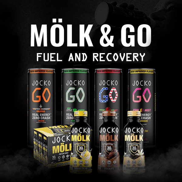
HARD WORK. CLEAN FUEL. NO EXCUSES
Use “WARRIOR2023″ for 10% off.