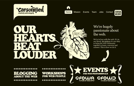
The new website of Carsonified (by @mikekus) is quite bold and memorable. I love the solid graphic nature of the design and the different pages having different colors really makes each page stand out strong. Not only does each page stand out strong from one another but the it stands out on the web as a whole. The illustrations are brilliant, especially the ones of the team members. You also just gotta love cooper too!
I do really hate that the contact link opens up an email prompt, i’d love to see some form design on the site, that would really complete it for me.
I’ll have to say, when I first loaded the site in my browser, I was startled a little and didn’t like it much. I spent some time on it and thought about it and in the end wind up liking quite a bit of it. There are still some elements i’m not fond of, the stars for one. But mostly i’m impressed with the uniqueness of the site, I haven’t seen much quite like this and that’s really refreshing.


Thanks Gene! 🙂
You got it, I know you all worked hard on this relaunch! Keep up the great work!
Great site… refreshing approach to the design/layout… doesn’t look like a lot of the same stuff we are seeing lately.
Keep it up!
~ Aaron I