Submitted by Matt Harding. Designer & Developer.
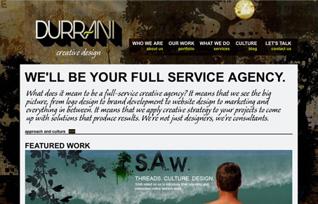
Bold, Dark, great texture, clean css. very visual with good content.
Really cool background image, it really makes the entire experience on the website very different than others i’ve seen. It could have easily been a big gradient type thing, but the way the imagery has been used in the background really makes this site stand out. That background image’s feeling played against the logo and other elements make this site look & feel different to me. I do think that main block of text (the first real paragraph on the page) is quite hard to read set in that typeface, it does look good style wise, but it’s just hard to read that much text set in that style.


These guys are kooks! The designer has his head so far up his ass that he cant even tell when his customers are unhappy/ These guys totally screwed up my friend’s website