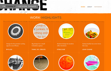
The simplicity in this design is genius, the only thing I really want to get to is the work and he’s delivered it first class for me in this design. I love the main view, the grid view and how I get a short overview of the project then in some cases many large views of the work (not to mention there’s some really great work in here.) The typography and color is amazing and cleanly executed. There’s just the right amount of schmutz on the page, it’s beautiful.
Glassmorphism: The Transparent Design Trend That Refuses to Fade
Glassmorphism brings transparency, depth, and light back into modern UI. Learn how this “frosted glass” design trend enhances hierarchy, focus, and atmosphere, plus how to implement it in CSS responsibly.


Thanks for the kind words!
Totally agreed! Several dilemmas are solved very well, and a great collection of works here.
Using circular masks for thumbnails brings a very unique look to the display. Grouping the project info in well-thought titles at the top has left a nice amount of screen space for big work display and added to the uniqueness.
Topping it up with Similar Projects navigation, instead of Prev/Next is a nice finishing touch as well 🙂
…and just the right amount of grunge on the page too.