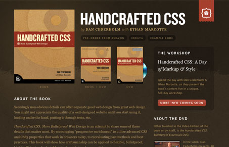
I absolutely love the simplicity of the layout with this site. It’s so clean and neatly organized. This is an excellent example of “less is more”. The color use is very subtle, it’s quite different enough to be memorable but there’s nothing really loud about this site. The call(s) to action are all colored similarly and tie into the coloring of the book seamlessly. Not to mention I can’t wait to get my hands on a copy of this when it comes out.
Glassmorphism: The Transparent Design Trend That Refuses to Fade
Glassmorphism brings transparency, depth, and light back into modern UI. Learn how this “frosted glass” design trend enhances hierarchy, focus, and atmosphere, plus how to implement it in CSS responsibly.


0 Comments