Submitted by Dave Harrison, @daveharrisonnet.
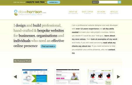
Well I am biased but i think it makes good use of semantics, typography it is usable and accessible and hopefully communicates what i want. I see some weaknesses but am looking for some constructive criticism from people who haven’t been made immune by looking at it for months!
Observations
Overall this is a well designed portfolio/freelance designer website. The thing that stands out most to me is that it is so full of content, you can find out everything you need to know before you contact Dave about business. That’s really a good thing, since most of the portfolio/designer sites I see are very shallow on content and don’t usually include much background at all. The “about” page is one of the most thorough and well done pages i’ve seen in a while. There is some really good stuff here design wise too, the simplicity, nice details throughout the site – I especially like the detail of the search box in the top right corner of every page. The blog is also a good read too, I’ve subscribed to it’s RSS personally.
Criticisms
One thing that sticks out to me, and this is a testament to the quality of the site’s layout and minimalism (which I really love), is the typography on the home page specifically. The variance in type styles, weights and colors makes an otherwise beautifully simple layout overly complex. I was originally going to write that I thought there was too much content on the home page, but after more careful review I think it’s the variance in the font treatments. For example the two main paragraphs of copy in the beginning section of the page compete for attention because of length of copy and treatment, they both appear to have the same hierarchical position visually and as a result i’m not sure which is more important and they both appear to be saying basically the same type of thing.
Overall, this is a really good website that with just a few tweaks to things like I mentioned above could be a really great website.


Thanks for the review Gene. I made a few small adjustments, what do you think?
Oh yeah, I like what you’ve done with the spacing and sizing there. That right paragraph is actually much easier to scan now.