Web Design Inspiration Curated
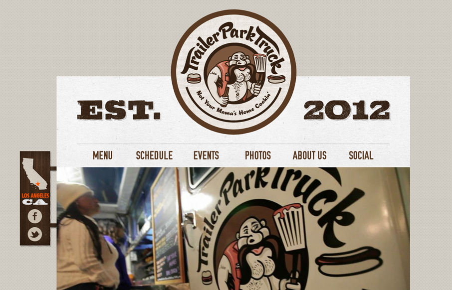
trailerparktruck.com
Submitted by: Jonden Jackson @Forefathers Role: Designer & Developer It is the vision of Dave Miller, who spent his youth touring the world in a punk rock band, then working in the NYC music industry and party scene before finally settling in Santa Monica where he saw...
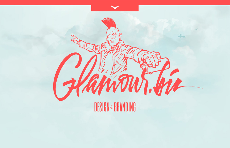
glamour.biz
Submitted by: Jan Sovitsky Role: Designer & Developer Both Giovanni and I dig this design. It's chock full of great illustration work and details. In general it's a nice tight design that's all kind of impressive visually. We had a few things to pick at about the...
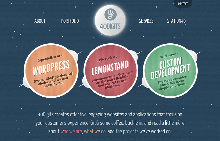
40digits.com
Website of 40Digits, a development-centric agency based in Springfield, MO. 40Digits collaborates with other agencies and clients from all over the country on UX, web design, UI, XHTML/CSS, Wordpress, Lemonstand and custom web development. The site was designed with...
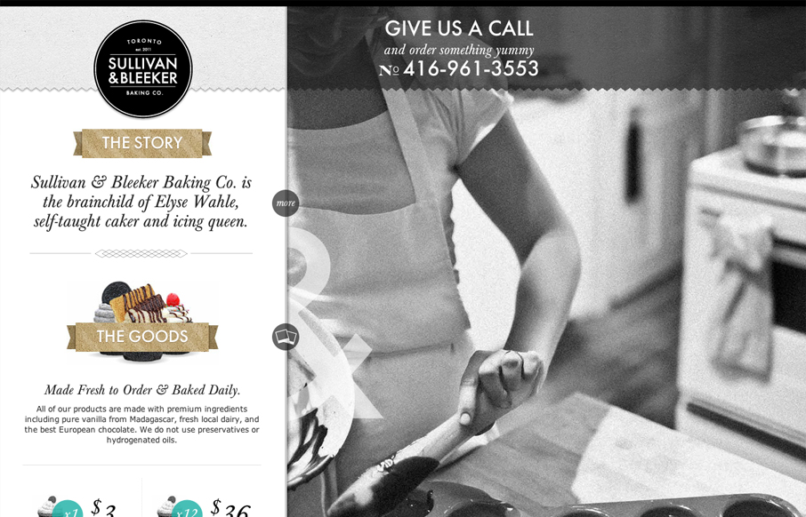
sullivanandbleeker.com
Submitted by: Dave Fox @davejfox Role: Developer There's a few little bits and pieces I'd like to improve and maybe add to in the future, but I'm pretty happy with this site's soft launch. The design is by the very talented Matt Hryhorsky @matt_hy and I was...
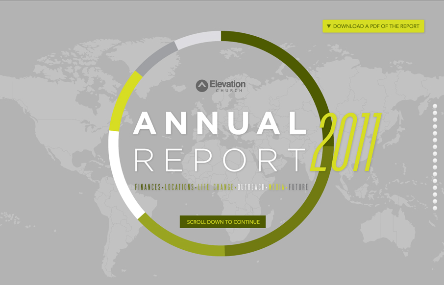
annualreport.elevationchurch.org
Submitted by: John Anderson @elevationsarge Role: Developer At Elevation Church, we don't struggle with trying to find things to celebrate, we struggle with taking the time to celebrate them well. This year, instead of producing our Annual Report in magazine-only...
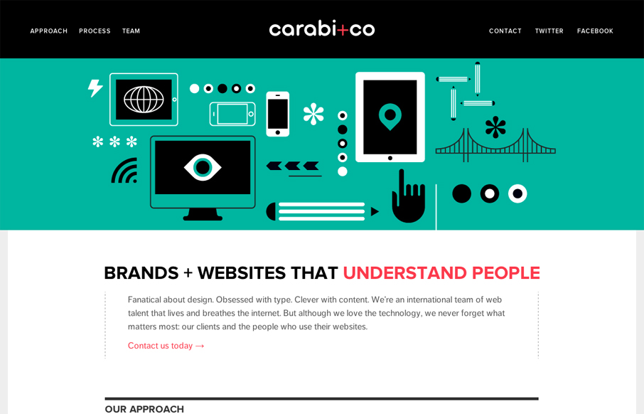
carabi.co
Nice use of illustrations to help tell the story of what you do. Nice limited color palette of black, green & a little red. It keeps it simple overall while still having some slightly busy illustrations. I especially like the header, the fixed header that gets a...
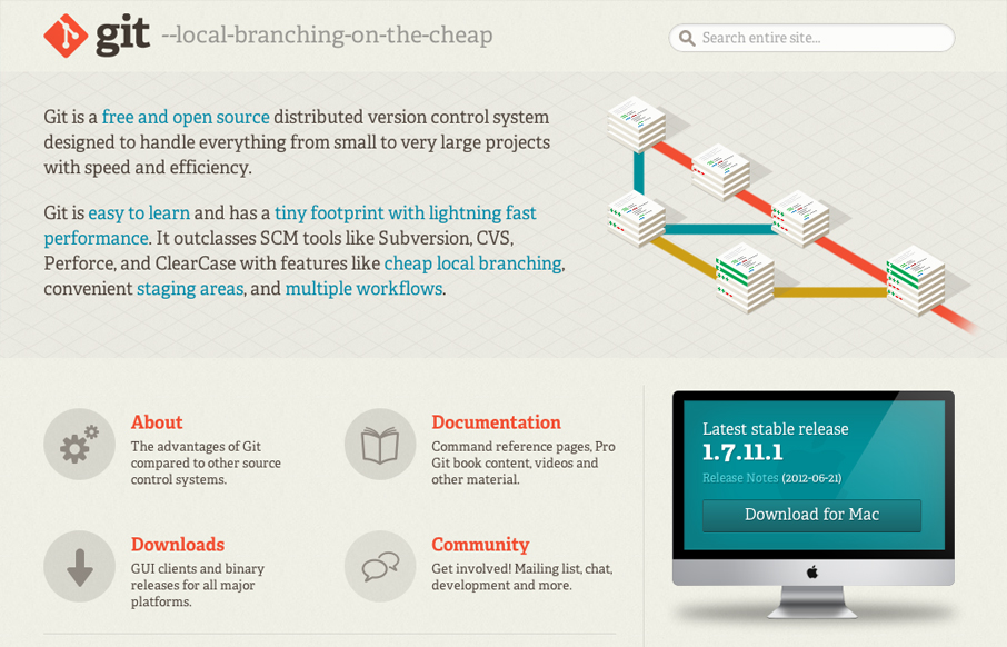
git-scm.com
The Git website is another great example of good design helping to sell an open source project. The great illustration of how it works really sells the concept visually and the solid design of the rest of the page gives Git the visual brand it needs for you to trust it.
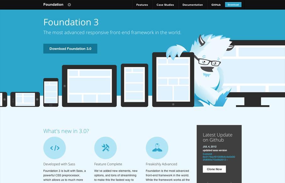
foundation.zurb.com
Zurb has given us many good things, Foundation is surely one of them. But they also design pretty solid websites to house the things they make. This site is great example of making a monochromatic color scheme work. The idea of using the yeti and the cool blues...
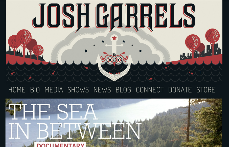
joshgarrels.com
Found Via Kyle Steed: I'm not sure if you've heard how awesome @JoshGarrels is, but you should totally check him out today - joshgarrels.com #fb— Kyle Steed (@kylesteed) July 4, 2012 I haven't checked out the music yet, but the website/illustrations are...
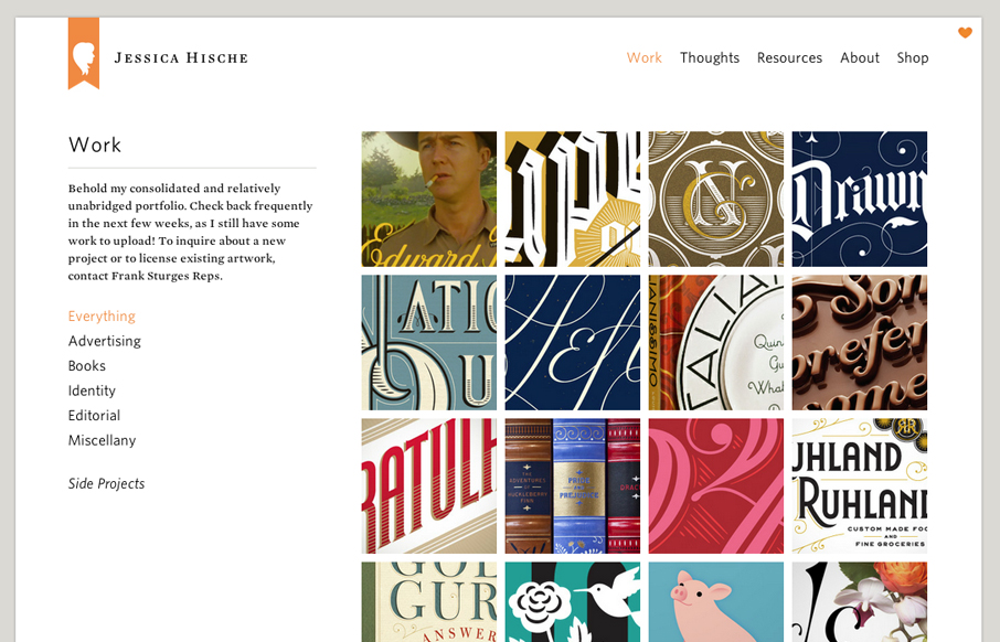
jessicahische.is
Launched a new version of my website! jessicahische.is I think you'll find lots of new goodies + it’s a lot easier to navigate— Jessica Hische (@jessicahische) July 2, 2012 The new Jessica Hische website is fantastic. Yeah yeah I just posted her wedding site...
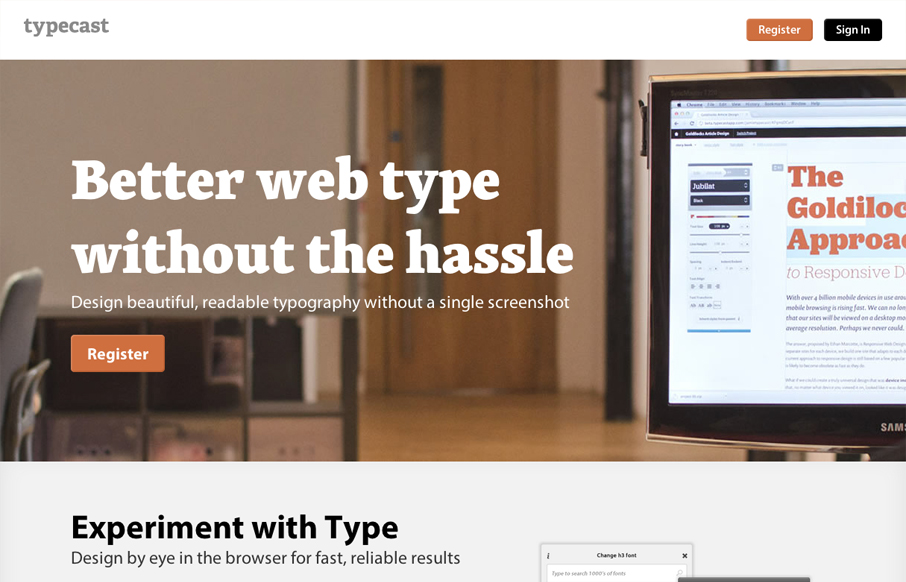
typecastapp.com
Aside from what looks like a brilliant app. The typecastapp.com website is very well produced. I like asymmetrical layout a lot, the right side is heavy with visuals and it really helps to draw you down the page more. Keeping your eyes focused on that right side...
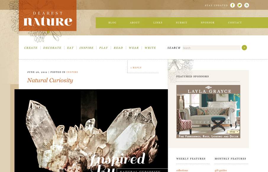
dearestnature.com blog
Posted by: Donaville Herrick @dearestnature This site was 5 years in the making. The original concept behind the site arose while working on niche publications for my previous employer from 2007 - 2010. It wasn't until 2011 that I hunkered down and mapped out the...
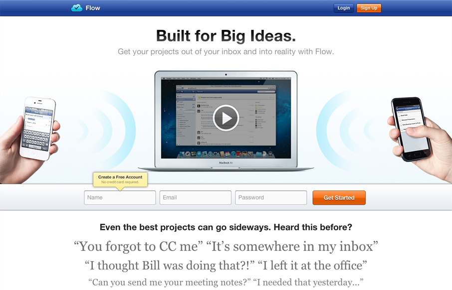
getflow.com
Really great looking/working website. I dig the bold colors, they kind of burn into your retina in a good way. I also like the small animation on the initial page load from the two hands holding the iPhones. The thing I like the most is the multiple chances to get...
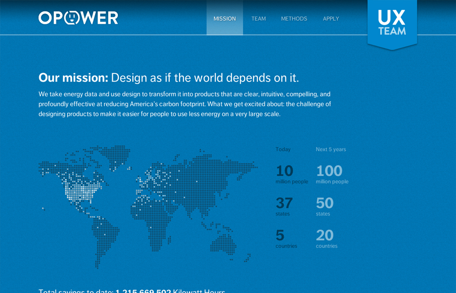
opower.com careers
Digging the new Opower UX team site bit.ly/LBtazr with fun facts & some friendly energy savings competition (cc: @jimjones) — Samantha Warren (@SamanthaToy) June 27, 2012 This is a nice representation of the Opower UX Team from their collective mission down to...

jessandruss.us
This is the wedding invitation/announcement website for Jessica Hische and Russ Maschmeyer. There is a lot of beautiful illustrations and just purely joyful feeling effort put into this website. There are some neat little easter eggs you can find in the site too, I...

ajmarksberry.com
A random Google search brought me to the site of AJ Marksberry and I have to say I was pleasantly surprised. I really dig what AJ has done. It's a straight up portfolio site which does an excellent job of selling his skills and representing his work, but it also is a...
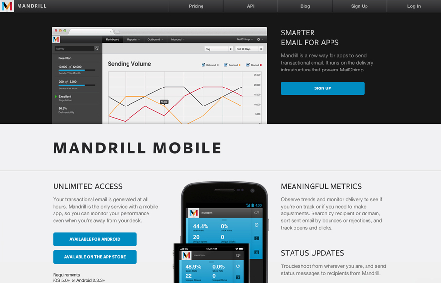
mandrill.com
The Mandrill site is a such a nice product/app website. The experience is clean with a few little visual treats here and there, like the slight parallax type image shift on the two mobile phone images. Good responsive design too. I particularly like the signup form...
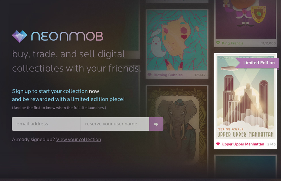
neonmob.com
I love the interactions on NeonMob. They're simple color shifts and sliding shapes but the overall experience is delightful. That's really all it takes sometimes to really draw you into singing up. In this case, onboarding by great interactions, it's a first for me to...
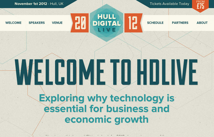
hd-live.co.uk
The Hull Digital Live conference website is a nice responsive top navigation design to study. I like the pattern here of going with the fixed top nav then as you get smaller screen widths, it still stays fixed but folds out with a slight transparency on it. It's not...
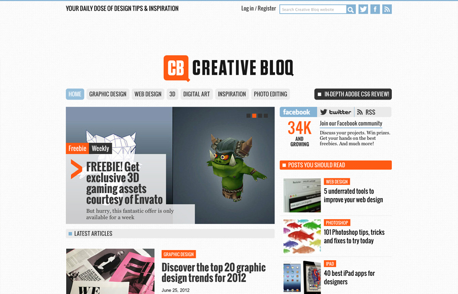
creativebloq.com
Creative Bloq is a brand new website by the makers of Computer Arts, 3D World and .net magazine that offers up a daily dose of design tips & inspiration. First impressions are that this could be something good. What I noticed immediately is that it's SUPER easy to...
EMAIL NEWSLETTER
News & Articles
unmatchedstyle
RT Simple Guide: How To Get Started With jQuery http://u.nu/3a67 @9swords #UMS
Monthly Design Panel #1: Mostly about type on the web
The first of our monthly design panel podcasts. We talk mostly about type on the web and a few tips from our participants: Jason Beaird, Ken Seals and Jay Barry.
unmatchedstyle
http://cssmania.com has relaunched with a new design. Nice looking site! #ums

HARD WORK. CLEAN FUEL. NO EXCUSES
Use “WARRIOR2023″ for 10% off.