Alienbikes.com is lovely. Well, it’s mostly lovely. I think the gallery is under designed, but its a small complaint. I want to focus on the store.
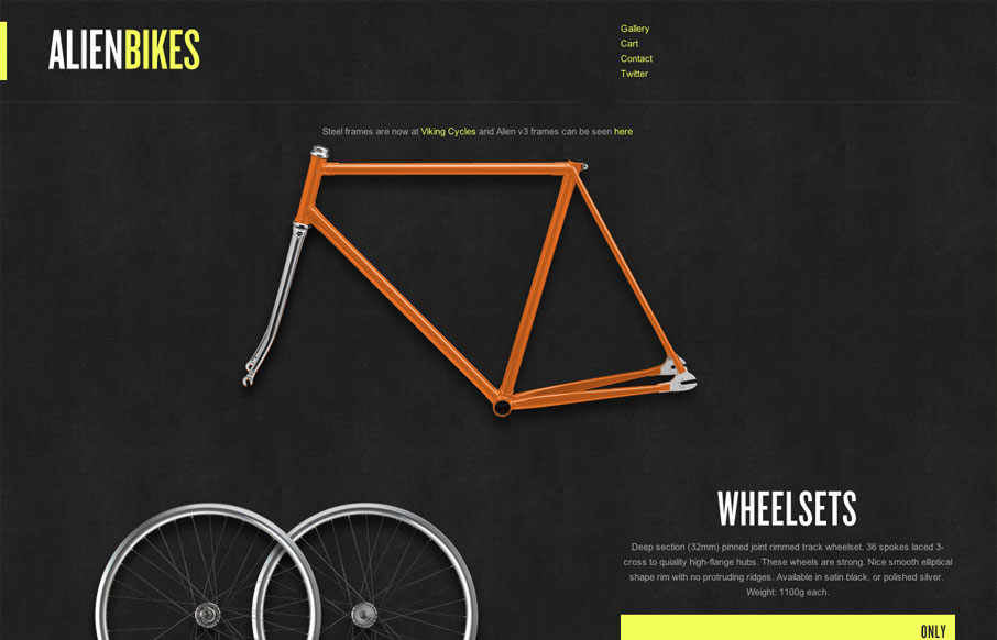
First of all, the store offers only a few items so the layout is considerably more open than most commerce sites. It breaks the mold by not thumbnailing all the products into a tight list or gallery, instead favoring a wide open view of each product so that the viewer can look at each item in detail. I also love that all of the art (pictures of the products) is completely integrated into the design. Instead of having rectangular snapshots of each product against a white background, the products have been carefully cut out. The result is a much more interesting design.
Even though the structure of each section is very similar (beauty shot, product details, and modal slideshow), the irregular shape of each product create a much more dynamic design. Its a nicely executed concept.


0 Comments