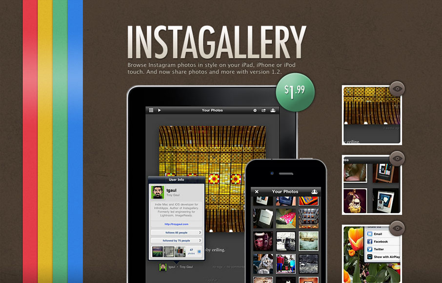
This is another one of those microsites that all mobile apps seem to have. It’s tight and simple, with minimal structure and lush textures. The vertical stripe is beautiful and gives the design a boldness it might otherwise lack. It also gives the design a slightly retro feel, which is nice when paired with the clearly modern devices which are clearly the centerpieces of the design.
The page is almost entirely static. Only a few items are clickable. In the main image, in a right sidebar, are three thumbnails. When you click on them, they switch out what the iOS devices are displaying. I really like this approach to showing the app’s functionality. It follow the principle “show, don’t tell” and demonstrates both the features of the app and it’s flexibility.


0 Comments