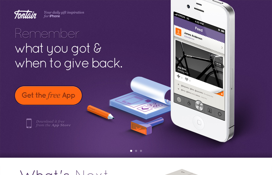
I love how all the items/things used on the page are rendered, even the iPhone. It creates a very unique vibe. I love the colors and the dark first half and light second half, it creates a nice dichotomy for the site design. I also dig the way the slideshow is used, it introduces and almost animated aspect instead of just showing more product shot. Very smart site.


The Call to Action, Revisited
The Call to Action hasn’t changed in a decade, but the bar has. A fresh look at prominence, copy, mobile tap targets, and accessibility, with lessons from three major design systems.


0 Comments