Web Design Inspiration Curated
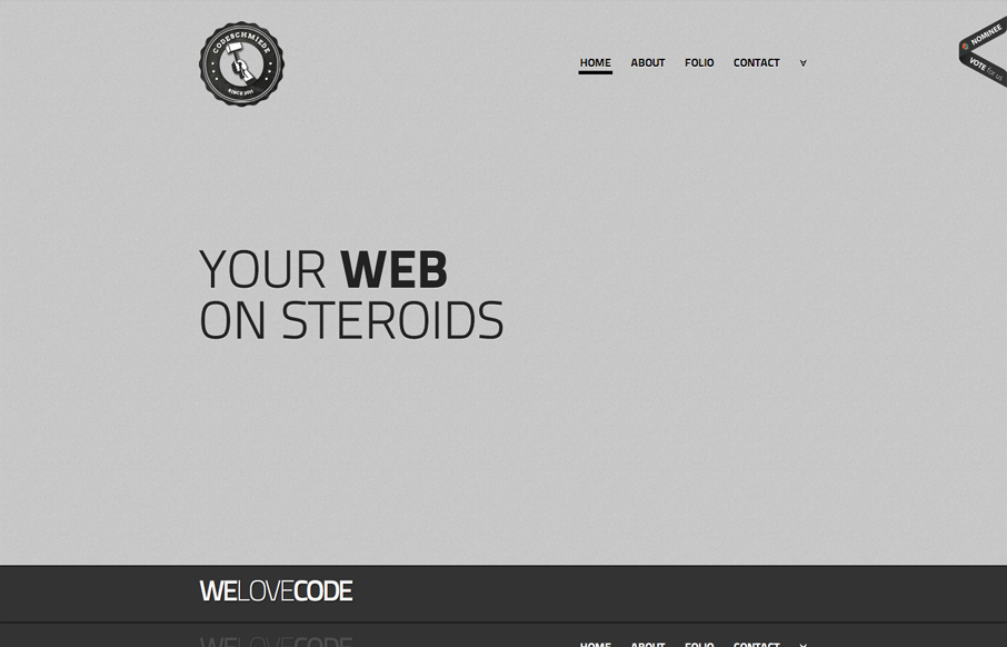
codeschmiede.de
Submitted by: Stefan Pasch @hubeRsen Role: Designer & Developer Pretty cool interaction design for the header. As you scroll or click the nav elements it goes from looking like a big open fixed area to a navigation bar that changes colors (or dark gray to white) from...
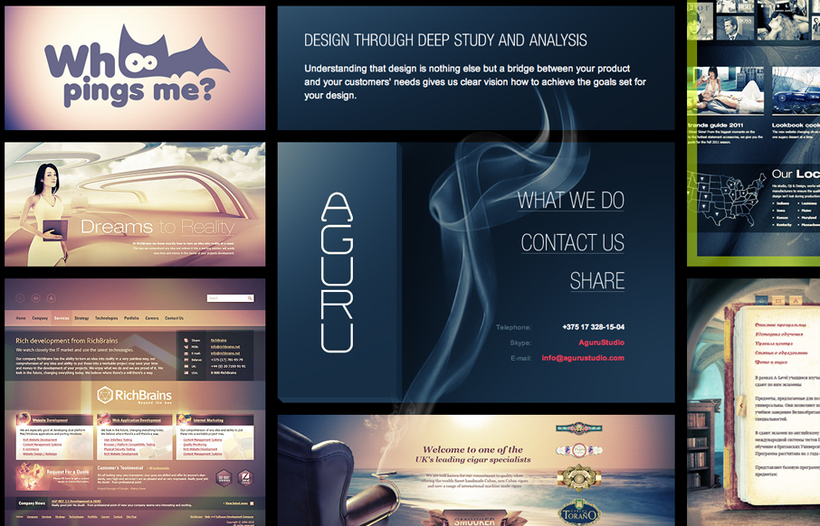
agurustudio.com
Submitted by: Steve Craw @AguruStudio Role: Designer I'm often against splash screens, but the one presented by agurustudio is really helpful and definitely improves the experience. The simple animation is easy to understand and introduces visitors to a behavior that...
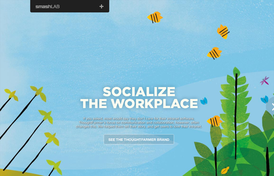
smashlab.com
Submitted by: Jen Gerullis @smashLAB smashLAB is a creative agency (based in Vancouver, Canada) with expertise in digital, brand, and advertising. It was designed in-house, employing a mobile-first responsive design using the concrete5 CMS. We really like it. 🙂 I...
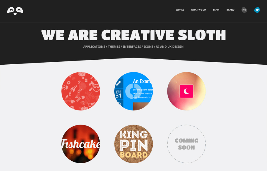
sloth.co
Submitted by: Erman Kutlu @creativesloth Role: Designer Creative Sloth is a fascinating team based in London, UK. Applications, themes, interface designs, icons, UI&UX services are better with their skills. They are creators of PICTONIC. I love the branded "slothy"...
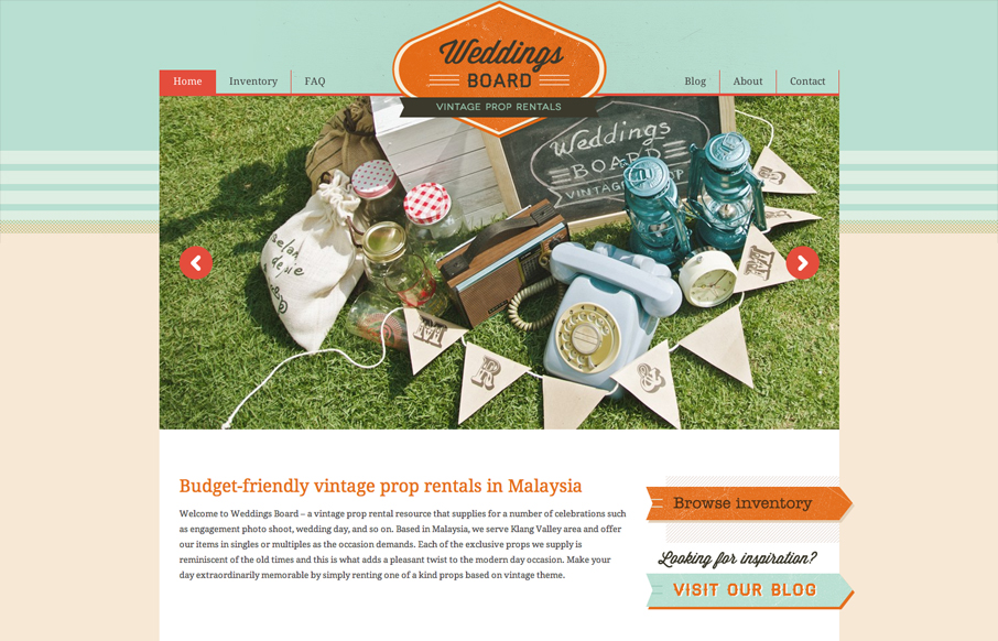
weddingsboard.com
Submitted by: Kathie @zhngdesign Role: Designer & Developer Interesting business here, vintage prop rentals for photo shoots and whatnot. With a subject like that how do you make a website that 'feels' vintage, but is still a usable website. They've done it with...
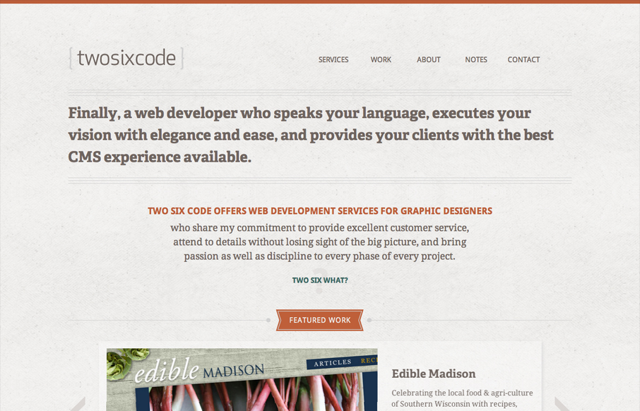
twosixcode.com
Submitted by: Alex Kendrick @twosixcode Role: Developer Designed by Cococello and built by Two Six Code . * responsive * 2x images for retina * subtle animation effects * ajax with history and deep linking (jQuery Address) * portfolio site Very nice almost minimal...
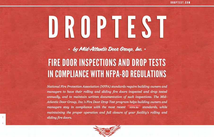
droptest.com
I love to see great client sites, and this is certainly one of the best to date. Designers often submit their personal websites and online portfolios, but only once in a while do we get an amazing site that was created for the non-web-industry. I think this site is a...
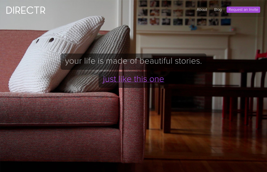
directr.co
Submitted by: Jonah Goldstein @jgmakes Role: Designer & Developer I'm pretty excited about Directr, and it was a fun challenge figuring out how to tell our story for this teaser/landing page. It ended up being a responsive one-pager that showcases a few movies (native...
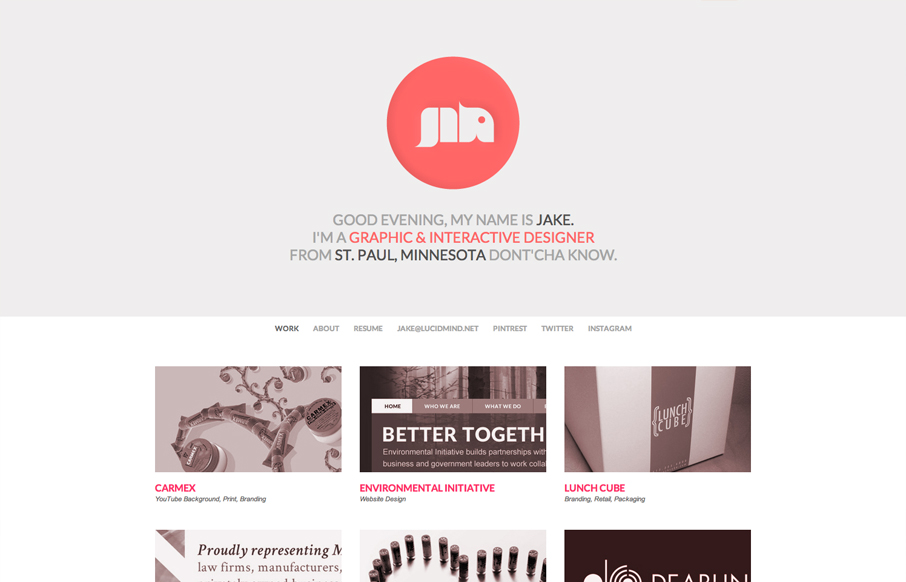
lucidmind.net
Submitted by: Jake Haugen Role: Designer Portfolio website for Jake Lee Haugen built in HTML & CSS3. Utilizes JavaScript for a tricky header that resizes when scrolling. LucidMind is a solidly built site with a great monochromatic color palette. Simple, clean, and...
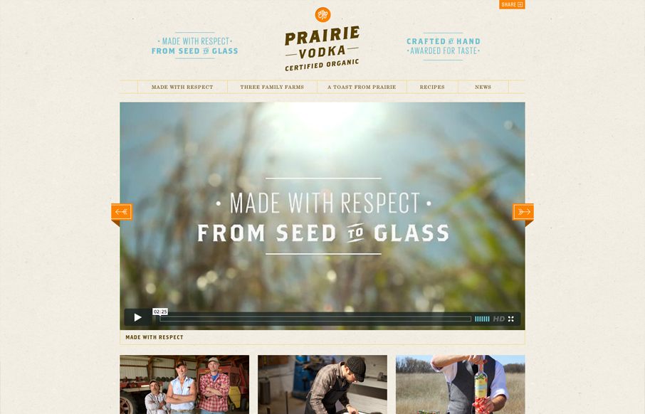
prairievodka.com
Submitted by: Charlie Hield @charliehield Role: Developer The Prairie Vodka website was a total redo from scratch. It's a fully responsive site that truly encompasses the brand. Prairie is made with respect from seed to glass. From the time it takes to grow organic...
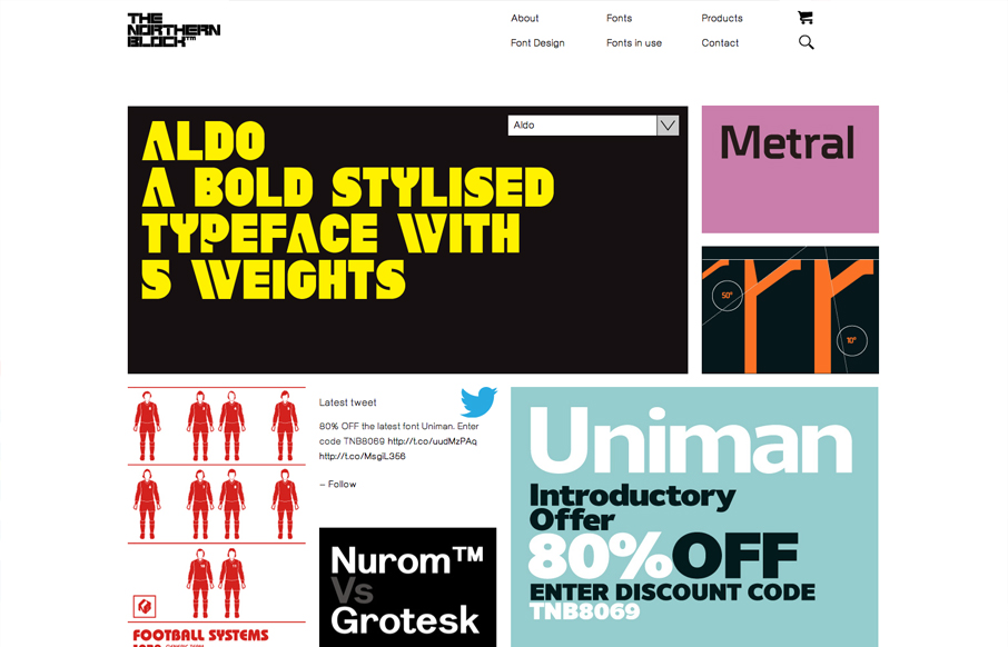
thenorthernblock.co.uk
Submitted by: Mike Stephens @WeAreRaw Role: Developer We were asked by Jonathan Hill – the man behind all of The Northern Block’s carefully crafted typefaces – to create an online home for his font foundry that would enable him to showcase, and crucially, sell his...
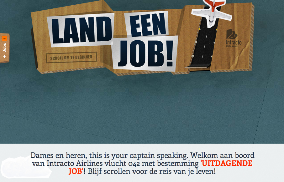
landeenjob.be
Submitted by: Maarten De Proost @intracto Role: Designer A one-page scrolling site created for a recruitment campaign for Belgian digital agency Intracto. The ‘airlines’ theme came from the term ‘landing page’, which it actually is. Hence the title of the campaign...
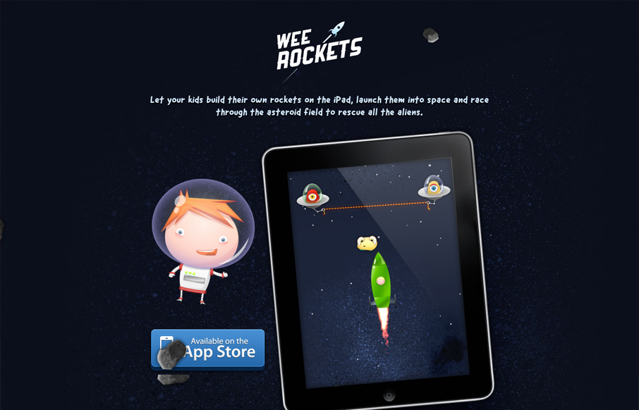
weerockets.com
Submitted by: Paddy Donnelly @paddydonnelly Role: Designer Let your kids build their own rockets on the iPad, launch them into space and race through the asteroid field to rescue all the aliens. Holy frijoles, that is adorable! I love the art and the subtle 'drifting'...
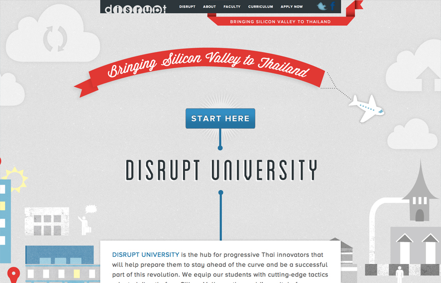
disruptuniversity.com
Submitted by: Matthew Seccafien @studiocartogram Role: Designer & Developer Disrupt MBA is a four week accelerated transformative experiential learning program. In just one month they expedite you from your creative idea to your innovative start up, and give you the...
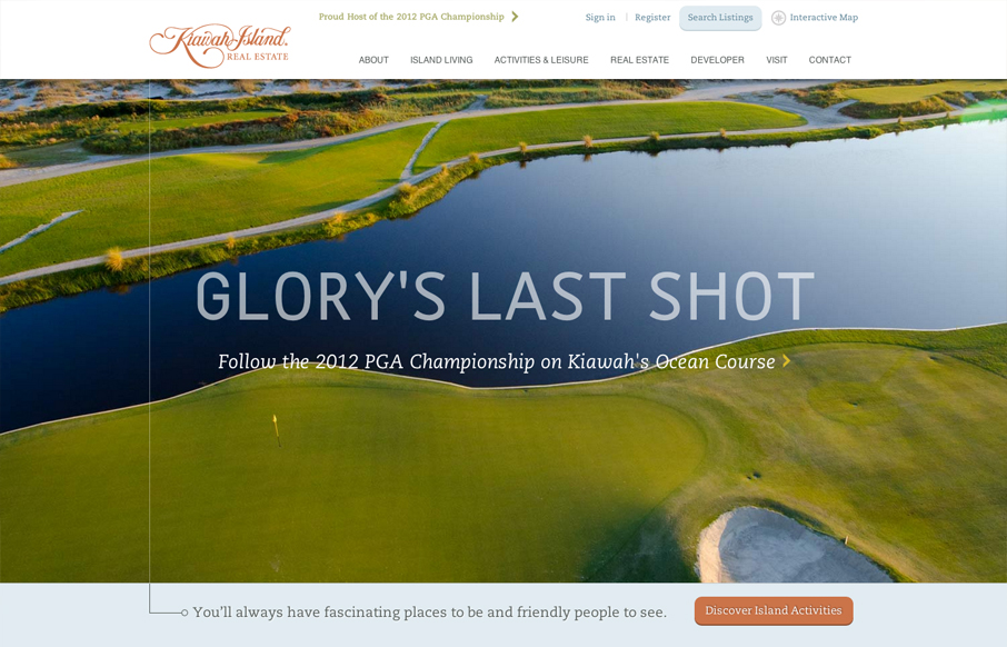
kiawahisland.com
Another great website from the fine folks at e house studio with kiawahisland.com. My favorite part is how the nav is fixed until you get a to a certain target point in the page, then folds up into the top of the page. I also like the change from rectangular imagery...
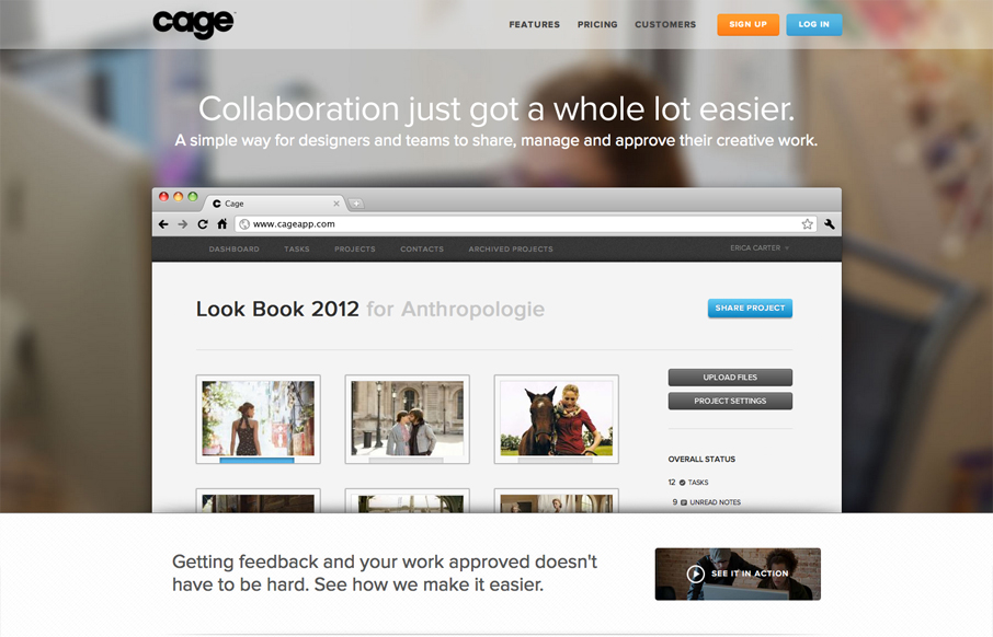
cageapp.com
Name: Sandip Patel @cageapp Role: Designer & Developer Cage is an online collaboration tool that provides a secure environment for creative teams in web, mobile, print, video, design, 3D and motion graphics to easily present their work for feedback and approval. It...
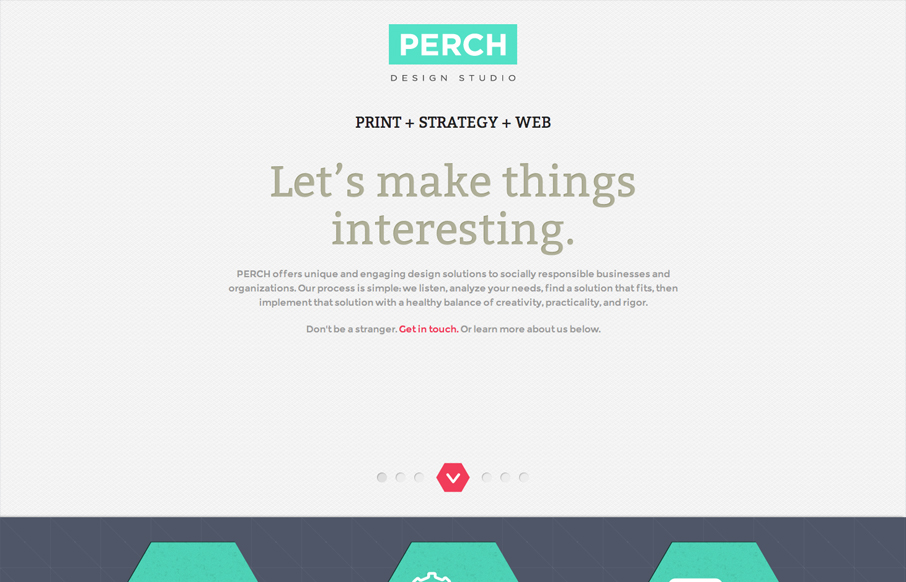
perchmade.com
Name: Stacy Kim @perchmade Role: Designer & Developer Although this website is fairly complete—we really consider this a one page splash page—a precursor to the full website. The design is simple and focuses on color and typography. This may be just a one page...
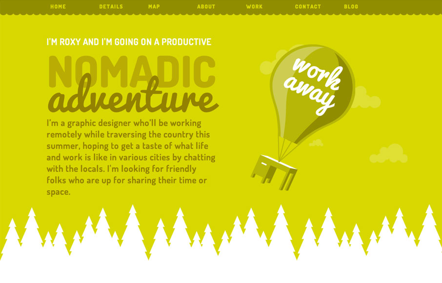
roxannekoranda.com
Just a great consistent feel across all elements of this single page website. The illustrations and colors have a really nice feel and it comes off as very welcoming. I like that it is responsive, specifically how the images resize and the choices made there between...
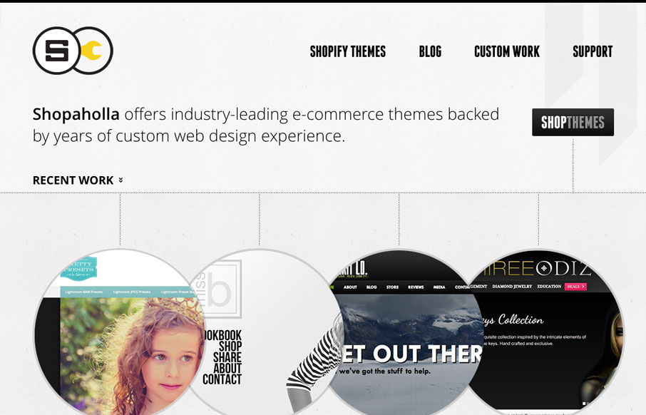
shopaholla.com
Posted by: Andrew Johnson @and_rwj Role: Designer & Developer This website looks pretty dynamic on first viewing. It has circular shapes were traditional squares would be used, there's also lots of great little interactions across the page. I especially like the page...
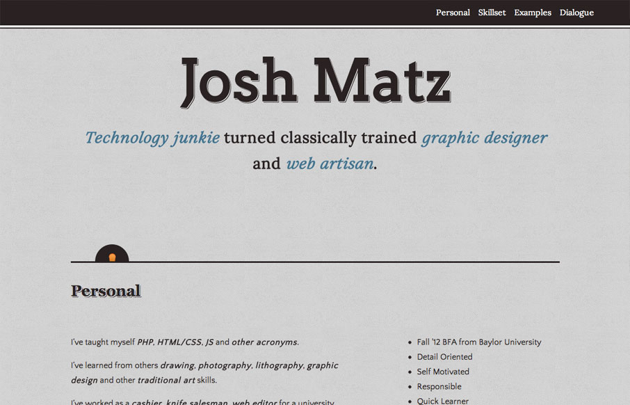
joshmatz.com
Submitted by: Josh Matz @joshmatz Role: Designer & Developer Overall another fairly simple design but I liked some of the responsive design decisions and I also like the little interactions that have the surprise questions about Josh. That kind of stuff really...
EMAIL NEWSLETTER
News & Articles
unmatchedstyle
Sexy Drop Down Menu w/ jQuery & CSS http://bit.ly/93YK7 #ums
unmatchedstyle
Great post by 45royale covering a couple of important client work questions. Good stuff! http://bit.ly/1418AB #ums
unmatchedstyle
Pretty nice resume HTML template. http://sampleresumetemplate.net #ums

HARD WORK. CLEAN FUEL. NO EXCUSES
Use “WARRIOR2023″ for 10% off.