
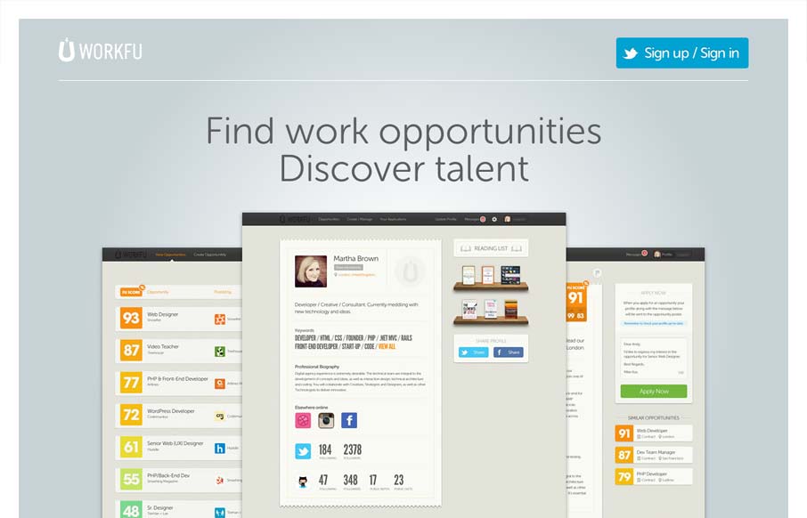
Really minimal product site design. I think the way they’re showing the product screens off is superb like this. I also like the way they’re treated as you size the screen down too. Super simple signup process too using twitter. I’d love to hear how that’s helped conversions if there is comparative data on a before and after of using twitter solely for signup/sign in.


Fitts’s Law: Why the Easy Button Wins
Large, close targets are faster to hit than small, distant ones, that’s Fitts’s Law. A look at the 1954 rule behind buttons, prime and magic pixels, thumb zones, and dark patterns.


0 Comments