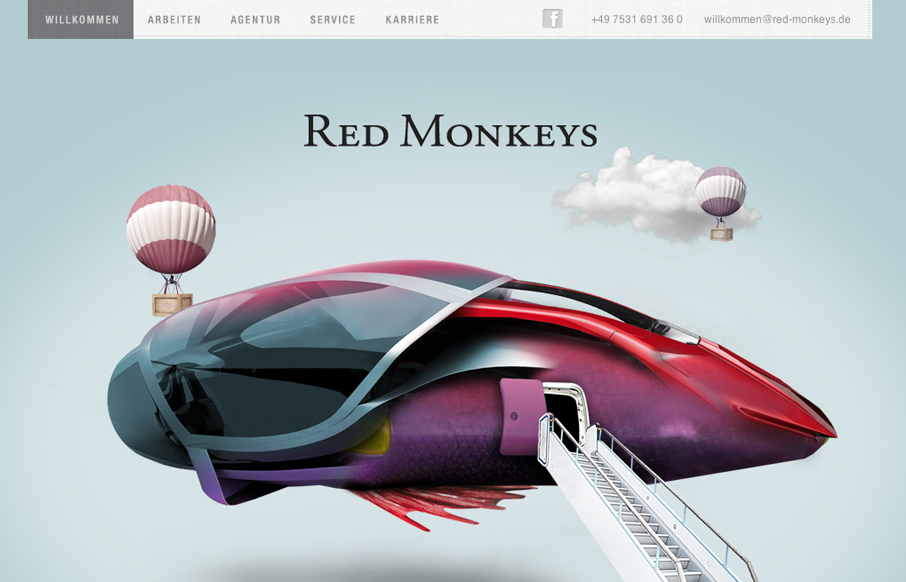
Nice mix of fantastical illustration and parallax here. It’s fun and keeps you engaged with enough eye candy then the visual structure behind it delivers what it needs content wise. One little detail I both like and dislike is the tool tip that shows the “scroll” icon. I get it that you want to make sure we know to scroll, that’s smart, but on the other hand I wonder how confusing it can be to your average visitor. Worth a thought I think.


The Call to Action, Revisited
The Call to Action hasn’t changed in a decade, but the bar has. A fresh look at prominence, copy, mobile tap targets, and accessibility, with lessons from three major design systems.


0 Comments