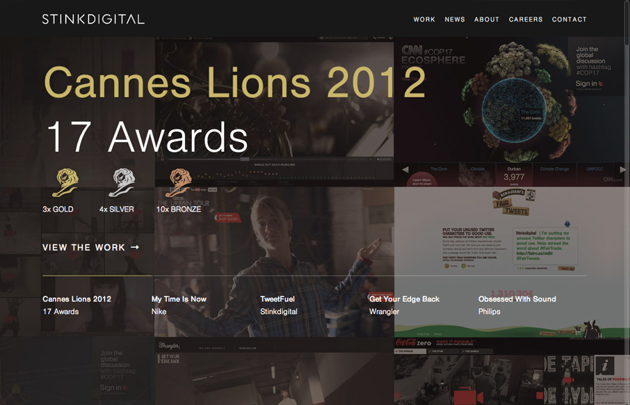
Really love the parallaxy effect with the background images and the main text/copy on the home page it makes a nice stark difference between the home and sub pages. THe use of different colors for each sub page is nice overall design decision too. The website feels pretty epic with just a couple low-tech type design choices and that’s just sweet to me.
Glassmorphism: The Transparent Design Trend That Refuses to Fade
Glassmorphism brings transparency, depth, and light back into modern UI. Learn how this “frosted glass” design trend enhances hierarchy, focus, and atmosphere, plus how to implement it in CSS responsibly.


0 Comments