Web Design Inspiration Curated
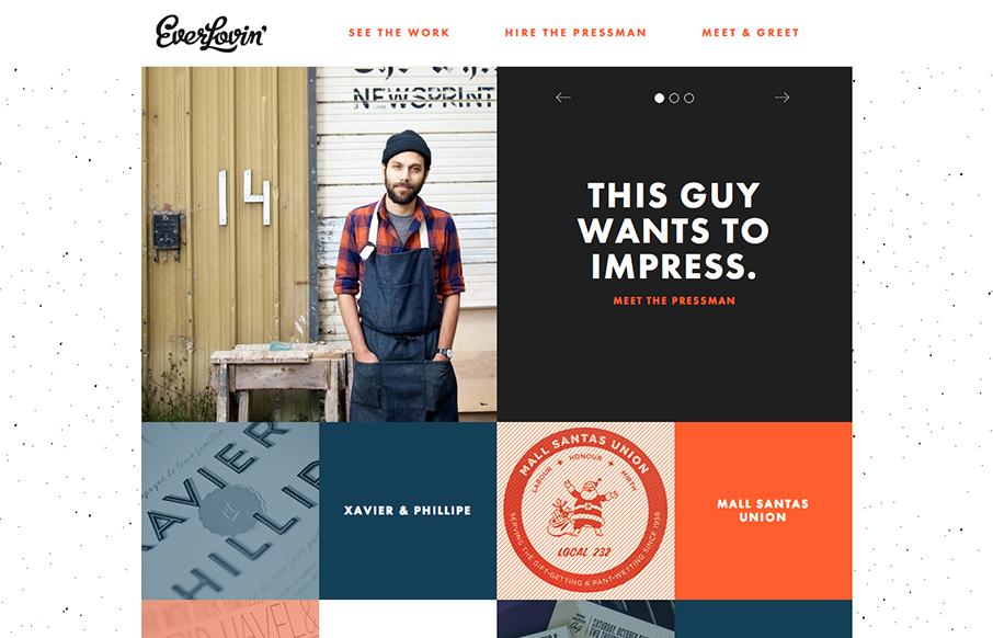
Everlovin’ Press
Great layout and photography really helps tell the story of this letterpress shop/guy. A lot of character comes out when you get something printed by hand like this shop does so the website naturally has to carry that same level of care and love right? I'm pleasantly...
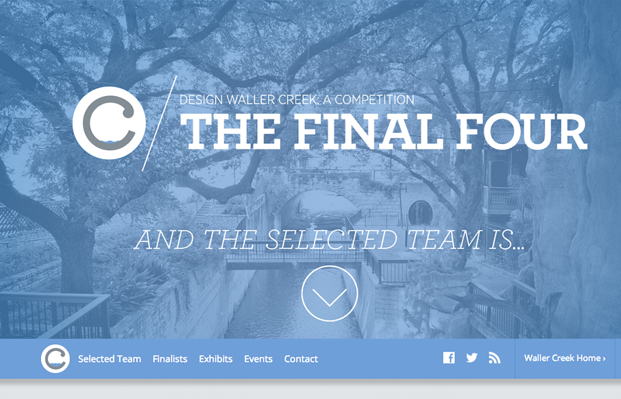
Waller Creek Final Four
There is so much richly constructed simple interaction here to check out. I love it. I like the simple organization and feel of the site but with nice little animations and extras on the details.
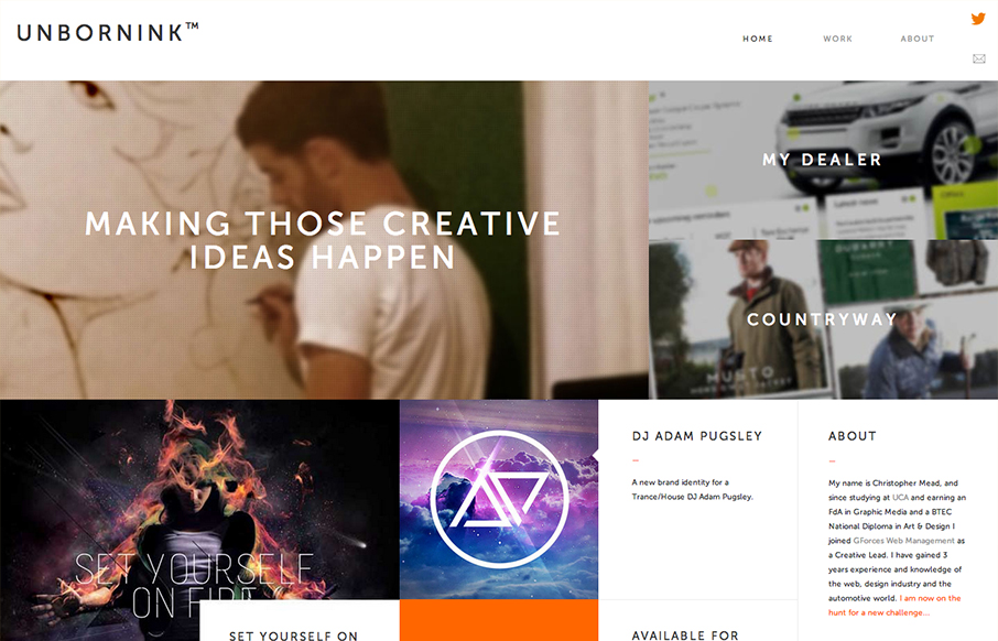
Unbornink
Man, at first glance I totally thought this was as website for a high end design agency only to discover it's basically just a portfolio for one person. That's impressive to me because it's not just the look that pulled me in, the the presentation of the work and...
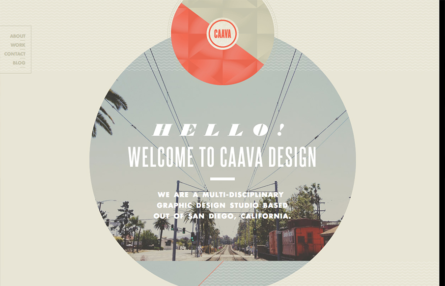
Caava
Nice touches here and there make this a really interesting site design. I really dig the big circle with the image in it and how it stays put as you scroll. I've seen that before but it feels fresh here.
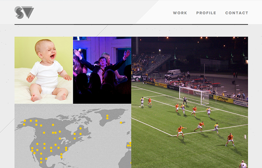
Stevevorass
Great simple but bold graphic website. I dig the grid and the way the responsive system works for this site. The portfolio section is great too with the way they demo the designs.
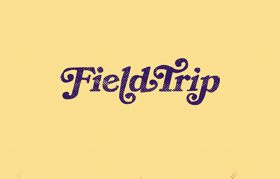
FieldTrip
Lovely home page design. With the split/slide in animation of the creative tools as you slide down the page the site immediately feels activated. I think that's the point given the subject matter and way the FieldTrip conference is supposed to play out. Just read the...
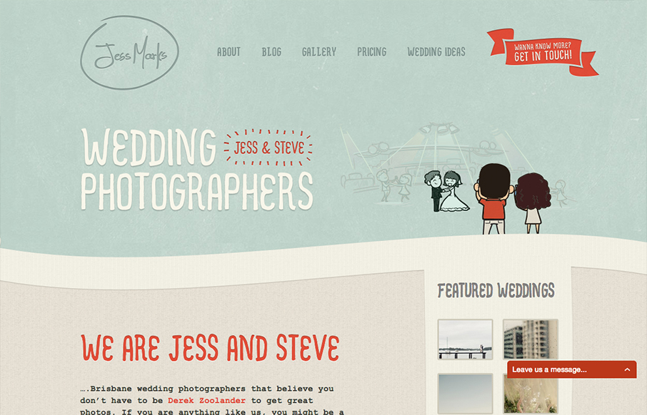
Jess Marks
I love these colors, they feel so soft and welcoming and perfect for the subject matter. The little slideshow/animation of the scenes helps you understand really quickly what the site is all about if you don't notice the large type "wedding photographers" - I mention...
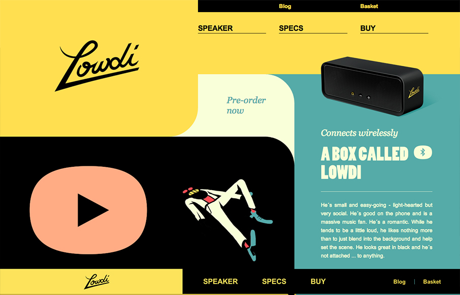
Lowdi
The design is a nice example of an asymmetrical design that leads to a symmetrical as you scroll down. I like that balance. Nice colors and interactions make this a well rounded design that's going to be memorable.
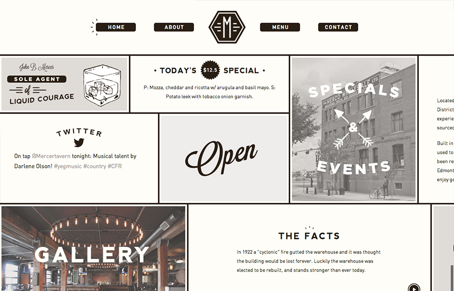
Mercer Tavern
Interesting single page design. It scroll sideways which gives it an extra push of into making if "feel" really graphic. Not sure that makes sense, but it did in my head. I'm not normally a fan of tricks like this side scroll design here. But for some reason it just...
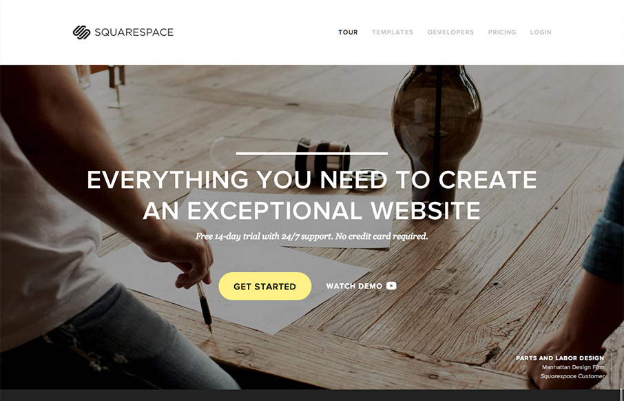
Squarespace
The Squarespace product website is simply a thing of beauty. Richly designed and executed with system screenshots and great photography. It's a long page that scrolls forever but it's full of useful product info and tells the narrative of using Squarespace superbly....
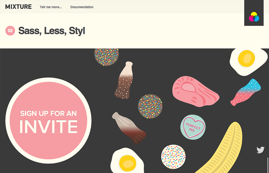
Mixture
Really looking forward to checking Mixture out, but until then we have to live with their documentation only. A nice looking temp site with all the illustrations and clean type. Love it.
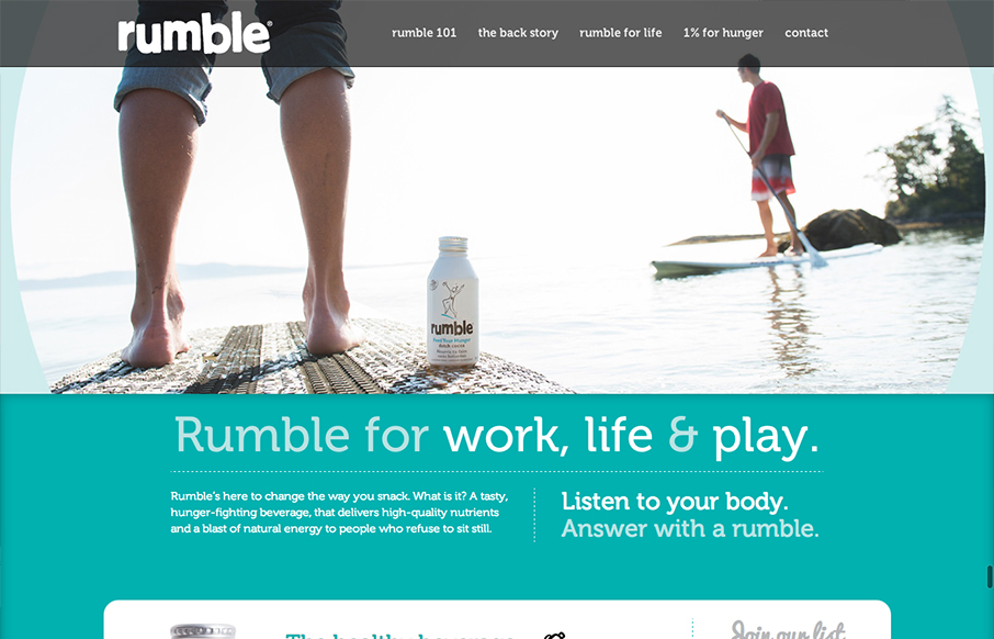
Rumble
Some nice interactions help tell the story of Rumble. Literally the animations look like things "rumble" or shake. Clever. Overall I dig the single page layout and fixed header, encouraging scrolling by the placement of large graphic objects.
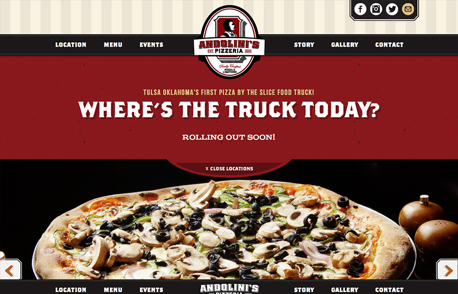
Andolini’s Pizzeria Food Truck
Submitted by: Forefathers Group @forefathers Role: Designer Tulsa Oklahoma's First Pizza By The Slice Food Truck! Another great Food Truck site from the Forefathers Group. I love these guy's work. This one is another fine example of what a restaurant website should...
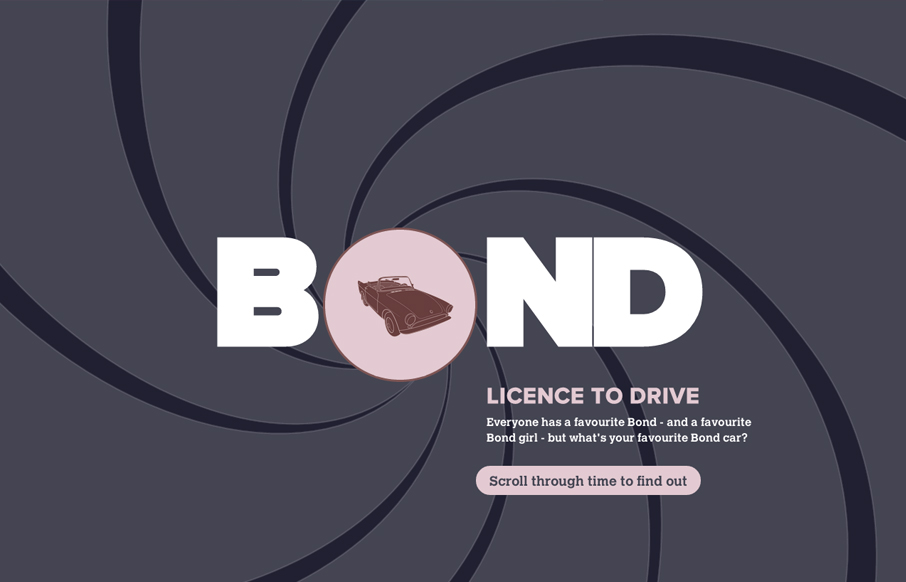
Bond Licence to Drive
Submitted by: Evans Halshaw Role: designer Everyone has a favourite Bond - and a favourite Bond girl but what's your favourite Bond car? This interactive guide from Evans Halshaw traces the entertaining evolution of 007's cars. Super cool illustrations of the Bond...
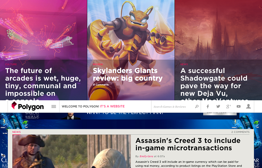
Polygon
Very nice responsive website design. I like these web based magazine sites the Verge is the center of. Polygon is no exception. I like the header that slides up to a fixed position, once highlighting the top three stories then getting out of your way as you scroll....
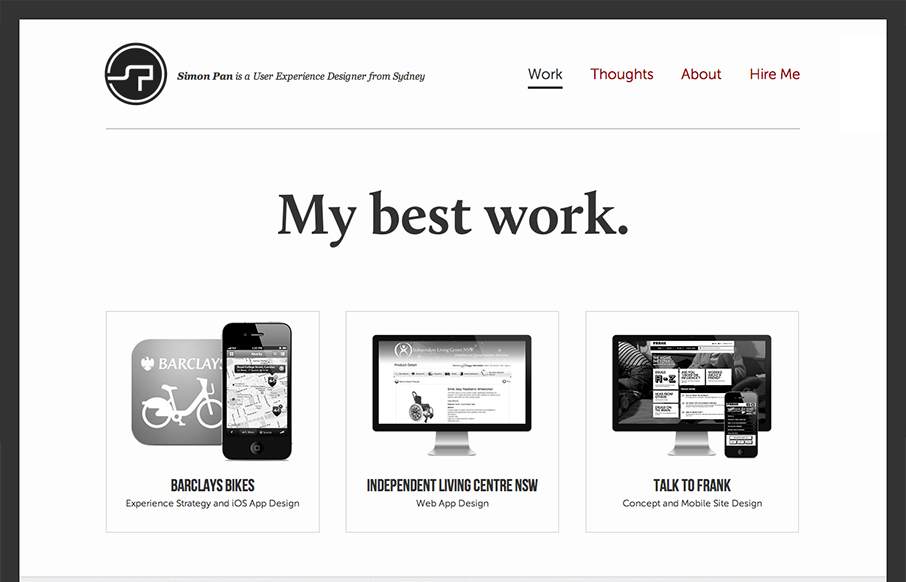
Simon Pan
Submitted by: Simon Pan @span870 Role: Designer & Developer Creating a site about myself was a challenging task. I aimed to craft something that arouses trust from my users through a pure and sincere presentation. My aims were to strive for a timeless aesthetic,...
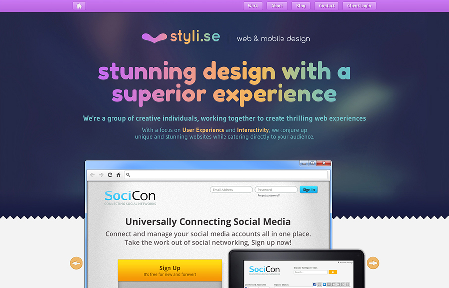
Styli.se
Submitted by: Brinton Boehm @styli_se Role: Designer & Developer We're a group of creative individuals making thrilling web experiences. We create stunning websites that cater to your audience. Nice smooth experience from desktop to mobile here on Styli.se. I like the...

Chris Seddon
Submitted by: Katherine Cory @katherinecory Role: Designer Cool take on a photography site. I like the parallax approach with the imagery too, it activates them in a very positive way. The background is pretty mute which makes the photos really stand out on top of it....
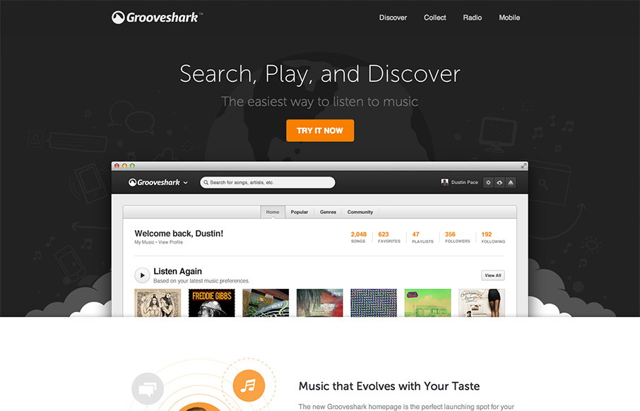
Grooveshark
Submitted by: Matt Brothers @grooveshark Role: Designer & Developer Landing page for early access to the new Grooveshark redesign. Nice new design update for the Grooveshark experience. I understand this to be a gateway to get to the updated Grooveshark. It's nice and...
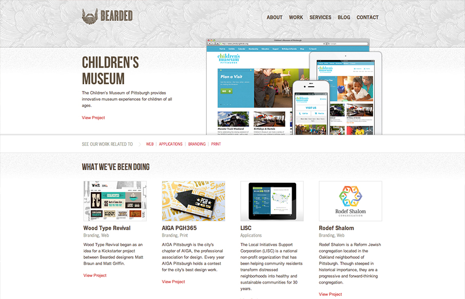
Bearded
Nice clean design with a nice background pattern to break it up and keep it visually active. I like the strong/simple grid underlying the design too. The best part about the site IMHO is the responsive work. The nav is a typical horizontal words based nav but when...
EMAIL NEWSLETTER
News & Articles
Designer Interviews: Thoughtbot.com
![]() Discussion with Kevin Burg & Fred Yates of Thoughtbot.com about their design process.
Discussion with Kevin Burg & Fred Yates of Thoughtbot.com about their design process.
ConvergeSC Design Presentations
Earlier this year, June 27th (and we're doing it again in 2010!) we had the honor of being part of pulling together a great conference, ConvergeSC. There were many presentations that day, you should try to check them all out. There were three presentations that...
Yahoo Developer Network update with Jonathan LeBlanc
In this podcast/interview Gene sits down via Skype with Jonathan LeBlanc of the Yahoo Developer Network to get an update on what they have going on. Show notes: Here's some useful links from the interview: Yahoo Developer Network: http://developer.yahoo.com Open Hack...

HARD WORK. CLEAN FUEL. NO EXCUSES
Use “WARRIOR2023″ for 10% off.