Web Design Inspiration Curated
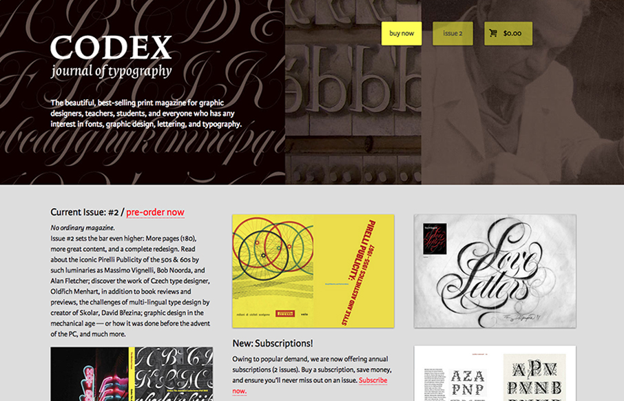
Codex Magazine
The Codex Magazine website is beautiful. I love the blocks of content on the home page, it's clear and concisely laid out and all so well balanced. It feels a little asymmetrical but completely balanced evenly. It's also a really nice mobile layout down to the iPhone...
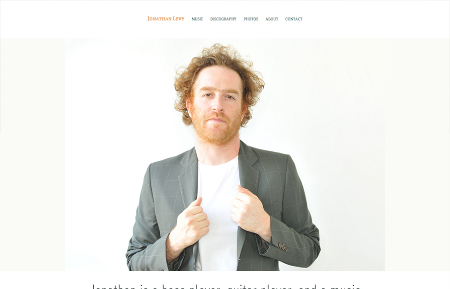
Jonathan Levy
Website by yaronschoen.com The Jonathan Levy site is simple clean and clutter free. I really dig the main photos and how they are carried through the pages of the site, they help sell the character and vibe of the man. I wonder if it was a special photo session just...
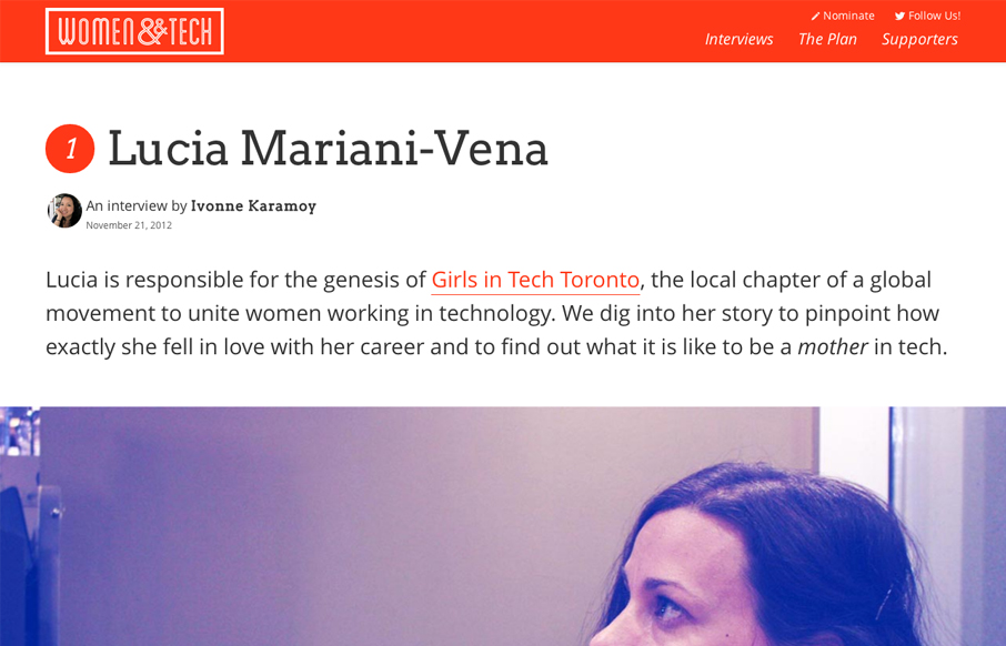
Women & Tech
Brilliant layout for the Women & Tech website. It's a gorgeous long form narrative based content site with a responsive wrapper. I love it. It's also a really great service for the community at large.
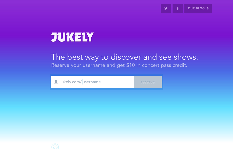
Jukely
We don't normally post a lot of coming soon pages or signup form pages like this. However, the Jukely interactions are well done and actually spur on the desire to use the signup form. It's fun and inviting and creates a nice little moment of delight all with it's...
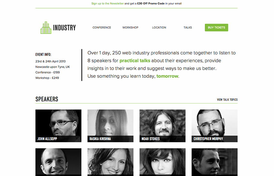
Industry Conference
Really nice clean minimal(ish) web design conference website. I like the subtle changes that happen as you scale down the site to smaller screen widths. It's really straight forward and that makes it beautiful to me.
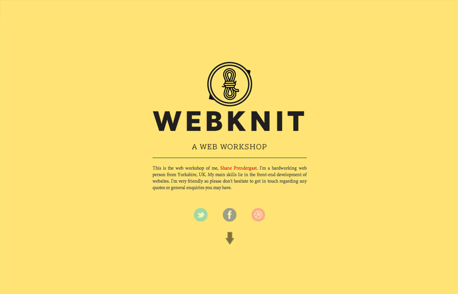
WebKnit
Submitted by: Shane Prendergast @webknit Role: Designer & Developer I kind of like this take on having a splash page. The top portion with the animation basically works as a splash page, then you scroll down to immediately see the portfolio - thus negating having a...
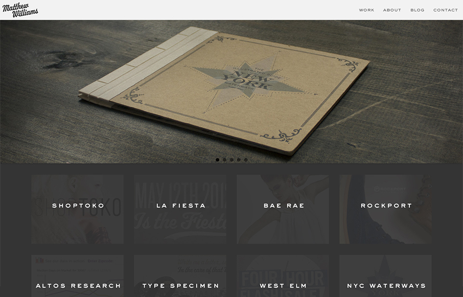
Matthew Williams
Maybe it's the colors or the photos that are used in the main slideshow but this design just feels "hand-made" (like, I know it was made by someone, but i'm talking about that hand-made aesthetic). It's really well done, with the attention paid to the imagery in the...
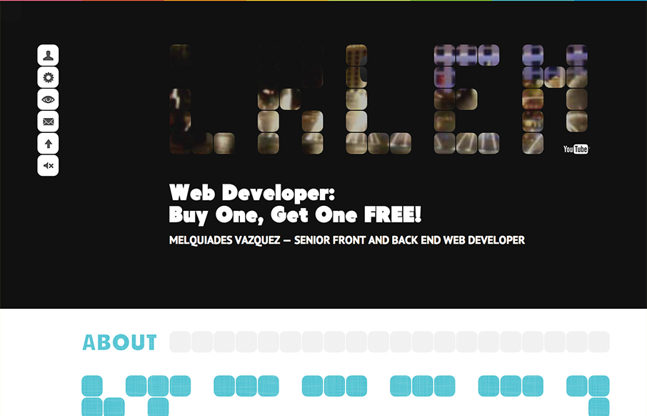
Melquiades Vazquez
Submitted by: Melquiades Vazquez @melvc Role: Developer Basically in my portfolio everything is based on a 50px by 50px square, you will know what I mean as soon as you see it. I've used html5, responsive design and jQuery animations. I really dig going with a theme...
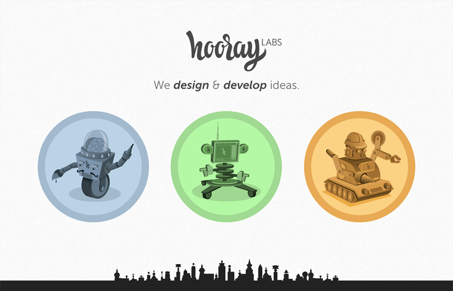
Hooraylabs
Submitted by: Christophe dumont @hooraylabs Role: Designer & Developer Really simple page here. Honestly there's not much, but boy what's here is fun and smart. I love the city scape with the airplane animation.
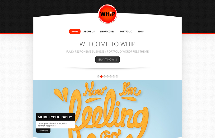
WHIP WordPress Theme
We don't post too many theme designs here on UMS. I happen to like this one on it's design merits alone. The circle design elements work really well to me once you get past the main hero image/slider. I can take or leave the main navigation design but it's all well...
Vito Salvatore
Submitted by: Vito Salvatore @vitosalvatore Role: Designer & Developer I'm Vito Salvatore an Italian Digital Designer/Art Director based on London. This is my portfolio website. Here are showcased all my works: websites, photo, graphics, and more... This website is...
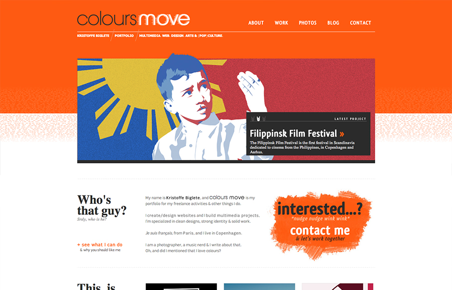
Colours Move
Submitted by: Kristoffe Biglete @kristoffe_ Role: Designer & Developer Colours Move is a portfolio, and has a minimalist design, with a strong visual identity. The palette is very contrasted, with a mix of bright and light colours. It is conceived in a grid layout. I...
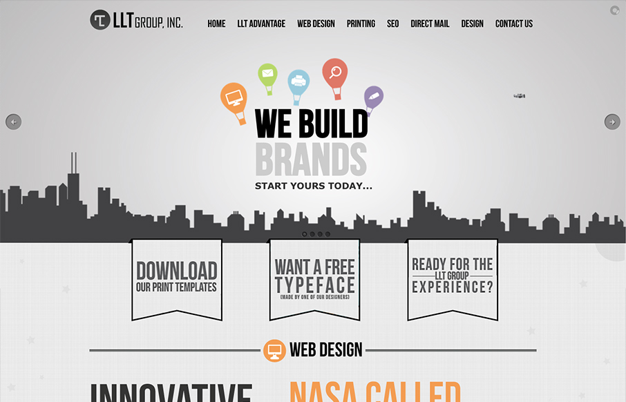
LLT Group
Submitted by: Tony Zipparro @LLTGroup Role: Designer I do like the bold graphic look of this design. The strong leaning illustration work and type works well together. They also bring it pretty well with copy and packaging themselves well. The message might be a bit...
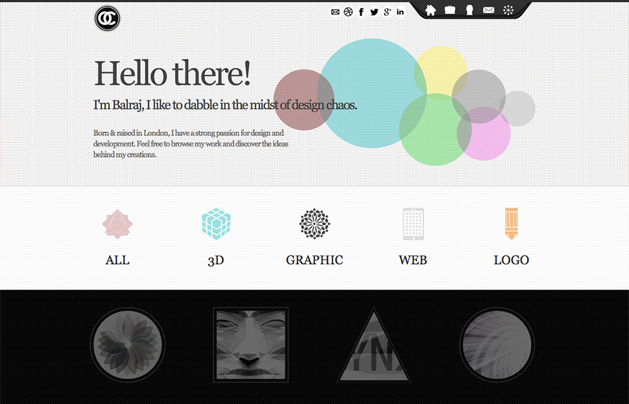
CircularChaos
Submitted by: Balraj Chana @circularchaos Role: Designer I like how all the links and sections are presented in this design. The icons and mouse overs are nice. I also really dig the experience section towards the bottom of the page.
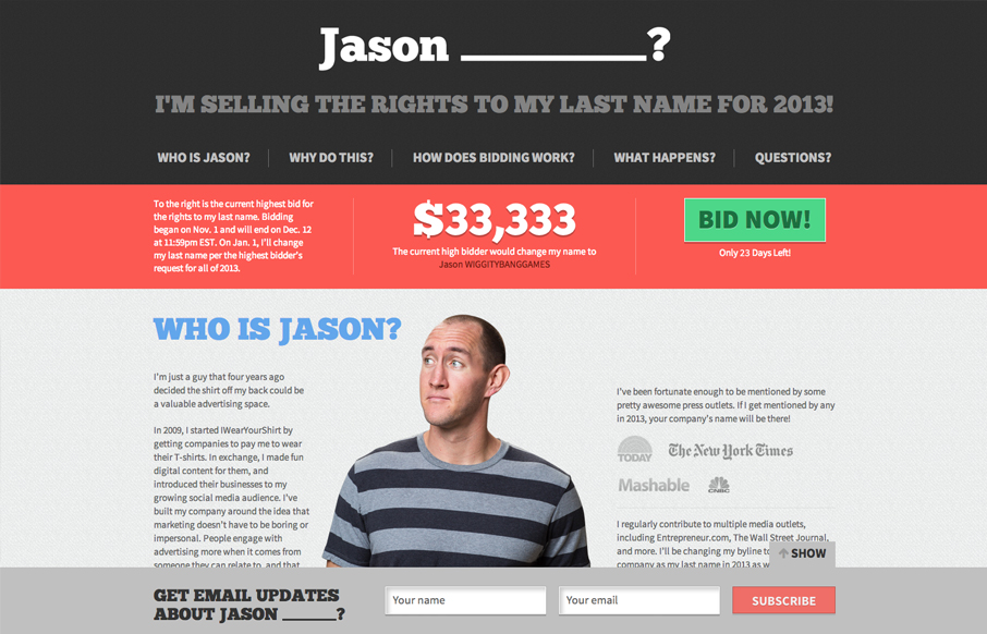
Buy My Last Name
Jason is crazy. But Jason has a cool website. I like the colors most of all they're very inviting and mixed with the imagery it works really well. Good choice on keeping it a simple one pager too. Nice!
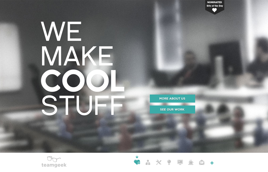
teamgeek
Nice prototypical type design but I like the minimal palette and the fixed nav interaction. Nice icons and general look and feel.
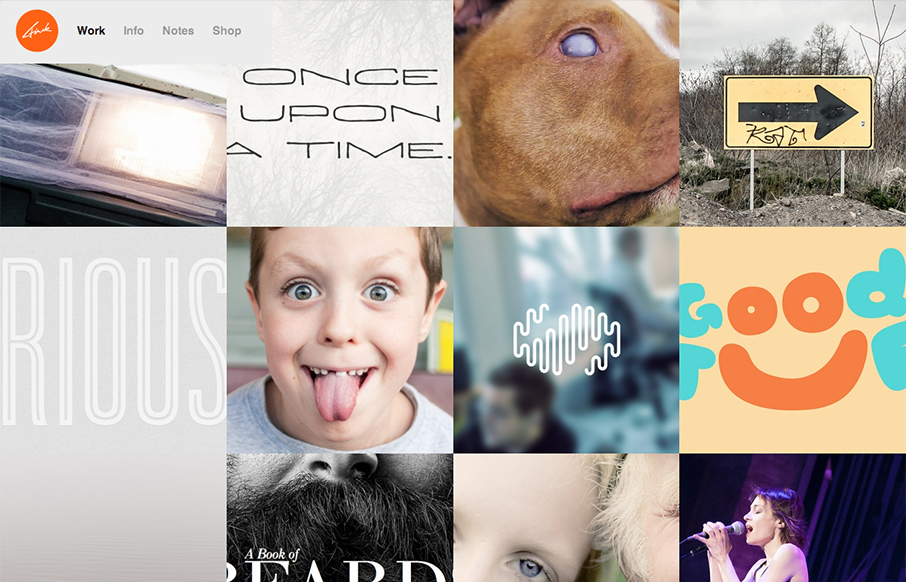
Tyler Finck
This site is a great example of setting the user up for great surprises. The home page is slick but rather minimal in it's appearance but you are treated to all sorts of cool images and a nice layout when you get to looking at the portfolio and about page(s). Well...
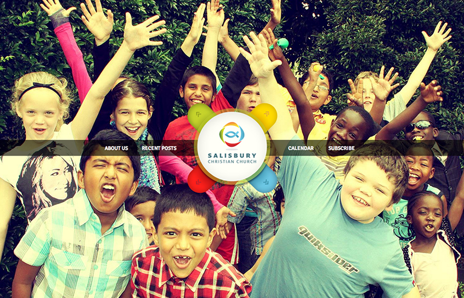
Salisbury Christian Church
This is an interesting problem to solve. There are several networks or resource website and then a few sub-page type sections that all have to be tied together. This solution, using this page as a hybrid splash page of sorts, with an interesting interaction for the...
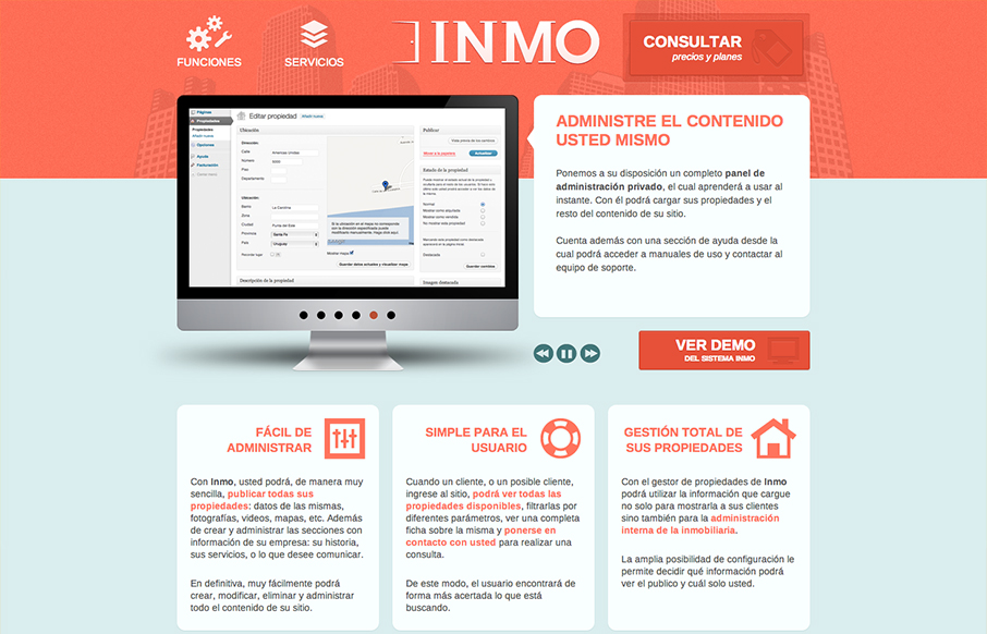
Inmo
There's not a ton of interactivity or special effects going on with this design, it's just a nice reminder for me that you can always make a nice solid simple design in and of it'self. I love the crisp icon/illustration work for the nav items and that header with the...
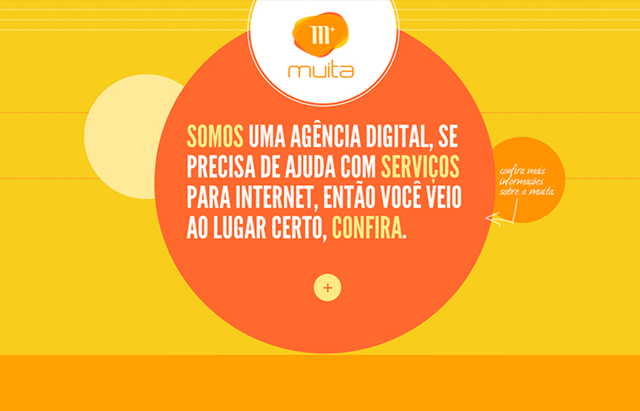
Muita
Bold colors and simple copy help sell this company even if I can't speak the language. It's a nice simple yet bold interaction design that has a nice feel to it. I like the little contact envelope that rolls out to be more info in the bottom right the most.
EMAIL NEWSLETTER
News & Articles
Designfruit exclusive Photoshop brush giveaway
 Designfruit has offered up a set of 38 royalty free Photoshop brushes for the UMS community to use.
Interview with Bastian Allgeier creator of Zootool
 Bastian and I talk about his creation Zootool. What went into it, how he came up with the idea for it and we also discuss the hurtles and issues he’s facing while trying to turn idea into a commercially viable product.
How to Stay Busy – And Profitable – In a Choppy Economy
I work with enough designers to know just how painful the current economic downturn has been to the other half of the creative community. For every project that goes forward, it sometimes seems like three or four are being postponed or canceled altogether. But that...

HARD WORK. CLEAN FUEL. NO EXCUSES
Use “WARRIOR2023″ for 10% off.