
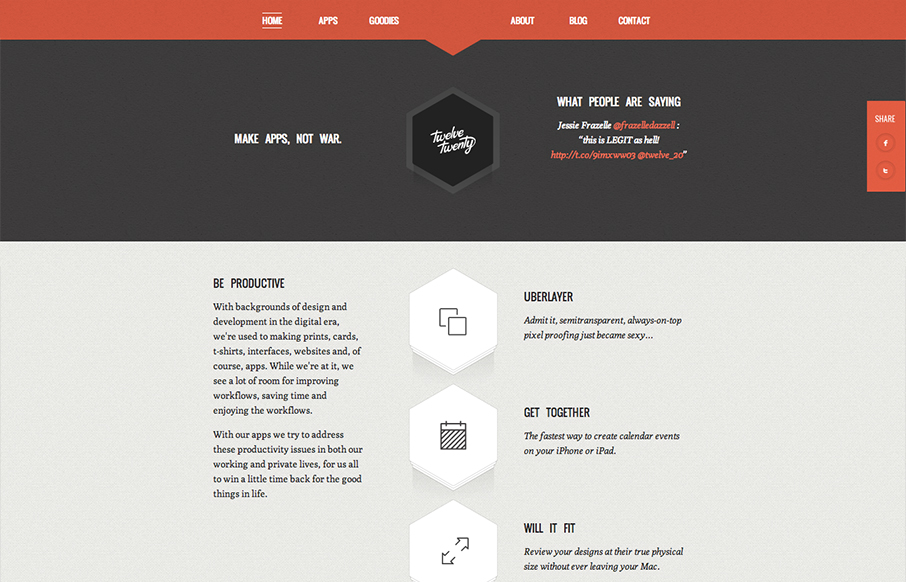
Really tightly designed website for Twelve Twenty. The little interactions that happen when you mouse over the icons are nice and keep you interested. The overall sharpness and minimal approach of the design mixed with limited color palette make it kind of stick out.


Fitts’s Law: Why the Easy Button Wins
Large, close targets are faster to hit than small, distant ones, that’s Fitts’s Law. A look at the 1954 rule behind buttons, prime and magic pixels, thumb zones, and dark patterns.


0 Comments