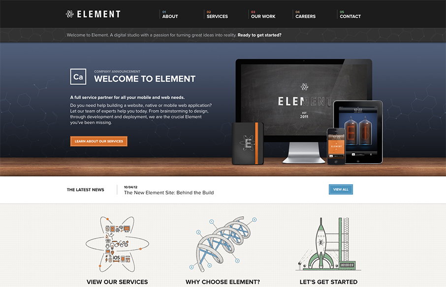
Element has just launched a really well done site. It has all the fancy bells and whistles of a hero carousel, responsive design, and snazzy graphics. What I really appreciate though is how overall what they’ve done is create a mature and solid brand experience. To me, the call to action here is less about the quick sell, and more about the discovery. I get the sense that every detail was poured over and that directly reflects how they’ll help those ‘happy clients achieve global domination.’


The Call to Action, Revisited
The Call to Action hasn’t changed in a decade, but the bar has. A fresh look at prominence, copy, mobile tap targets, and accessibility, with lessons from three major design systems.


I completely agree with you Maria regarding all of the little details Element put into their redesign that puts a strong work quality to their brand. My favorite thing about this new design would have to be their fun retro-nuclear illustrations.