Web Design Inspiration Curated
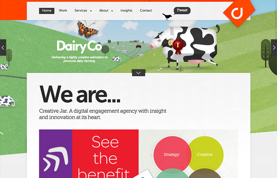
Creative Jar
Dern. This site has a lot going on at once. I really like to see designs that push conventions into new territory and creativejar have done that in a few ways. The layout of the homepage content is modular, but only loosely structured. This is interesting, but if...
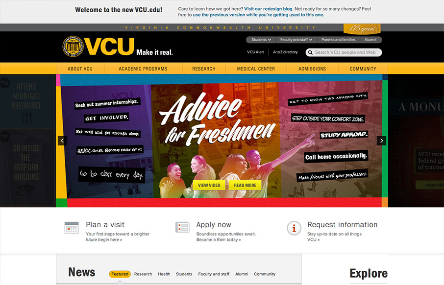
VCU.edu
The new VCU site (specifically the home page) is chock full of info that's nicely organized and presented. Despite all that's going on here, I feel like they struck a good balance between practical and promotional elements. Even more impressive is the publicity of the...
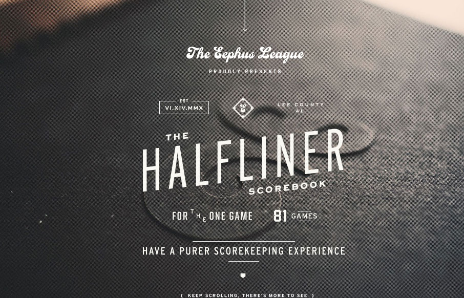
The Eephus League
The Eephus League website is damn pretty. When you get down to it, the site is fairly simple and straight-forward: big, lovely imagery, interesting throwback typography, and just enough small details to keep things interesting; but simple and straight-forward does not...
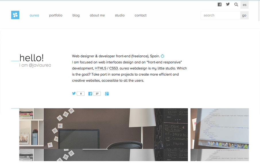
aurea
Aurea is simple, clean and highly readable. I really enjoy the minimal palette and open layout. It's a tight design with lots of contemporary details and a well designed aesthetic. Very nice. Cute dog too.
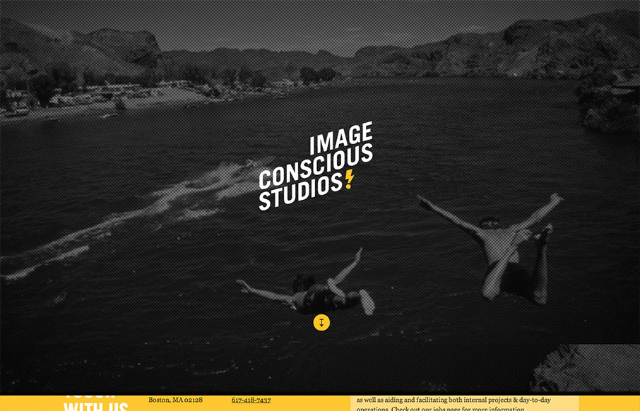
Image Conscious Studios
This site is a beautiful mix of energetic, graphic type and low fidelity imagery. The effect is a highly dynamic scrolling experience with small blocks of content flowing by in counterpoint to large dramatic imagery. I enjoy the sense of humor and technical savvy. The...
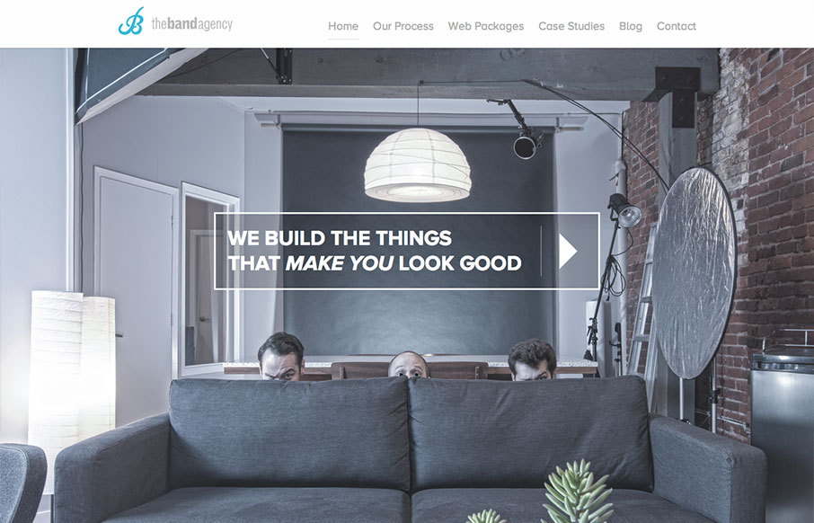
The Band Agency
I don't know these guys, but I already love them. This site is funny as hell, but serious. I take them seriously. Seriously.... But seriously, the design has more character and fun that you can shake a stick at. And it looks good at all sizes. And it's well designed....
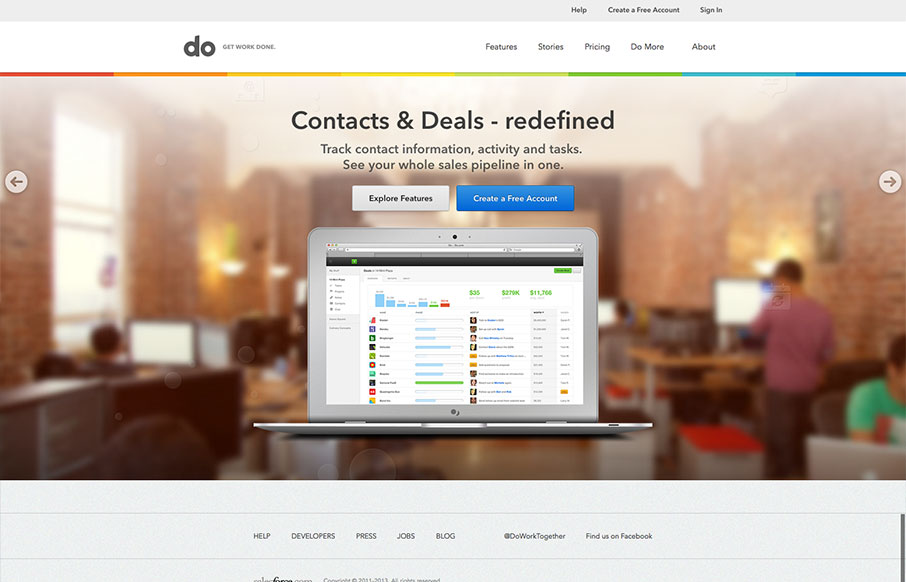
Do
I really love the simplicity of the Do site design. It's boiled down to just what's needed. The overall palette is muted, but not really which is a clever understatement to work into the design. I also dig the Features page, I like how it goes from just showing a...
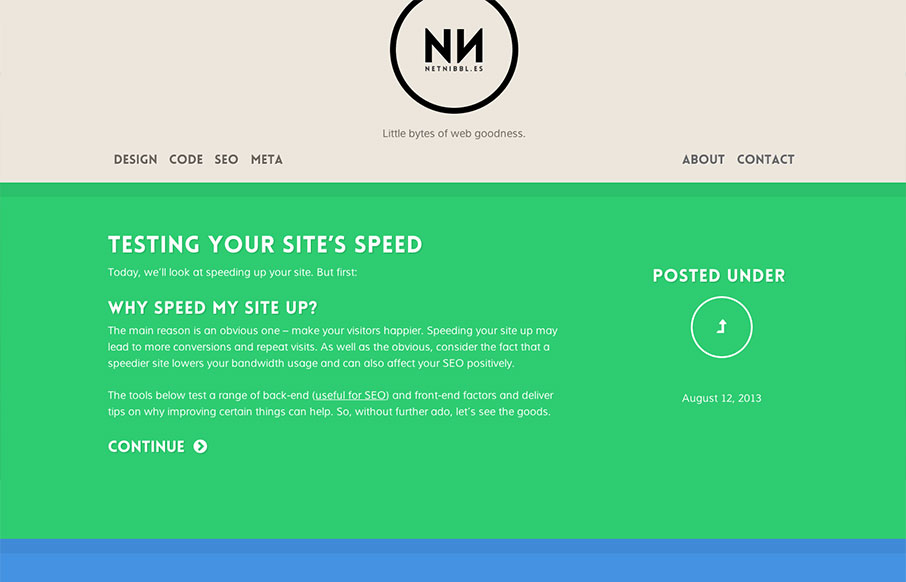
netnibbles
netnibbl.es takes simplicity to heart. The site is dead simple in layout, design and detailing, but the effect is sophisticated none-the-less. While differentiating post categories via color has it's usability issues, netnibbl.es does a good job of adding an...
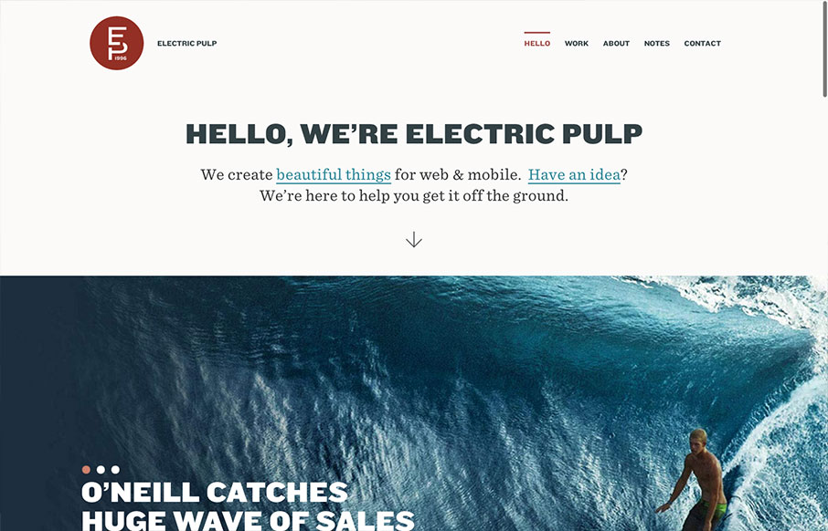
Electric Pulp
I'm always a fan of Electric Pulp's work, their company website designs have always delivered as well. Often being copied outright - which you know what they say about imitation and flattery... This site design follows a trend of simplifying the overall design. At...
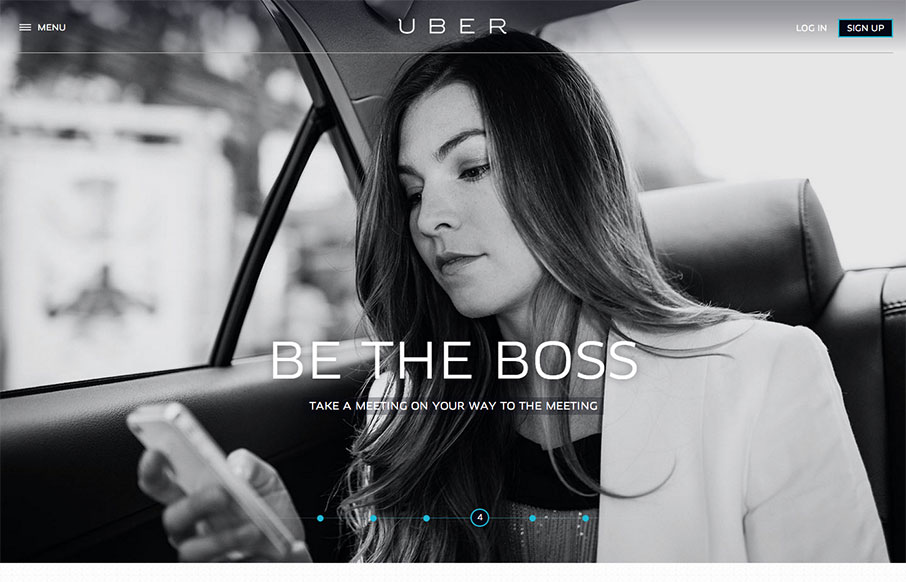
Uber
The new Uber site design is slick and upscale. Nice use of the slideshow IMHO, the images are something out of vogue and adds to the visual branding that they're rolling with. The site is a stark black and white design with a hint of of the blue/green color used for...
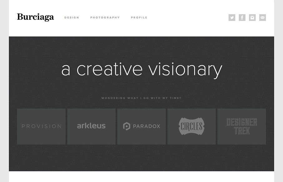
Burciaga & Co.
Super sleek and fairly minimal the Burciaga website looks great. I really like how it starts off primarily muted in colors with the grays, then as you interact with it and scroll you get colors. The design is primarily made up of the examples of work samples which is...
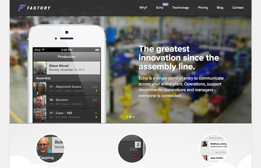
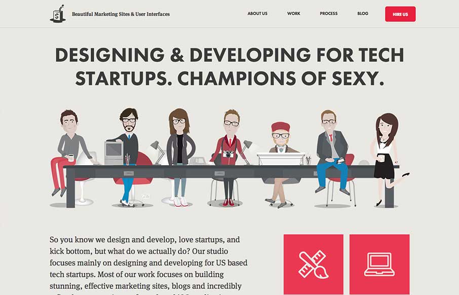
faktory
I really dig the smooth nature of this layout. It looks visually complete as you scroll down and/or click through different sections of the page. I do think it lacks in content, for example I want more on the pricing section. I get that they need to consult with you a...
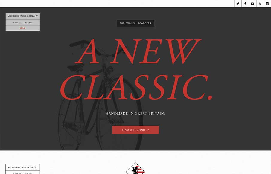
Vickers Bicycles
The Vickers Bicycles site is a small one that has one clear purpose: promote and sell the English Roadster Bike - a beautiful machine, if I do say so - and does so wonderfully. The simple, open layout has a slightly mechanical feel that doesn't feel overwrought. The...
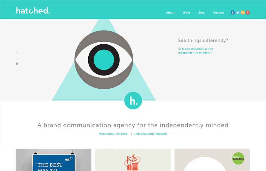
Hatched
The Hatched London website is a simple, elegant site. It's flat, minimal and strongly graphic. Everything you'd expect from a great design house.
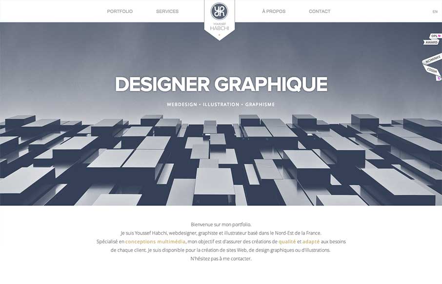
Youssef Habichi
While I'm not a hug fan of loading screens, youssef-habchi.com is a really nice responsive portfolio site. It balances low contrast grays beautifully and incorporates a fast, animated transitions that polish the interactions nicely. The splashes of color in the work...
Simple as Milk
The Simple as Milk website packs a lot onto one page! The site is strongly illustrative, which is perfect, one you see the portfolio; you certainly know what you are getting when you hire this agency. I really enjoy the playful quality of the artwork and interface...
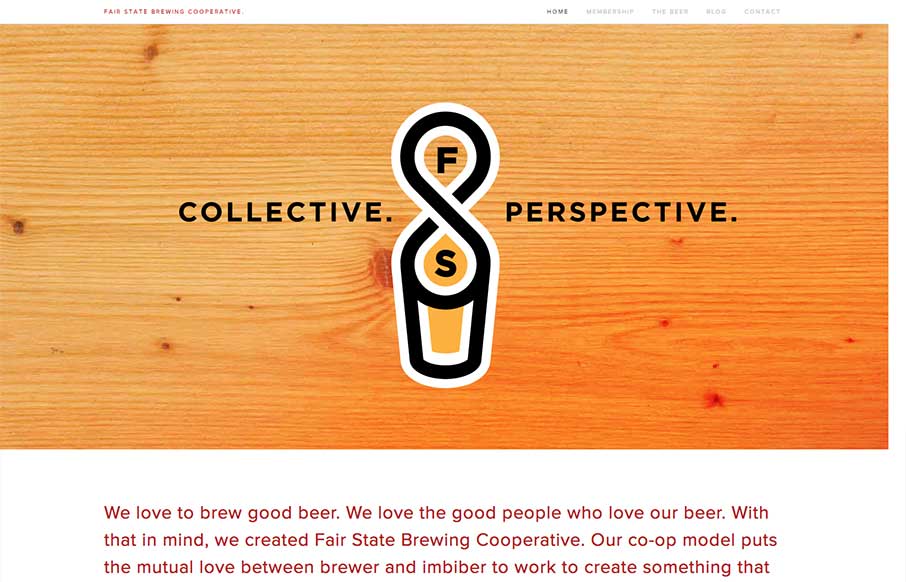
Fair State Co-op
Fair State Co-op is a really nice site filled with warmth and dominated by a simple graphic style. The site doesn't have all the bells and whistles that we often see in the gallery, but its got rock solid design and readability. It's a very friendly site.
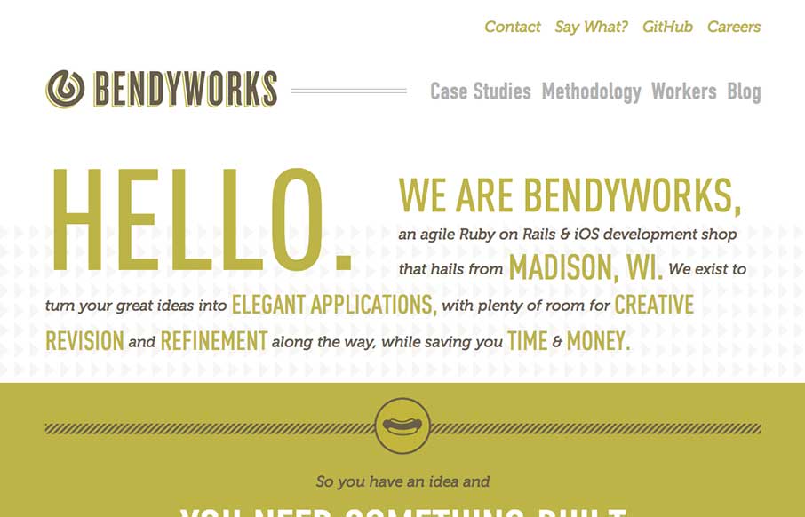
Bendyworks
I really dig the simple yet clever design of the Bendyworks website. It's largely made up of text, but it's well written and clearly defines what Bendyworks does for you and what they're looking to do. I also really love the hot dog graphic, who doesn't love a good...
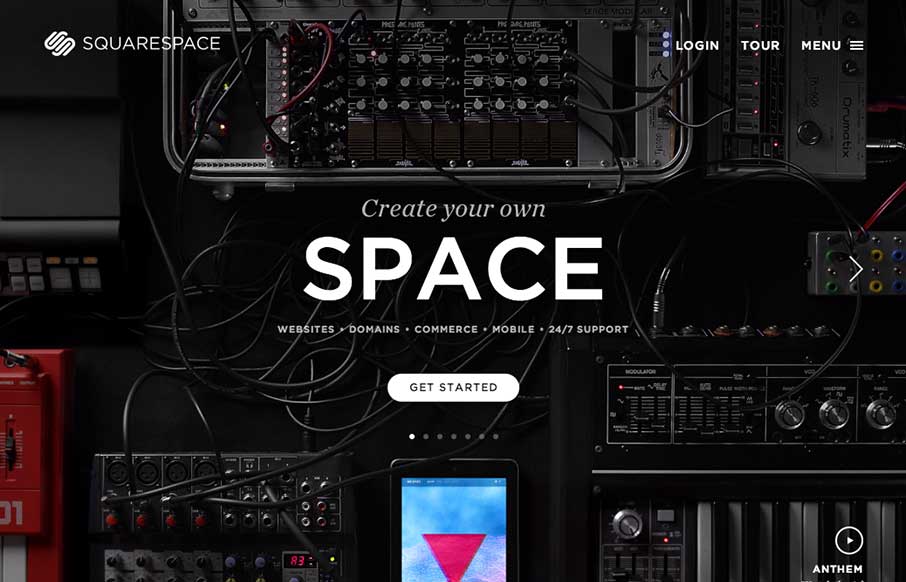
Squarespace
The updated Squarespace website design starts off with a homepage that's pretty much just a giant slider. It's a super clean, sleek and beautiful design across the board for sure. One question I have about it though, and i've seen this on a lot of new sites is the...
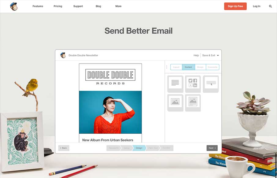
Mailchimp
The new Mailchimp site is superb to say the least. The simplified layout on the homepage really sets the tone for the rest of the design. Incorporating the video of how the app works into the homepage like this is smart and works very seamlessly, you almost don't even...
EMAIL NEWSLETTER
News & Articles
Processing.js – Hello World 3
 Explore building a trivial particle system with Processing.js.
HTML5 is the Future
 HTML5 is not the future. HTML5 is now. A lot of people are already using HTML5 and you should be too.
Designer Chat Session: Garrick Van Buren of Kernest
 Talking about web fonts & the font pairing service Konstellations with Kernest founder Garrick Van Buren.

HARD WORK. CLEAN FUEL. NO EXCUSES
Use “WARRIOR2023″ for 10% off.